alan little’s weblog
This page contains entries from my general weblog that I deem to be in some way connected with photography, or the visual arts generally.
As such, it contains a mixture of stuff ranging from pictures (although this last year I’ve taken very few pictures of anything other than my son, so photo gallery updates have been few & far between), to nuts & bolts photography articles on things like whether 16 bit files have any real advantages in Photoshop or if Leica have made a huge mistake choosing the storage format for their new digicam, to general thoughts about “what is art anyway?”
I actually do think these things belong together. Getting technically proficient with the nuts & bolts is sometimes tedious but it’s part of creative expression – a necessary-but-not-sufficient condition – in any art form; and unless somebody makes some attempt to produce some kind of artistic expression themself, why should I take their opinion about art-in-a-broad-sense seriously? So take my opinions on Photoshop and digicams as part of establishing my credentials to spout about “what is art anyway?”
snappy snaps
8th June 2009 permanent link
Some things the internet doesn’t know yet, as I mentioned to fellow bloggers Brian Micklethwait and Michael Jennings (blog even more moribund than mine) whilst lunching with them in London last Sunday.
My pro photo lab episode at home in Munich ended in tears as a result of a defective usb stick (mine, not the fault of the lab in any way), resulting in me urgently needing to get large, high quality digital prints done in London on a Saturday.
Googling revealed no pro labs in central London that appeared to be open at weekends. (Lots of pro labs used to be open at weekends, to enable Saturday’s sports and theatre photographers to get their pictures into the Sunday papers. Not any more, apparently.) I didn’t want to take my precious work of art to some random one hour print place. So what to do?
What to do, I figured out, was go to a pro camera shop and ask the people there what they would do. Calumet on Drummond Street is big, reasonably central and open on Saturdays, so off I went. “Snappy Snaps on Wardour Street”, the young lady there said immediately. “Don’t be put off by the name; they’re franchises and they’re all different. He’s good.”
Indeed he is. The place has a fresh looking coat of Snappy Snaps bright yellow on the front, but apart from that it looks and feels totally like a professional lab that’s been serving the Soho journalist trade for decades. It has The Smell. The price list prominently features the correct now becoming obscure items like medium format film and slide processing. I start talking to the guy about profiles and proofs for large format digital printers, and I strongly suspect he’s the old school film guy, because he quickly calls a young lady over to deal with me. She fires up the Mac – no Windows PCs here, another good sign – and helps me choose which of the various versions of my file are going to look best on their printer. The prints, collected the next morning, are great.
“Ah, but now you’ll blog this, and then the internet will know it” Brian pointed out, correctly.
smelling the past
8th June 2009 permanent link
They say smell is the most evocative of the senses.
I’ve given up on trying to print my own photos on an inkjet at home. I’m not going down the full Ken Rockwell Luddite road. I don’t doubt for a second that it is possible, by investing large amounts of time, and careful attention to calibrating and profiling everything, to get spectacular prints out of today’s high end inkjets. Michael Reichmann is no fool, and I’ve seen marvelous inkjet prints in exhibitions by world famous photographers like Andreas Gursky and William Eggleston.
But you have to be willing to put in the time and effort, and I have other priorities at the moment. I was getting increasingly unhappy with my Epson R800. It only had one big flaw: murky green-tinged skin tones in shadows. But the vast majority of photos I want to print these days are pictures of grandchildren for grandmothers, so a major flaw in skin tones is a fatal flaw. I downloaded different printer profiles, I spent hours staring at soft proofs in Photoshop. Problem not fixed. I stopped using the printer a year ago and switched to online print services; last month I finally sold the printer.
But last week I wanted something bigger and fancier than a run of the mill online print as a birthday present for my mother. Admittedly still grandchildren. But a big, top notch print of the grandchildren.
Quick googling revealed that the Munich pro lab I used to use back in the days of film is still going, albeit under a new name and at a new location that is less convenient than the old one, but nicer.
I walk through the door, USB stick in hand, and bam! That pro lab chemical smell is still there, just as strong as it ever was. Some professionals are still using film. I knew that anyway, intellectually, but I hadn’t set foot in a real lab for a long time and I wasn’t expecting The Smell to still be there. It took me back to my first few years in Munich. I was single then, working freelance, traveling a lot. I was in my first flush of enthusiasm for both photography and yoga.
My life is very different now – still good, but different. It surprises me that just walking through a door I had never walked through before, and smelling a smell that used to be associated with a major part of my life, can trigger such a big wave of nostalgia.
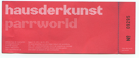
eggleston
14th April 2009 permanent link
I decided I needed to broaden my photographic perspectives, and a friend of my wife who was visiting us noticed that the Haus der Kunst has a show at the moment by William Eggleston. This seemed like the ideal opportunity: Eggleston is a very famous and much admired American photographer and not a Magnum photojournalist. I’ve seen bits of his work in books before, not much, found it quite interesting. The pictures on the exhibition webpage were good. So off we went.
And, hmm. Not for me. I can see why some people admire this stuff – there’s a kind of striving to look effortless and casual, taking pictures of nothing much, actually sneakily involving immaculate composition and superlative printing technique. Result: flashes of brilliance amidst a sea of “why did somebody bother exhibiting that?”
There’s a whole bunch of these “spontaneous”, “informal”, highly-rated-by-lots-of-people(*) American art photographers – Robert Frank(**), Gary Winogrand, Eggleston, Lee Friedlander – whose work I just don’t get. Clearly I’m too British, starchy and formal. (Joel Sternfeld, often spoken of in the same breath, I do very much get; he’s great.)
One of the things Eggleston is famous for, that museum curators still like to bang on about, is being one of the first people to do “serious” “art” photography in colour. So what? There’s a certain type of arts person still obsessed with fighting the New York art clique wars of their youth. Get over it. It was half a century ago; there’s no reason to care any more. It doesn’t matter what was controversial then; either the stuff is still interesting to look at on its own merits now, or it isn’t. And it very definitely is. It doesn’t speak to me, much, but I can see why it does to a lot of other people.
Eggleston himself clearly isn’t too hung up on particular media and technologies. Most of the major photographic printing techniques of the last half century are here. In the sixties and seventies he was evidently a big fan of the horrifically complex, obscure and expensive dye transfer process. There are lots of conventional colour and black & white prints, and – some of the most interesting pictures in the show, for me – some big, recent inkjet and Lightjet digital prints of older negatives, both colour and black & white. A couple of b&w portraits – not at all the sort of thing Eggleston is famous for – impress me very much indeed.
In the interest of further thwarting my perspective-broadening, the Versicherungskammer Bayern’s next exhibition after Magnum’s First is, once again, Magnum founder George Rodger. I could always not go – in the interests of avoiding having my perspectives kept narrow. But I think I most probably will.
(*) Michael Blowhard, for whose opinions I have a great deal of respect, wrote here about his admiration for Lee Friedlander.
(**) Not American, but famous mainly for photographs of America and generally said to be hugely influential for/by lots of famous American photographers.
magnum fanboy
31st March 2009 permanent link
The Versicherungskammer Bayern(*) is hosting a cool photo exhibition in Munich until May this year – Magnum’s First. If you’re in town, go. It’s free.
(Let me know via the mail links provided, and I’ll go with you. I already told my wife: if she loses track of where I am any time in the next couple of months, this is where to look first)
It’s quite a small, low-key show, but there are some great pictures. It’s interesting from a historical perspective too. According to the exhibition notes (here in German), although Magnum was founded in 1947, exhibiting prints in galleries was against the members’ anti-elitist ideals. Instead they focused on getting their work published in magazines – the main mass-circulation visual medium in those pre-TV days. This, their first group show eight years after the agency was founded, toured galleries in Austria in 1955. It was apparently such a low priority for them that they didn’t bother retrieving the prints afterwards. They were found in a box in the cellar of a gallery in Innsbruck over half a century later – I would like to have seen that gallery owner’s face – and are now on tour again.
And the pictures: not by any means, in my opinion, wall to wall masterpieces of amazing genius. A few really stunning pictures, also a few pictures where I ask myself why s/he chose to exhibit that. They may not have exhibited much before, but these were established, famous photojournalists publishing regularly in the biggest magazines of their day, not some bunch of inexperienced unknowns. Interesting juxtaposition, both subject matter and style, of Henri Cartier-Bresson’s pictures of Gandhi just before his assassination, and the funeral, with Ernst Haas’ stills from the shooting of Howard Hawks’ Land of the Pharaohs. One of the momentous events of the twentieth century, right next to something as trivial as stills from a film set. But what stills from a film set. A couple of Cartier-Bresson’s Gandhi pictures are really lovely; with some of the others I’m wondering, if I didn’t know they were by Henri Cartier-Bresson, would I still be standing here trying to convince myself I can see some kind of subtle compositional magic about them. Or, in other words, why did he choose to exhibit this one? In Ernst Haas’ pictures the compositional magic is far from subtle – they’re every bit as good as Cartier-Bresson’s, but in a way that’s much more formal and obvious, and seemingly far easier for my simple visual mind to grasp.
(Some fall on stony ground. I grasp the Cartier-Bresson pictures as an opportunity to explain to my nearly six year old son who Gandhi was and why he was important. A quarter of an hour later I check if any of it went in: “Would you like to explain to Mama who that man was?” “He was the greatest Indian man” “And why was he great?” “Don’t know”. Oh well. Try again another time.)
As part of the exhibition the Verischerungskammer is also showing a BBC TV documentary from 1989 about the history of Magnum. I didn’t have time to watch this at the weekend. (Or rather, my son didn’t have the attention span. “What was it about, Jack?” “Lots of blah blah blah in English”.) And so far I haven’t been able to track down any other means of getting to watch it. I resent this. I paid for it – in 1989, and for many years before and after, I was a BBC licence fee payer – so I’m entitled to see it. It should be streamable or downloadable from a BBC website somewhere, or at least available to buy on DVD. I couldn’t find it on any of the BitTorrrent search engines either, so it looks like I’ll just have to go to the exhibition again and watch it. Worse things happen though; the Versicherungskammer even provides free coffee.
For once the print quality of the exhibition catalogue is good.
After the exhibition, my wife and her friend wanted to go out and talk girl talk in Russian, an activity to which I am woefully ill-equipped to contribute. So I took our son home and put him to bed. And, before going to bed myself, I though I’d put a book or two by Magnum photographers out for my wife’s friend to have a look at. Just one or two – but which ones? It turns out that the majority of photography book collection is by Magnum photographers. No problem, then, finding a couple of books to put on the table – but perhaps I need to think about broadening my perspectives a little?
Retro-photo-blogging: I visited Magnum’s fiftieth anniversary exhibition in Berlin in 2000, thought that “If I could only look at one photography book for the rest of my life, [Magnum Landscape] is the book I would choose” – it still might be – and was bowled over by the work of former Magnum president Raymond Depardon.
(*) Bavarian Insurance Chamber of Commerce
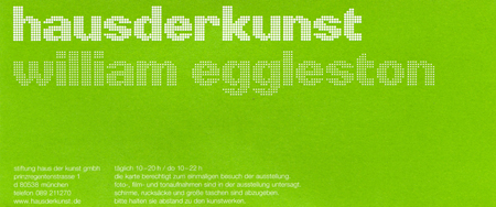
parr(t) two
3rd August 2008 permanent link
Going to photography exhibitions is expensive for me. Whenever I tell my wife I've been to a good one, she insists that I go again and take her with me this time. Which is actually wonderful. (I'm still jealous that she went to see an exhibition by the great Turkish photographer Nuri Bilge Ceylan last year and I didn't. Admittedly she was in Istanbul on business at the time and I wasn't) Yesterday we were at the Parrworld show at Munich’s Haus der Kunst, second time for me.
Apart from paying admission twice, the other big financial hazard of photo exhibitions is museum bookshops. As Mike Johnston says, “If you're looking for good places to find excellent photo books, check your local art museum”. This time it was Edward Burtynsky's China that caught my eye in the Haus der Kunst bookshop. (Don't be misled by the cover photo, to my eye one of the weaker pictures in the book). Buying art books in museum bookshops is equivalent to buying CDs and teeshirts at concerts, except that good quality large format photography books are a lot more expensive.
Burtynsky was on my mind anyway, since I was trying a little while ago to convince Brian Micklethwait of his merits - with some success, it would seem.
Oddly, one picture that very much impressed me on my first visit to Parrworld – taken in the P1 nightclub in the basement of the art gallery building – was gone this time, “at the request of the photographer” according to a little placard that was hanging in its place. I wonder what that was about.
we all love photography now
7th June 2008 permanent link
Martin Parr, whose exhibition at Munich’s Haus der Kunst I found interesting a couple of weeks ago, has a guest blogger spot on The Online Photographer recommending photography books.
I discovered whilst visiting Mr. Parr’s exhibition that the Haus der Kunst also has a very good bookshop. Harry Gruyaert’s Rivages is fantastic. Note To Self: casually mention this to Wife some time before Christmas. I also saw another marvelous photography book – with Martin Parr as one of the featured photographers – that I’m contemplating as an ideal Christmas present for somebody I know is one of my three regular blog readers, so I’m not going to name it now. And, come Christmas time, I will now have bitterly offended and alienated my other two regular readers. Life is hard.
CHRISTMAS UDPATE: Harry Gruyaert’s Rivages is indeed fantastic. Thank you my love. Unfortunately for my regular reader, the other book turned out to be sold out and out of print by the time I was doing my Christmas shopping. Note To Self: good photography books tend to have short print runs and go out of print quickly.
buskers
22nd May 2008 permanent link
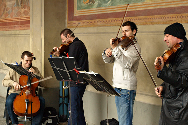
Genuinely good buskers are rare, and a great pleasure when you do find them. I found these guys today on my way from the U-Bahn to the art gallery. They were playing the Usual Suspects for classical busking - Eine kleine Nachtmusik, bits of the Four Seasons – and playing them well and with enthusiasm. I enjoyed them a lot.
And of course I had my new carry-around camera with me. This isn’t the world’s best or sharpest picture, sure – but I’m beginning to understand what people mean when they say the Olympus DSLRs produce subtly nice colours in their in-camera jpeg processing.
cruel and unusual
22nd May 2008 permanent link
The parrworld exhibition turned out to be thoroughly interesting and worthwhile. Martin Parr is a very talented photographer indeed, with a very cruel eye indeed. I personally can’t imagine being motivated to go out and produce art every day, driven by the loathing Martin Parr appears to feel for the people he takes pictures of.
(Top marks to Haus der Kunst, by the way, for having an exhibition in a major gallery, featuring a very good picture taken recently in the nightclub in the basement of the gallery building.)
The exhibition wasn’t just Martin Parr’s pictures: it also featured his large collection of mostly political kitsch art objects, and pictures by other photographers – presumably ones he likes, or who have influenced him, or whom has influenced. Or any combination thereof. One that particularly blew me away was an English suburban townscape by a guy named Mark Power who I had never heard of before, although googling briefly now, I discover he is in Magnum, much published and so on. The picture in question is the left hand one in the third group of three in this review of Mark Power’s book. It doesn’t look like much in a tiny thumbnail like this, but believe me it does in a big gallery print.
This is the photographic ability I really admire, far more than the ability to make spectacular pictures of spectacular things: the ability to make spectacular pictures of utterly mundane things.
freedom
22nd May 2008 permanent link
I just dropped my family at the airport for a ten day trip to visit relatives in Russia and, whilst of course i’m missing them terribly already (etc. etc.), I’m (also) contemplating what to do next with my new and precious freedom.
I have a couple of little projects planned for the house, but guess what: today is a public holiday in Bavaria. A quaint but irritating feature of German life is that everything is closed on Sundays and public holidays (with elaborate legal exceptions for, e.g., food shops in railway stations and – this is true – florists within a 500 metre radius of hospitals or cemeteries or on Mothers Day), so I can’t go out and buy the wood that I need for Project A.
I was also contemplating going into the office for a few hours. Sad, I know, but I do have a lot to get done at the moment and a bit of time without the phone ringing or people knocking on my door would be a bonus. Another quaint feature of German public holidays is my boss saying it would be fine for me to actually do some work today, but could the hours please appear somewhere else on my timesheet, because heaven forbid that the workers’ council should get wind of somebody who has a lot of work to do voluntarily showing up and doing it. If the Germans don’t start rethinking this kind of nonsense soon, the people who think there is no hope for the country will be right.
All these plans were in any case doomed when I drove past the Haus der Kunst on the way back from the airport and saw that it has an exhibition by Martin Parr. I don’t find Martin Parr’s work congenial – nor am I supposed to – but there’s no doubt that he’s a very talented photographer with a unique, if cynical, point of view. (At this point I am struggling and failing to come up with the right succinct English translation of the German word schief. Interesting.)
That, supplemented if necessary by the small but decent collection of Indian sculpture at the Ethnographic Museum just round the corner, followed perhaps by a spot of hanging out in coffee shops(*), should get me through the achingly lonely afternoon quite nicely.
(*) Lest I be misunderstood: unlike Dutch “coffee shops”, German coffee shops primarily sell coffee.
available darkness
19th May 2008 permanent link
Don’t use a flash out of respect for the natural lighting, even when there isn’t any.
Henri Cartier-Bresson
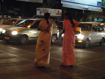
I like taking photographs in the dark. If I were really serious about it I would be saving up for the current high-ISO boss camera, the Nikon D3. From the reviews this sounds like the digital camera that finally overturns Kodak T-Max 3200 black & white film as the way to take photographs in the dark(*). The D3, however, is big, heavy and very expensive. I was interested to see if my new small, light, cheap Olympus carry-around camera would be at least adequate at night.
I would say it is, judging by the results of half an hour I spent standing at a busy crossroads in Pune one evening two weeks ago. The tiny little viewfinder is really dark at night, making composition tricky. The slow autofocus doesn’t help much either, and in theory the smaller Olympus sensor should be a stop or so less sensitive / noisier than a bigger one, other things being equal. But the results are, I would say, more than adequate. They’re sharp, with pleasing and accurate colour. They’re very noisy - not surprising considering I was desperately underexposing, in order to keep hand-holdable shutter speeds and avoid blowing the very contrasty highlights. But they clean up quite nicely with a bit of Noise Ninja in Photoshop, with a result that is probably slightly more grainy/noisy than I would have got with fast colour film, but with way better colour saturation and accuracy. I could never have done anything like this with a digicam. I don’t think I could have done all that much better with my D200, even allowing for brighter viewfinder, better autofocus and the fact that I have faster Nikon lenses.
(Always use flash outdoors in bright sunlight, by the way, unless you’re specifically aiming for a stark, high contrast black & white look. But do try to avoid it in all other circumstances.)
(*) “4–6 stops better than anything we had in the film days”, says Michael Reichmann.
digicam
17th May 2008 permanent link
My current main camera, a Nikon D200, is a spectacularly good camera and I’m very happy with it. I feel no pressing need for the slight improvements over it that the current second-from-top Nikon, the D300, offers; I will be sorely tempted by the nearly 25 migapixel, awesomely capable, huge and expensive D3X when it comes out later this year, but for the amount I’m shooting at the moment there’s no way I could even try to justify the expense.
I’m thinking in a different direction camera-wise at the moment. Both on my first business trip to Pune and meeting Michael Jennings and friends at a beer festival in Munich, it struck me what a cumbersome thing the D200 is to lug around when I’m not going somewhere primarily to take pictures. A big pro camera with big pro zoom lenses would be even heavier, and a lot of the time that simply isn’t what one needs. I’m thinking smaller.
But not too small. I find myself here on the verge of repeating what I wrote about small digicams two years ago:
I do have a little digicam, a Fuji F10 which I bought because it's supposed to be one of the faster-focusing and generally more responsive small cameras, and quite good for available light photography without flash. Supposedly. I still find it frustratingly slow in the kind of fairly low light indoor situations where I usually want to take snapshots. Its six megapixel picture quality makes reasonable small prints of my son for his grandmothers, but is nowhere near even a previous generation six megapixel SLR like a D70, let alone something more state of the art like the D200. The F10 is better than nothing, but if I were willing to lug my D200 around with me everywhere I would enjoy taking pictures a lot more, and get better pictures.
This is actually a big difference from the film days, and not one that is favourable to digital. A lot of small 35mm film cameras, including the little Yashicas and Olympuses I used to use, were (are) capable in the right circumstances of producing results every bit as good as professional SLRs. They had limitations – fixed lenses, slow autofocus and general lack of control – but the lenses were just as good as SLR lenses, and of course they used exactly the same sensors as their big brothers, in the form of bits of 35mm film. In most of the circumstances where you want to carry a small camera just in case, being theoretically capable of the same image quality as an SLR isn’t particularly relevant, but I did sometimes get some pretty decent pictures with film point’n’shoots.
The problem with small digicams isn’t lens quality. Plenty of them have good lenses. Small good lenses are easier and cheaper to make than big ones, and Fuji’s ability to make excellent lenses is beyond question. But the physics of small batteries and small sensors dictate that autofocus will always be slower, and pixel-for-pixel image quality will be worse. I personally have yet to take a good picture with a small digicam.
… none of which has changed, including – hey! – the exact same cameras that I still own and use (not much, in the case of the Fuji). And none of which means, as I also went on to say two years ago, that nobody can take great pictures with little digicams. Clearly lots of people can and do. But I don’t seem to be one of them.
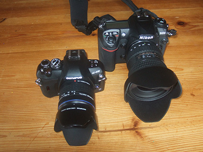
So what to do? I want a camera that is significantly smaller and lighter than the D200, but a better digicam isn’t going to do the job. Olympus to the rescue, as it turns out, in the form of the (now) second-smallest DSLR in the world, the E410, on clearance sale at my local electronics superstore for €299 complete with a reputedly perfectly decent 14-42 (28-84 equivalent) kit zoom lens.
(Real Photographer Lawrence Ripsher talks more eloquently about the severe limitations of small digicams and reviews – and likes – the E410)
I find this amazing. Sure, the price I paid for the E410 is a stock clearance price because Olympus just started shipping a slightly improved and even (fractionally) smaller replacement model, the E420. Nevertheless: this is a ten megapixel DLSR for about a fifth of the price I paid for my D200 only a little over two years ago. The D200 is still a far more capable ten megapixel DSLR (I hope – if it turns out not to be it’ll find itself on ebay PDQ). The Olympus feels lightly built and delicate: I’ll have not be careful about throwing it casually in bags or coat pockets, or taking it out in less than perfect weather. Which is a serious limitation for a casual carry-everywhere camera, as is the fact that the slightly smaller sensor is generally reputed to have about a stop less low light usability. But if I seriously wanted an indestructible camera that can take pictures in total darkness [I do, I do] then I’d be back to thinking about the behemoth D3 that can shoot three stops faster than the Olympus, but weighs three times at more than ten times the price.
taking pictures of cameras: sad
Two weeks ago I was in India on business again, for the second time this year, and this time I only took the Olympus. First impressions: it’s a nice little camera. It's much less burdensome to carry around than the D200; it’s comfortable in a belt pouch, which the D200 very much isn’t. It has some drawbacks in comparison (as indeed it should at the price). Autofocus is slow and lacking in control. Highlights seem to blow out quite a bit more easily than the D200 – I haven’t done any like for like testing to confirm this, and shooting in the Indian midday sun is a challenge for any digital camera, but less dynamic range certainly would logically follow from the somewhat smaller sensor. Having to fiddle around on the screen to change shooting settings is slow and cumbersome compared to the dedicated buttons and switches that the bigger and heavier D200 has room for – although the Olympus menus are well organised which reduces the pain somewhat. The viewfinder is fine in daylight but terribly dark for night photography. But I like it. I didn’t buy it for “real” photography; I bought it as a super-digicam that is unobtrusive enough to carry around when I’m not primarily out to to take pictures, but capable enough that I can still take real pictures with it should the opportunity present itself. I think it will fill that niche pretty much perfectly.
mahatma gandhi road
9th May 2008 permanent link
People who were cremated and had their ashes scattered on the waters of a holy river clearly don’t “turn in their graves”, so: in an irony that doubtless has Mahatma Gandhi swirling in the Ganges, the main upmarket shopping street in many Indian cities is called “M G Road”.
M G Road in Pune, I only noticed last week on my third visit there, has modern glitzy shopfronts; but if you look above street level, many of those shopfronts are tacked on to ramshackle and charming Pune old town buildings.
two by two
20th April 2008 permanent link


Family trip to Munich zoo.
I suppose I could have claimed to have taken these in a park on the outskirts of Pune three weeks ago. Only people from Pune, and people who know that only South American monkeys have long prehensile tails, could have called my bluff. General knowledge from information placards at zoos is a wonderful thing – did you know polar bears are so well insulated that they are invisible to infrared sensors?
photography quotes
17th March 2008 permanent link
Cartier-Bresson got by with one lens … and Sebastiao Salgado uses three. You need more?
Mike Johnston
on the banks of the … gleissen
13th August 2007 permanent link
In a similar vein, my friend Andrew was chuffed when I said Henri Cartier-Bresson “wouldn't have been ashamed” of this:
© 2005 Andrew Haley
“No-one has ever said that to me before – and I suspect that no-one ever will again”
figures in the snow
13th August 2007 permanent link
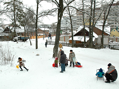
Yesterday my wife and I took advantage of my mother-in-law’s visit for an art gallery visit sans child to the Alte Pinakothek. The Alte Pinakothek was the only one of Munich’s major galleries I hadn’t got round to so far; my wife had been before and came away unimpressed. It specialises in Renaissance and early modern European masters, and neither of us is much into saints, Madonnas or Flemish burghers. But I was sure there had to be something there worth looking at.
Sure enough there was, in the form of several marvellous pieces by Pieter Bruegel the Elder and his confusingly-named but almost equally capable sons, Pieter Bruegel the Younger and Jan Bruegel the Elder.
Highlight of the day for me was my wife’s comment: “aren’t your pictures of kids sledging in the snow in Russia rather like Bruegel?” Well, would you care to guess how accidental that is, dear? Still it’s nice somebody noticed what I was trying, however feebly, to do.

cool camera
21st July 2007 permanent link
A Saturday Family Life Vignette.
I loaded up my Nikon FM2 with a roll of black & white film and took it for a walk round the zoo with my son today. I like to do this from time to time; there’s a lot to be said for autofocus and modern digital whizz-bangs, but there’s also a lot to be said for a camera where you press the button and it takes the picture immediately.
My son’s take on the matter:
Daddy, this camera is cool
Looks at back of camera. Works out that the little rectangular thingy where people too stupid to remember what film they were using used to put torn-off bits of film carton(*) isn’t a viewing screen.
But you can’t see the pictures can you?
No son.
Daddy, this camera is cool, but next time I want you to bring the other camera
Mister Diplomat.
(*) OK, ok, more likely pros who needed to know at a glance which was the one with the Kodachrome in and which was the one with the Tri-X.
war photographer
14th June 2007 permanent link
Yesterday I dropped Greatest Living War Photographer James Nachtwey’s name in a comment thread on Michael Jennings’ blog. This morning, surfing the online photographer [Greatest Living Photography Blog?] at breakfast, I noticed a link to a speech by Nachtwey accepting a journalism award.
James Nachtwey is a fantastic photographer, the only one whose work has ever caused me to have to walk out of an exhibition, sit down and cry. So this little coincidence seems like a good excuse to link to War Photographer, a very good documentary about his work that I went to see with my wife about a week before our son was born, my suggestion that there would be things in it that weren’t suitable viewing for a highly pregnant woman having been comprehensively ignored.
The Magnum Photo agency used to have very good online portfolios for their photographers, but have now shot themselves in the foot by hiding everything behind a subscription-only search wall.
acro yoga
1st May 2007 permanent link
I have some pictures from the Acro Yoga classes in Köln in April up on flickr.
I haven’t used flickr before. I’m uncomfortable with the idea of somebody else’s software automatically cropping my pictures to make thumbnails, messing with my colour balance etc. But a couple of people had asked about the pictures and were waiting for them, I haven’t touched my photo gallery pages for ages (should do something about that one day), and life is too short to edit HTML by hand. So I’ll see how it goes.
jealousy
12th April 2007 permanent link
I am jealous. My already outrageously well-travelled wife is on a business trip to Istanbul, where between meetings she managed to fit in a visit to Architectural Wonder Of The World the Hagia Sophia mosque / former cathedral, and (far more jealousy-inducing for me), an exhibition by brilliant Turkish photographer and film director Nuri Bilge Ceylan.
She’s bringing me back an exhibition catalogue and three of his DVDs, which we already tried to find on amazon.de and ebay.de but no go. Strange. Perhaps Germany’s large Turkish population wants a rose-tinted view of home and isn’t into gritty arthouse social realism.
I have Mike Johnston to thank for introducing me to Ceylan’s work.
I can’t be too jealous, though – this is just a quick dashed-off blog posting before I run out the door to catch a flight to Köln, where I will be hanging out with yoga babes at the Yoga Conference Germany 2007. Köln Cathedral ain’t the Hagia Sophia, nor am I aware of any current photo exhibitions there by artists as talented as Pieter Bruegel the Elder – but I’ll be disappointed if my yoga classes aren’t considerably more fun than Maria’s business meetings.
lessons in seeing
8th April 2007 permanent link
Bruce Robbins and Sharon Akler both, coincidentally, emailed me this week about my years-old review of Magnum Landscape – thus causing me to have another look at the book, which I hadn’t opened for a while. It's still my Desert Island Photography Book; thanks, Bruce and Sharon.
Bruce shakes his head over a reviewer on amazon.co.uk who thinks “very few of the images are truly outstanding”. S/he is is of course entitled to his/her opinion even though it is completely wrong.
I found the review after mine on amazon.com interesting, where the guy complains bitterly about the reproduction quality of the pictures in Landscape compared to Magnum Degrees. My thoughts about this:
- I’ve never seen a book reproduction that remotely compares to seeing a real print in an exhibition. Therefore I almost never buy exhibition catalogues (including Magnum Degrees) at the exhibition. If I buy them at all, I wait until several months afterwards when I can pick up remaindered copies much cheaper in art bookshops, after my memories of the glories of the exhibition prints have faded somewhat.
- Degrees is a big, expensive, glossy production; Landscape is a small, cheap, non-glossy production. Looking at some of the pictures that are in both side by side, I still find the reproductions in Landscape perfectly adequate. Matte looks different from gloss, it's not automatically worse.
- I didn’t find the repro quality of Degrees that great either, see above
- The actual point I want to make here: this is not landscape photography as we normally think of it. This is landscape photography of a kind that depends for its power on composition and conception, on seeing the non-obvious, not on mind-blowingly detailed and technically impressive huge prints of mind-blowingly tedious and clichéd subject matter.
Here’s your list of who’s in the book, Sharon:
Abbas · Eve Arnold · Micha Bar-Am · Bruno Barbey · Ian Berry · Werner Bischof · René Burri · Cornell Capa · Robert Capa · Henri Carier-Bresson · Bruce Davidson · Carl de Keyzer · Luc Delahaye · Raymond Depardon · Nikos Economopoulos · Elliott Erwitt · Martine Franck · Stuart Franklin · Leonard Freed · Paul Fusco · Jean Gaumy · Burt Glinn · Harry Gruyaert · Ernst Haaas · Erich Hartmann · David Alan Harvey · Thomas Höpker · David Hurn · Richard Kalvar · Josef Koudelka · Hiroji Kubota · Guy Le Querrec · Paul Lowe · Costa Manos · Peter Marlow · Steve McCurry · Susan Meiselas · Inge Morath · James Nachtwey · Martin Parr · Gilles Peress · Gueorgui Pinkhassov · Raghu Rai · Marc Riboud · Miguel Rio Branco · George Rodger · Ferdinando Scianna · Chris Steele-Perkins · Dennis Stock · Larry Towell · John Vink · Alex Webb · Patrick Zachmann
photography quotes
7th March 2007 permanent link
You mustn't want. You must be receptive.
Henri Cartier-Bresson, courtesy of Mike Johnston
a picture occasionally
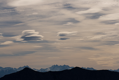
19th October 2006 permanent link
Blogging remains, and will remain, sporadic as long as I remain without a laptop and the rest of my family continue have their own ideas about how I might like to spend my time at home.
This week, however, my wife’s ideas about how I might like to spend my time included taking a midweek break to go and enjoy glorious autumn weather in the mountains. Excellent idea. Here’s how the skyscape over the Grossvenediger in the Austrian Alps looked yesterday:
ted orland
3rd August 2006 permanent link
I've been an admirer of Ted Orland's book Art and Fear for years.
What I first discovered today, thanks to a link from Paul Butzi on The Online Photographer is that he is a damn fine photographer.
(Note To Self: in future, you might want to consider finding out whether somebody is actually a capable artist before spending years believing their advice about how to do art)
photo rules
27th June 2006 permanent link
Mike Johnston has a couple of very funny satirical pieces: internet-forum-style critiques of classic photographs by famous great photographers.
I think he thought he was making it up, until he found this real life example of some folks recommending that a picture by Henri Cartier-Bresson should be deleted from flickr.
Hmm. Perhaps the foks on flickr are taking the piss too. Even if they’re not, they’re entitled to their opinion. Not every photograph H C-B ever took is an immortal masterpiece, and anybody is entitled to their own opinion even about the ones that most people think are. No artist’s work is entitled to unthinking reverence from everybody. I personally happen to think the picture in question is pretty damn fine though.
Mike’s The Online Photographer is, incidentally, easily the best talking-about-photography blog on the web today.
a picture a week (8)
30th May 2006 permanent link
This one is a genuine film scan, shot in 2002 on traditional Fuji Reala on a retro-even-then Nikon FM2.
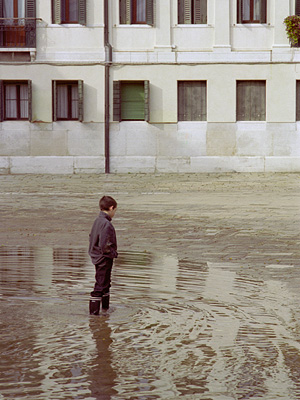
My first – and so far, only – visit to Venice was with Maria when she was pregnant with our first – and so far, only – child. Being an expectant father changes your perspectives. Venice is fascinating and amazingly beautiful, but it also occurred to me that it must be a lousy place to bring up kids. There are no trees or green spaces for them to play; you can’t let them run in the streets for fear they might fall in and drown. Venetians seem to be of the same opinion: the population of the city has halved in the last fifty years.
The few kids who are there are quite photogenic playing in the flooded squares at high tide, though.
a picture a “week” (7)
22nd May 2006 permanent link
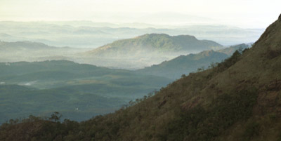
Morning mist in the Cardamom Hills, Kerala, India, January 2000.
This one has been in my Indian landscapes gallery for ages, but Denys Bourque reminded me of it last week by asking if he could use it to illustrate a report he is producing on forest conservation work in the Indian hill regions. Glad to be able to support a good cause.
It isn’t a great picture. It was one of those ones where you think it might be when you press the button, but then you see the print a couple of weeks later and it isn’t. C’est la vie. (At least these days with digital you get the disappointment over with sooner) I’m still fond of it though. It brings back memories of my first trip to India. I was mainly there to study yoga with Lino Miele, but for a couple of days my friend Jeffrey and I rented motorbikes and headed for the hills. Those were the most memorable days of the trip for me: going to yoga class then sitting on the beach is all very well, but for me actually seeing a bit of India away from heavily westernised beach resorts was important too.
Seeing the shop print of this one was also a big step on my road to digital photography. The whole point of the composition, for what it’s worth, is the way the layers of mist are interleaved with the hills. In the print I got back from the lab everything beyond the mountain in the foreground was just blurry mist. I was sure that couldn’t be right, so I had a careful look at the negative and sure enough, the bands of mist and hills were there just as I wanted them to be. So I went out and bought a film scanner, and this picture was one of the first to appear on alanlittle.org a few months later.
(Whereas now, I haven’t shot a roll of film for over a year but I’m thinking seriously about going back to outsourced printing, because trying to get a decent colour match on inkjet printers I can afford is just such a time-consuming and endlessly frustrating bastard of a struggle. I simply can’t get my Epson R800 to come out with skin tones I’m happy with for people shots)
photography quotes
16th April 2006 permanent link
Photography is the power of observation, not the application of technology.
Ken Rockwell
a picture a week (6)
25th March 2006 permanent link
from a castle window
Photos of Mad King Ludwig of Bavaria’s castle at Neuschwanstein are an appalling tourist cliché and could not therefore possibly qualify for A Photo A Week. Photos of the view from Neuschwanstein are ok though.
It’s astonishing what modern cameras and lenses are capable of. The tree in that picture is well over half a mile away. Here’s what it looks like in the full size image (unsharpened on the left, and on the right with Photoshop Smart Sharpening applied):


Those fence posts underneath the tree that you can barely see? At 100% you can clearly see the wire:
Holy Shit. That wire, remember, is well over half a mile away.
And this with the Nikon gear I can afford, which is very good but not quite the absolute best: a D200 with the 180mm f2.8 lens. A similar but truly state of the art setup – the D2X with the 200mm f2 – might produce just-about-perceptibly better results, but at over four times the price I’d be well into diminishing returns for the extra money.
a picture a week (5)
13th March 2006 permanent link
yoga class – learning to fall
Digital cameras – good digital SLRs at any rate – beat film hands down for taking pictures in the dark on any practical measure of resolution, tolerable grain/noise, ability to check that you’re getting exposure right in tricky lighting, etc., etc. They still don’t come close to fast black & white film – in this case Kodak TMax 3200 – for beauty.
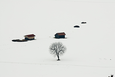
a picture a week (4)
5th March 2006 permanent link
An Apologia: my Photo A Week project was supposed to be about digging worthwhile old pictures out of my my slide cupboard. Until such time as it eventually succeeds, my quest to take a great photograph in Munich’s Westpark is nobody’s problem but my own. And snow-covered trees are an appallingly tedious photographic cliché except in the hands of talented photographers (such as the cinematographer who shot the early scenes of The Lion, The Witch And The Wardrobe – Donald McAlpine, says imdb)
Nevertheless: even in Munich, an hour’s drive from the Alps, the heaviest snowfall in a century doesn’t happen very often; and when it does, those slides don’t scan themselves while I’m out sledging with small children. It’s all a question of priorities
So, Ladies and Gentlemen, The Lantern Waste:
the state of the art
4th March 2006 permanent link
what if any are the advantages of the silver halide method of recording images compared to the digital alternative? … The massive change from classical silver halide photography to solid state imagery has been completed by now and the chemical recording of images will become a tiny niche, cared for by a handful of aficionados, as is the case with the vinyl LP record.
… says Leica expert Erwin Puts in an interesting essay that I recently dug out of my to_read list. In it he talks about Leica rangefinder cameras – his great love – their place in the history of photography (the golden age of photojournalism), and the particular style and aesthetic that was built upon their use. The same sort of stuff I talked about my comments on photojournalism in the Second World War, except much better informed and more thought through.
His key point is that different tools and materials encourage different aesthetics, make different things possible in art, and this will continue to be true in the digital photography era. Shooting black & white chemical film in mechanical cameras is an anachronism, no matter how beautifully made the cameras are. There are things you can do, looks you can achieve, with Leicas, available light and black & white film that you can’t with digital – but vice versa too.
I’ve only been taking pictures seriously for ten years and have never set foot in a darkroom. (Actually, a did have a nice little Ricoh rangefinder in my early 20s and enjoyed taking pictures with it, but it got hurt on a climbing trip and didn’t get round to replacing it until many years later. That was a phase of my life when I was lost and confused in many ways.) I’m not a hoary old film photography veteran. But I did learn photography with a 35mm film SLR – my Nikon FM2 which I will never part with even when I do get around to selling, scrapping or giving away all my other film cameras. And even though I shoot nearly all digital these days, I’m still very much an SLR-mindset shooter. Which perhaps makes me a dinosaur from a previous generation too.
I do have a little digicam, a Fuji F10 which I bought because it's supposed to be one of the faster-focusing and generally more responsive small cameras, and quite good for available light photography without flash. Supposedly. I still find it frustratingly slow in the kind of fairly low light indoor situations where I usually want to take snapshots. Its six megapixel picture quality makes reasonable small prints of my son for his grandmothers, but is nowhere near even a previous generation six megapixel SLR like a D70, let alone something more state of the art like the D200. The F10 is better than nothing, but if I were willing to lug my D200 around with me everywhere I would enjoy taking pictures a lot more, and get better pictures.
This is actually a big difference from the film days, and not one that is favourable to digital. A lot of small 35mm film cameras, including the little Yashicas and Olympuses I used to use, were (are) capable in the right circumstances of producing results every bit as good as professional SLRs. They had limitations – fixed lenses, slow autofocus and general lack of control – but the lenses were just as good as SLR lenses, and of course they used exactly the same sensors as their big brothers, in the form of bits of 35mm film. In most of the circumstances where you want to carry a small camera just in case, being theoretically capable of the same image quality as an SLR isn’t particularly relevant, but I did sometimes get some pretty decent pictures with film point’n’shoots.
The problem with small digicams isn’t lens quality. Plenty of them have good lenses. Small good lenses are easier and cheaper to make than big ones, and Fuji’s ability to make excellent lenses is beyond question. But the physics of small batteries and small sensors dictate that autofocus will always be slower, and pixel-for-pixel image quality will be worse. I personally have yet to take a good picture with a small digicam.
I’m not suggesting it can’t be done, though, and that’s the whole point. Just as with the switch from rangefinder to SLR photography that Erwin Puts writes about, there will be people who create marvellous pictures that take advantage of the strengths of small digital cameras, and that will have an aesthetic of their own that is different from the era of 35mm SLR photography. Alex Majoli, who won Photojournalist Of The Year 2004 using Olympus digicams, might be one of those people.
(There are other things too about the new digital world that aren’t improvements – everything has its trade-offs. We’re too dependent now on expensive, fragile, battery-hungry electronic gadgets compared to the days when all the storage and electricity you needed was a bag of film and a tiny little battery for the lightmeter that you had to remember to change every couple of years. But the places where those things are an advantage don’t feature prominently at the moment in my life as a responsible husband-and-father – the days of journeys by bus and motorbike around rural India, and week long hikes in the Arizona desert, are behind me for the time being. Pity. I can see the D200 making a lovely job of red dust-haze Deccan twilight.)
UPDATE: Steve Crandall has a friend who is a professional fashion and ad photographer, who says he is more creative and has more fun with his little pocket digicam. That I am not says more about my personal prejudices and limitations than those of digicams.
a picture a week (3)
28th February 2006 permanent link
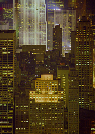
Cityscape: Midtown Manhattan, looking north from the Empire State Building, July 2000.
I was in NY to attend a yoga workshop with Pattabhi Jois. Given his sometimes-somewhat fearsome reputation, I wanted to check him out before taking the plunge and going on a big trip to Mysore. His teaching tour in 2000 included New York, so it also seemed like a good chance to get acquainted with that wonderful, wonderful city.
The yoga classes were great. I was single at the time and didn’t know anybody in NY, so outside of class was a bit lonely at times until my friend Jeffrey showed up for the second week – but at least I had plenty of time for wandering about with a camera without having to worry about what anybody else would think. At the time I was only just starting to get to grips with digital imaging, struggling to learn how to scan film, how to drive Photoshop etc. I put some of my yoga class photos online (they were one of the first things on alanlittle.org) but it was an awful lot of work, and I never got round to doing anything with any of the non-yoga photos from the trip even though I was pretty pleased with some of them. Now I have a family, a more demanding job and much less free time than I had five years ago, but my photo-processing technique is also a lot slicker than it was (and I’m running Photoshop on a much faster computer). And it’s important to still make an effort to keep in touch with the creative process.
(about) a picture a week (2)
24th February 2006 permanent link
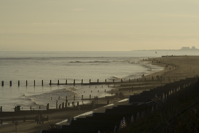
Southwold beach, 2nd January 2006. Conclusion reached by my son on his first-ever visit to the seaside: “wet, wet, wet and more wet”. Conclusion reached by me: low-angle winter sunlight on the English east coast can be astonishingly beautiful. I realise I am not the first person to have noticed this, although I may well have been one of the first to test the Nikon D200’s ability to capture it. Test passed with flying colours, I would say.
Another picture of the same scene, however, shows that you can’t get away with shooting straight into the low sun with a thirty year old cheap lens with no lens hood. Not even if that thirty year old cheap lens is the Nikon Series E 100mm, highly rated even by discerning lens connoissuers.
a picture a week (1)
12th February 2006 permanent link
This is the room in Mysore where Pattabhi Jois and BKS Iyengar – probably the most famous yoga teachers in the world today – studied in the 1930s as young men with their teacher, T. Krishnamacharya. Another highly respected senior yoga teacher, BNS Iyengar, also a former Krishnamacharya pupil, still has his yoga school in some upstairs rooms in the same building.
Russell has been visiting here lately.
a photo a week
6th February 2006 permanent link
If it’s worth taking time to look at other people’s photos, it’s worth making an effort to do something with my own too. Since I bought my Nikon D70 in the summer of 2004, my entire lifetime’s creative output up to that point, in the form of thousands of slides & negatives, has been locked in a cupboard while my film scanner sits next to my Mac gathering dust. Time to start doing something with them. So, New Year’s Resolution: from now on, A Photo A Week.
recharging
6th February 2006 permanent link
And then you go to the galleries and museums. You look at those fine books on photography and you see what the masters did long before you knew the difference between Tri-X and Ektachrome. Will you ever shoot a better picture than those Cartier-Bresson street scenes of the 1940s? Will you ever come near the intensity of a Gene Smith reportage? You discover that any imaginable situation has beeen photographed already - the moment of birth and the split second of death, desperation and joy, man on the moon and life in the womb.
Now they are working on computers that will store every photograph that exists in the world. You want a picture of spear-fishing in Surinam? Push the right buttons and you'll see it in milliseconds. The world on magnetic disks wll be right at our fingertips. Why bother to send a photographer all the way to South America? Why bother to go out into the heat and cold of the real world and take even more pictures, adding to the millions that exist already, stored away in the electronic maze? Will photography eventually make itself obsolete through overproduction?
… it takes a lot of courage (or arrogance) for any photographer to go out again and again taking even more pictures to add to the ever-growing abundance of photography
That prescient circa 1980 quote from Munich born, New York resident photojournalist Thomas Höpker has been at the top of my old writing-about-photography page for ages. But I wasn’t particularly familiar with Höpker’s work, so when I saw that the Munich City Museum is showing a fifty year retrospective I went to check it out.
Not the most amazing photo exhibition I’ve ever seen, but some pretty damn fine stuff. You can see a formal web portfolio of Höpker’s work at Magnum Photo, and an informal one at google image search.
One thing that strikes me about some of the older photos – blacks & white street photos of kids in Germany in the fifties and sixties – is “oh my god, that’s me”. My brother and sister and I were little kids on a cobbled street with terraced houses in the sixties – did we really look that old-fashioned? My home town hadn’t been heavily bombed in the war, unlike the ones photojournalists generally liked to take pictures of in those days; but my Dad remembered and could tell us exactly where each of the few bombs did fall (those having been the exciting bits of his childhood).
Once again I learn that there is a huge difference between seeing a real photographic print, big and properly lit, and seeing even a good reproduction in a book. The museum had the book of the show for sale, which even included some very impressive pictures that weren’t in the show, but the ones that were looked so flat and lifeless in a book compared to the “real thing” on the gallery wall that I didn’t bother. (As usual, there’s a good chance I probably will buy the book in a few months time when I see it somewhere remaindered, and my memories of what the “real thing” looked like have faded)
When you’re a parent of a small child you learn to be very assertive about needing and taking time for yourself. I was in town with my son, shopping for my wife’s birthday present, when I saw that this exhibition was on. Hmm. Good photo exhibition. I’m going. And although I would much prefer to go with my wife than alone, there’s no way I’m willing to try to look at something like that with a three year old in tow. My wife is away on business this week, so I decided I was entitled to a bit of preemptive battery charging before three days as a single dad and awarded myself Sunday morning off from husband-and-father duties.
Only a couple of hours though, so: into the museum. Straight to the photos, glancing neither to the left nor to the right at other exhibits. Look at photos. Museum coffee shop looks tempting afterwards, but if I do then I won’t have time for yoga practice before my friend’s birthday party in the afternoon. (Nearly all my [remaining] friends have small children too, so social events tend to start early) So no coffee: straight home, mat out, practice.
Arrived home to find the rest of my family limping around complaining about their bruised backs having had a huge sledge crash. Shit happens.
emergency camera
19th November 2005 permanent link
We just had our first snowfall of the year, and there are still a few autumn leaves on the trees. The result in our local park was extraordinarily beautiful when Jack & I went for a walk this morning.
Landscape photography doesn’t mix well with keeping an eye on an energetic toddler. I didn’t even think I had a camera with me. Then I remembered I did, but you’ll have to be content with my phone’s impressionistic effort:

photography quotes
22nd October 2005 permanent link
Needless technical perfection is a bad thing in creative art.
Ken Rockwell
Jein, as we like to say to such things in Bavaria. Yes, but … you need to be very sure that being technically immaculate is not relevant, or even directly contrary, to the artistic impression you are consciously working to produce. Or be producing things that are not “realistic” representations of reality, but doing so in a technically perfect manner – which I think is what Ken is actually trying to do. Both are different from just sloppiness or not knowing the difference between technically good and bad.
unrealistic?
16th October 2005 permanent link
You may be spending too much time in Photoshop if:
… you’re out for a bike ride with your family on a cool, clear Autumn morning and you see the outline of a tree against the sky, and you think “nah, that’s oversharpened. Doesn’t look realistic.”
noises off
10th October 2005 permanent link
Comments on other peoples’ blogs:
Steve Crandall has some figures on efficiencies of cycling versus other modes of transport that I think are overoptimistic. See my comment. Steve’s source, for example, has the statistic: “elite athletes produce 6 and sometimes 7 watts/kg for several hours”. In this Tour de France coach’s diary, I find that Lance Armstrong and other top ten Tour riders can sustain that output level for twenty minutes in short time trials. Over several hours on long road stages the power output is less than half that. I doubt the existence of athletes so elite they are twice as fit as Lance Armstrong.
Norm Geras, meanwhile, addresses the question of why it would be worth going to see an exhibition of photos by Diane Arbus if you’re already familiar with them, even already have a book with them in? Norm doesn’t have comments (shocking!) so I emailed him to point out that an actual photographic print is a very different thing from a reproduction in a book, even a good one. This is especially true of photos by technical virtuosi like Edward Weston or Ansel Adams, as I experienced when I went to the Ansel Adams centenary exhibition:
Seeing the actual prints also makes sense of some of what John Szarkowski has to say in the book that accompanies the exhibition. He says that during the later years of his life, Adams took fewer new pictures, or fewer that he liked, and concentrated instead on ’re-interpretations’ of earlier negatives. And Szarkowski feels that the later prints – intenser, more contrasty – are heavy-handed and melodramatic compared to the earlier prints. Having seen the prints he’s talking about, I agree. He shows two examples – one of aspens in New Mexico, a print circa 1960 and one from 1976; and another of Denali (Mt McKinley) – again, a print from the ’40s or ’50s and one from the ’70s. The earlier aspens print is gently, ethereally beautiful (melancholy, my girlfriend Maria says). The ’70s print also has a certain – different – beauty viewed close up, but from further away it just looks harsh. Same with the two Denalis. You can’t see this at all in the book (which I therefore didn’t buy). In the reproductions there, the ’70s prints look good, the earlier prints just look grey and flat and lifeless. You can’t see this sort of thing in a book, you have to be looking at a real print.
Even if (for some bizarre personal reason) you’re not fascinated with how the prints are produced from a technical perspective, the difference in how they look is still going to have some impact on how you experience them. It’s not as extreme as the shock I had seeing a real Van Gogh for the first time – prints in books give you no idea of the intense, heavy, three-dimensional brushwork – but it’s there. It’s there for more photojournalistic pictures too. I didn’t buy the book of the Magnum Photo fifitieth anniversary show at the show, because I was so disappointed by how the reproductions looked when I’d just seen the real thing. I bought it later when the book was cheaper and the memories had faded.
photography quotes
9th October 2005 permanent link
you have to die of something, and why not die getting a good photo
Asks Brian Micklethwait, who clearly has his priorities in life properly sorted out.
moma!
20th September 2005 permanent link
Five years ago, on my first visit to New York, I was absolutely floored by the Museum of Modern Art. Since then the museum has had a spell of exile in Queens while its midtown Manhattan site was completely rebuilt and greatly enlarged. Now it’s back. The old MoMA was a hard act to follow.
Things that struck me about the new one …
Edward Weston’s prints: not for their subject matter, which is irrelevant, but for their sheer technical beauty – lustrous depth, rich contrast, incredible sharpness. Can nobody print black & white photographs like that any more? Certainly nobody whose work is on show in MoMA at the moment can – Frank Gohlke’s prints, for example, are shockingly flat and muddy by comparison.
(Frank Gohlke might argue – certainly anybody could argue – that producing prints that are technically immaculate in that particular highly abstract Weston way is not the only legitimate artistic goal in photography. He/they would be right. It’s just difficult for me personally, having just been struck dumb by the sheer excellence of Weston’s prints to the point where my wife almost had to drag me from the room, to then go and look at technically inferior prints immediately afterwards, whatever the non-technical merits of the pictures might be)
Joel Sternfeld’s pictures of the High Line, an abandoned elevated railway on Manhattan’s west side.
I gather they have some stuff by painters and sculptors too, although remarkably little of it post-Jackson Pollock – i.e. in the last fifty years – seems to be interesting in any way.
The new building. Michael Blowhard points out that Terry Teachout is most unimpressed. I liked it, as a building, for two main reasons:
(1) I found the huge atrium very impressive.
(2) Windows. Michael, I know, and Terry, I assume, are long-time Manhattanites and might therefore be jaded and inclined to overlook the fact that Manhattan itself is the ultimate work of Modern Art. I, on only my second visit to the city, am not and find just walking around the place looking at it hugely exciting. The new MoMA has windows that offer some great views of the fantastic surroundings. I don’t remember windows or being able to see the surroundings anywhere in the old MoMA except the courtyard.
So I found the new building impressive as a building. But I liked the old MoMA too, I didn’t find this visit such a mind-blowing experience as my first one. That was my most awe-inspiring art gallery experience ever by far. Why not? This time I wasn’t seeing the amazing MoMA collection for the first time. Maybe this time they didn’t have the right things on display to push my buttons – there is nowhere near enough photography on show given the alleged vastness of the new display space; nor do they have the old hit-them-right-between-the-eyes-right-away “highlights of the collection” room right by the entrance. Pollock, Monet, van Gogh, Picasso … That was an excellent idea. And this time I was there on Labor Day so it was very busy.
Is the new building actually a better or worse place for viewing art than the old one? I certainly don’t dislike it the way Terry does, but I wouldn’t say it was obviously a huge improvement either.
“The Lenin's Tomb of Modern Art”, says Robert Locke. “Fill ’er up”, says Edward Winkleman.
one that got away
23rd August 2005 permanent link
But before I go, a cheeky re-post of an old piece from 2001 that I found whilst looking round the dusty attics of my pre-blog photography pages.
Imagine a photograph. A low hill in the New Mexico desert. Sagebrush under a black stormcloud sky. A red dirt road runs up diagonally leftward from the bottom right of the frame. At the top of the hill, a windmill glows against the black sky, pinpointed by the last gleam of the sun before the storm closes in.
I thought “wow, look at that” and didn’t stop. Two days before it had dumped a metre of snow in one night – Easter Sunday 1999, and the biggest snowfall of the year according to the locals I talked to. Driving my rented four wheel drive across the Jemez mountains west of Santa Fe the day after the blizzard was great fun – starting in the morning, with the whole day to get myself out, or hope for somebody to come by, if I got stuck. But this time it was five in the afternoon, I had thirty miles of dirt road to go before I got to the highway, then another fifty to the next small town and motel. I wanted to stop and get the camera out but I told myself not to take a stupid risk for the sake of a picture. By the time I reached what passes for civilization in northwestern New Mexico it had been snowing hard for ten miles.
Ansel would have screeched to a halt anyway, set up his tripod and eight by ten view camera in two minutes, and produced another Moonrise, Hernandez. And either got caught out in the blizzard or not, but not cared too much either way.
Some of the ones you don’t get stick in the mind’s eye the most. Besides, it probably looks better there than I could have managed on film.
commercial policy
20th July 2005 permanent link
It seems to be quite the thing lately for bloggers to complain about being “spammed” by marketing and PR people. I have mixed views on this.
I get a lot of requests for links from commercial yoga sites. These I generally ignore or politely decline – the latter if the people concerned have made the effort to write personally rather than just indiscriminately spamming me. I make exceptions for sites like Purple Valley Yoga, where they have yoga interests very close to my own and I know from other sources that they have a good reputation.
I would gladly prostitute myself for photographic toys, but sadly nobody has ever taken me up on my offer to do so.
And the other day I got a mail from Ross Stensrud of Fortuna Classical, whose company apparently makes an audiophile-grade hard disk jukebox that comes preloaded with classical music metadata. As Ross says, this is exactly what I described last year:
Somebody who is willing to spend … thousands of dollars for a … digital jukebox might well also want it to come with some decent metadata (i.e. not the crap that is in CDDB) pre-loaded rather than having to key everything in themselves from scratch.
I’ve never used Fortuna’s products, and the only piece of audio gear I might personally be in the market for right now is an Airport Express. But since Ross has made the effort to search for websites that might be relevant to his products, actually read them (this is the crucial step, folks) and send individual emails, I wish him every success.
yoga workshop pictures
3rd July 2005 permanent link
Just returned from a great weekend in Berlin, attending a weekend course with David Williams. David is one of the most experienced western ashtanga vinyasa yoga practitioners who first learned the system in the mid ’70s. Interesting perspectives, quite significantly different from how a lot of people are approaching their yoga these days.
Notes to follow, meanwhile here are some pictures.
Many thanks to David, and to Henning of the Prenzlauer Berg Yoga Shala who organised the event.
This is one of the great beauties of digital photography. The event finished this morning, and the same day I have the pictures edited on the flight home and ready go to on the web. Try doing that with film. I used to be able to go the the lab to drop film off, go to the lab again to collect it, spend a whole evening scanning film (and did anybody, ever, not hate doing that?) and have the pictures up within a few days; but that was before I was a father. It would never happen now.
photojournalism in the desert
18th June 2005 permanent link
Having been impressed by Stephen Bungay’s book about the Battle of Britain last year, I’m currently reading his one on El Alamein. Which I’m not finding so impressive.
The photos are interesting though. They’re contemporary press photos, taken by not-now-famous photojournalists of the time. A lot of them are pretty good, but it struck me that they’re good in a way that’s very different from the better known black & white photojournalism style of the 50s and ’60s. Even in small book reproductions you can see that these are technically lovely black & white photographs. Razor sharp, beautifully subtle tones – especially considering the harsh desert sunlight they were shot in. The lighting is consistently high key – predominantly pale tones, contrast and areas of heavy shadow not used heavily as compositional features. But the compositions are stiff, formal, posed-looking. Often because they were posed: Bungay mentions that one picture, famous at the time, shows Australian infantry assaulting their own cookhouse for the camera.
Partly, perhaps, the 1940s guys, although competent, just weren’t as good as some of the great photojournalists of the post-war years. (Raymond Depardon, whose career began in the 1960s, is the great desert photographer). There’s more to it than that though. It’s about differences in both equipment and attitude, with the equipment making the attitude possible. 1940s press photographers were mostly still using large format cameras with 4x5 inch sheet film. Crown Graphics and the like (on the Allied side: the Germans might have already had somewhat smaller Rolleis). With a piece of film roughly ten times the size of a 35mm negative, these things then – and still to this day – produced images with resolution and tonality no 35mm camera (and only digital cameras costing tens of thousands today) could come close to. But they were big, clumsy, slow-handling beasts, difficult to use rapidly in fast-changing situations like battlefields.
High quality small cameras shooting 35mm movie film were first developed in the 1930s by Oscar Barnack of Leica, followed by the first Nikon SLRs in the ’60s. Leicas weren’t widely available outside Germany until after the war, but when they were they made a whole new approach possible. They couldn’t come close to the technical quality of black & white pictures from the old press cameras, but their lightness and speed of use made a much more “authentic”, genuinely close-to-the-action-style possible. This goes along with much more fluid, spontaneous-looking composition.
The most famous postwar photo agency, Magnum, was founded in 1948 by a small group of already well known photographers including Henri Cartier-Bresson and American war photographer Robert Capa, whose photos of the Normandy landings in 1944 were one of the best known early example of the new style. The Magnum guys and others even took the technical limitations of what could be done then with tiny little black & white negatives and made them into a new and different photo-verité aesthetic: lots of heavy contrast to make strong compositional blocks, in place of smooth midtones and sharp detail. You couldn’t do those anyway with 35mm film, no matter how mechanically and optically wonderful your Leica was.
“Spontaneous-looking composition” doesn’t mean “pointing a camera at random and firing away”. The pictures of, to take two examples, Cartier-Bresson or the great contemporary war photographer James Nachtwey, are masterpieces of elegant composition. It’s just that they are such highly-practiced masters that they can do it quickly and almost unconsciously, watching for the moment in fast-moving situations. And maybe because they’ve trained themselves to do it instinctively, it isn't obvious what they’re doing. Not to me anyway. I’ve spent hours gazing at pictures by both of them, asking “How did he do that? Why does this have such a strong impact?” and not coming up with answers.
(The standard of photo reproduction in books, even in cheap paperbacks, seems to be higher than it was a few years ago - or maybe Mr Bungay’s publishers Aurum, who I haven’t otherwise heard of, are particularly good)
I’m writing this one the train, unfortunately, so I can’t look for online examples of the kinds of photograph I’m talking about. I might try to dig some up later.
tokina 12-24 first impressions
18th May 2005 permanent link
One of the things I have missed in the year I have had my D70 is the ability to take proper wide angle pictures. I don’t personally need or want ultra-ultra-wide: the 24mm is one of my favourite film lenses but composing effectively even with that is a challenge, and I’ve found I can’t really handle anything much wider. But still, 24 is 24 and the wide end of the 18-70 zoom that I got with the D70 (equivalent to about a 27mm perspective) just isn’t quite wide enough.
Paying over a thousand bucks for Nikon’s 12-24mm zoom isn’t an option for me at the moment, so I was very interested when Tokina came out with their 12-24. A lot of reviewers seem to think it is optically of similar quality to the Nikon at half the price; it seems to lack only things that, for me, are irrelevant in a wide angle lens anyway like fast internal autofocus.
They seem to be selling faster than Tokina can make them; my local shop let me had a play with a display/demo one today but said they couldn’t sell it to me and didn’t know how long it would take if I ordered one.
build quality & handling
I’m impressed. General feel is very solid. More neat & compact than I was expecting; very unobtrusive on a D70 body.
Zoom ring: I can’t compare to Nikon professional zooms as I’ve never used any. Way better than Nikon consumer zooms I have used (original 24-120, 18-70)
Manual focus ring: better than Nikon AF primes I use regularly (24, 50 1.8, 180)
AF performance: not relevant for the type of photography I do, especially for a wide angle.
test shots
Very unscientific quick’n’dirty test (standing in a shop with my 2 year old son and a borrowed camera & lens)
12, 18 & 24mm at f4 and f8, just handhelds pointed along the shop counter. And I didn’t have anything with me to compare it with – if/when I get one, I will do comparisons with the 18-70 at its wide end (should be no contest?) and the 24 prime (might be interesting).
Big methodological mistake: the area where I had most usable detail for comparison – lots of writing – was bottom right. But I quickly noticed that was close enough to the camera that differences in depth of field made any kind of assessment of comparative sharpness between f4 and f8 meaningless, even at 12mm. Note to self: use a flatter subject next time.
Methodological mistake #2: I was using the shop’s D70S. I forget to set it to raw: it was taking 3000 x 2000 jpegs with sharpness/contrast/saturation set to Normal.
Methodological mistake #3: I was shooting handheld indoors, and had to set the ISO to 400 to get a shutter speed I could handhold at f8. If there’s slightly more visible noise in the f8 shots, ignore it.
Methdological caveats aside, my general impression is: impressed again.
Corner pictures are actual pixels crops from untouched from-the-camera jpegs. I’m not going to waste time or bandwidth with centre crops: in-focus objects at the centre of the picture are sharp.
12mm
 |
| 12mm f4 |
If I buy this lens, it won’t be primarily to use it at the very wide end. Nevertheless, here if anywhere is where I would expect to see obvious weaknesses.
Barrel distortion is clearly visible but not dreadful. Light falloff in the corners is visible at f4 if you look for it, but not blatantly obvious/objectionable to my eye.
Let's have a look in the top left hand corner:
 |
 |
| 12mm f4 corner | 12mm f8 corner |
What I see here: f4 is softer but not terrribly so. Chromatic aberration around the edges of the spotlight is visible in both pictures but more pronounced at f4.
There appears to be some blue colour shift in the f4 picture, but given that the pictures were taken under mixed artificial light with I-forgot-to-check-what light balance setting in the (not my) camera, I really wouldn’t want to jump to any conclusions from this.
18mm
 |
| 18mm f4 |
I did test shots at 18mm because it’s the middle of the zoom range; it’s also around (a bit longer than) where I would expect to be using the lens most, based on 24mm (=16mm) being my most-used wide angle with film.
Still some barrel distortion detectable by drawing straight lines on the image in Photoshop, but not at all obvious to my naked eye. Still a bit of light falloff at f4.
Corner view (actually top-just-a-bit-left-of-centre view, but this was the only place I had good in-focus detail right at the edge of the frame):
 |
 |
| 18mm f4 corner | 18mm f8 corner |
f8 is visibly but not massively sharper than f4. Chromatic aberration around the spotlight is very obvious at f4, only just visible at f8.
Again, ignore differences in exposure/colour balance – this was not a controlled-lighting test.
24mm
 |
| 24mm f4 |
Oops. Moved the camera whilst switching settings between f4 and f8. The top left hand corner of the Sigma poster is right in the corner of the f8 shot and about a sixth of the way in in the f4 shot:
 |
 |
| 24mm f4 corner (ISO 200) | 24mm f8 corner (ISO 400) |
To my eye the f4 looks sharper. I think this is probably the noise difference between ISO 200 and ISO 400 compensating for any minimal difference in sharpness between f8 right-in-the-corner and f4 near-the-corner. There’s visible magenta chromatic aberration/fringing on the red lettering at f4 that’s barely there at f8.
moiré
All the pictures have moiré in the ceiling tiles that for some reason is more pronounced at f4 than at f8. I assume this is about the camera not the lens. The f4 pictures were shot at ISO 200 and the f8s at ISO 400: I wonder if the noise in the ISO 400 pictures is breaking up the moiré patterns to some extent?
going retro
17th May 2005 permanent link
I’ve been shooting nearly all digital since I got my lovely Nikon D70 last year, but a couple of things inspired me to dig a few rolls of black & white film out from the back of the fridge, and my old manual Nikon and 50mm lens from the back of the camera cupboard, and do some back-to-basics retro photography.
One was this excellent editorial from Lenswork magazine, 21 Ways to Improve Your Creativity: Letters to a Young Photographer [pdf], linked to by Evelyn Rodriguez. The other was a mail from Hugh Leighton McWilliams, who had come across an old blog entry where I was wondering whether I could do more to improve my photography by buying the D70, or just keeping the cameras I had and buying a big pile of black & white film.
On the whole the D70 was a good idea – if you actually want to do anything with your pictures, the whole digital workflow is so much easier than film that I have been taking more pictures, and enjoying my photography more, than I would otherwise. And more pictures ultimately == more good pictures. From 21 Ways:
1) Shoot more than you do; print more than you do; and be a ruthless editor. There is a great deal to be gained in sheer volume – not that volume itself is any virtue, but practice is.
I have noticed, though, that I don’t “see” in black & white as well with the D70 as I do with a camera loaded with real black & white film. It’s not just a matter of post-processing; the whole attitude and approach to composition needs to be different. I personally don’t often take colour pictures that work well converted to black & white after the fact in Photoshop.
Whether or not I actually get any decent pictures out of it, it’s been a very worthwhile exercise to spend a couple of days thinking carefully again about light, shade and composition in a different medium – pictures as things not pictures of things. The zoo this afternoon with convalescent Jack was fun: instead of just hauling my biggest telephoto lens around adding to the world’s already vast surplus of boring animal close-ups, I was actually looking for interesting pictures. It’s the looking that matters, not whether I actually got any this time.
lost & found
6th May 2005 permanent link
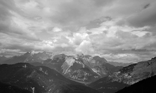
Wetterstein Alps, Austria
A couple of years ago I lost the negatives from a couple of rolls of film of hiking and climbing trips in the Alps. I was hopeful that they might turn up one day – I couldn’t see myself knowingly having thrown negatives out – and sure enough, last night I was looking for some other pictures and there they were in the wrong folder.
I quite like this one, of storm clouds building over the Wetterstein Alps on the Austrian-Bavarian border. It violates the “rules” of landscape photography that say “thou shalt use large (or at least medium) format slow film on a tripod”, having been shot handheld with fast film in a 35mm point & shoot. This is because, as the late Galen Rowell knew, the “rules” of landscape photography are trumped by the rule of mountaineering that says “thou shalt not carry heavy stuff that jeopardises thy chance of being off the mountain before those photogenic storm clouds get to where thou art”. Which I was.
finally, a real picture
2nd May 2005 permanent link
This, incidentally, is the picture I actually wanted to print when I began my Epson R800 black & white printing adventure:
Tungabadra River, Hampi
more pictures of greycards
2nd May 2005 permanent link
Whilst spending an entertaining and educating morning measuring prints of greycards, I realise that this would also be a good time to measure the dynamic range of the D70’s sensor.
Which turns out to be about 6 stops: 3½ under, 2½ over.

The mid grey bar with the red stripe shows a grey card at a standard exposure. The bars to the left and right show under- and overexposure in 1 stop increments. We go white - highlights completely burned out – somewhere between +2 and +3 stops.
On the underexposure side there’s still a clear discernible difference between -3 and -4; there’s still a slight measurable difference between -4 and -6 but I can barely see it, and I‘m sure it’s nearly all noise by then anyway. I assume you could keep underexposing more or less indefinitely without getting to RGB 0,0,0 – difficult under normal conditions to prevent any light whatsoever from reaching the sensor – but beyond a certain point you’re just taking pictures of the sensor’s background noise.
Greater underexposure latitude is presumably why current imaging software, such as Photoshop’s Shadow/Highlight adjustment, can do such a remarkably good job of salvaging recognisable (if noisy) detail from what appear to be the deepest shadows; whereas white is white – once a pixel is reading off the scale that’s it, game over.
Coming soon: a return from camera/printer geekery to actual photographs somebody might actually want to look at. But (some level of) one is part of being able to produce the other.
r800 black & white notes iii
2nd May 2005 permanent link
print your own greycard?
Having read various discussion forums in which people complain about their Epson R800s producing coloured black & white prints, and then apparently push buttons in Photoshop and Epson’s printer driver more or less at random until the results start to look more pleasing, I decided instead on the radical approach of actually doing some measurements to work out what is wrong and what to do about it.
Here's how to use a Nikon D70 (or any other good digital camera) as a poor man’s colorimeter:
You take a photographer’s standard grey card, meter and set manual white balance on the card, and take a picture of it. You load the raw file into Photoshop, adjusting nothing in the raw file converter, and voila, you have a grey picture with RGB values around 110,110,110 – the light level inevitably varies across the surface of the card but it’s is pretty much perfectly neutral, with the R, G and B values never varying by more than a point or two.

photographer’s standard greycard
(People refer to standard grey cards as “18% reflectance”, but this doesn’t seem to correspond in any way to what Photoshop regards as “black minus eighteen percent”, or 82% greyscale. Nor is it 50%. Photoshop calls RGB 110,110,110 “64% grey”. I am so glad I don’t actually need to understand this stuff)
Then you print the print the picture of the grey card exactly as you were previously printing your black & white pictures. In my case, that was as an RGB file, with the appropriate Epson paper profile, perceptual rendering intent and black point compensation selected in Photoshop, and colour adjustment turned off in the printer driver. This gives excellent results for colour pictures, but black and white comes out looking green to my eye.
You lay the print on the grey card, reset the manual white balance in case the ambient light has changed, take a photograph showing half the real grey card and half the print, load that into Photoshop and compare the two sides.

greycard (right) compared to unadjusted glossy print
You immediately discover two things: it’s difficult to use this approach with glossy prints because what you photograph is as much reflections on the surface as what’s actually on the print. (It might be better to use a flatbed scanner for this exercise if you have one instead of a camera. Or perhaps not – I hope a $1,000 D70 has better metering and white balance than a $50 scanner).
 But also: even with a glossy print, you quickly learn that what your eye was seeing as a “green” print is actually yellow – or in RGB terms, lacking blue. The density of the print – i.e. how dark a shade of grey it is – is pretty close to the real grey card, but B is around 12 points below R and G. You can see this clearly on the histogram too: everything is nicely bunched together as it should be for an all-one-shade-of-grey image, except that spike of too-low blue on the left.
The first correction I try is a Yellow -5 colour adjustment in the printer driver. This produces a picture that is pretty neutral, but far too light. Look at the two nicely neutral, but too far apart, spikes on the histogram.


greycard (right) compared to glossy print with Yellow-5 colour adjustment
Switching to matte paper for the time being because it’s going to be easier to get accurate comparisons, you find that an unadjusted print still looks-green-but-is-really-yellow, but slightly less so than it was on glossy paper: B is 7 or 8 points down instead of 12.
I try levels tweaks in Photoshop. The first thing I try is simply Blue +5. This looks pretty good to the naked eye, but when measured is still a bit too light (10 to 15 points) and a bit too red (R 5 points or so higher than G and B).


greycard (right) compared to matte print with blue+5 levels adjustment
At this point I perhaps go slightly off track (again). This print looks good to the eye but still doesn’t measure all that well, so I go off trying further multidimensional levels tweaks, taking the overall tone down a bit, blue up a bit, red down a bit etc. The “best” one I come up with – i.e. the one that measures closest to the actual greycard, is this: RGB midtone down 8 points, blue +6, red -3, green +2. It’s still not perfect, but it’s getting very close (look at the lovely tight histogram):


greycard (right) compared to matte print with complex levels adjustment
There are still two problems: it’s still just fractionally too red and too light – doubtless fixable by further tweaking. But further tweaking may not be worthwhile because … it doesn’t actually look any better than the first, simple levels tweak.
Lessons learned: a methodical scientific approach pays off. Finding out exactly what was wrong was quick, and I was immediately able to try out adjustments that made big steps in the right direction. But also: what measures best may not be what looks best to the eye. My first simple tweak on matte paper (Photoshop levels Blue+5) doesn’t quite match the greycard perfectly when measured, but to the naked eye it looks at least as good as, if not slightly better than, the fancier attempts I made afterwards. Don’t forget that the objective is to find out what produces an aesthetically pleasing print; measurement is a tool to get yourself pointed in the right direction, not an end in itself.
NOTE: I should mention - ignore the slightly lighter bands in the middle of all the comparison prints. These are just the out of focus edges of the prints laid on the grey card. It’s the left hand side (print) versus the right hand side (greycard) that we’re interesting in comparing. At some point if I have time I shall re-photoshop the images and cut the middle bits out.
r800 black & white notes ii
28th April 2005 permanent link
In the first episode, Alan set out to get better black & white prints from his Epson R800, but got sidetracked into the surprisingly intricate intricacies of producing greyscale test charts in Photoshop.
Now, he googles “Epson R800 black & white” (always do this first folks) and quickly finds the photo.net black & white printing discussion, where it becomes apparent that lots of people have this problem and some of them have suggestions about ways to improve it. Others say the improved results, whilst not perfect, are about as good as you can realistically expect from a printer that uses coloured inks. I shall try out some of the suggestions.
(Some of the people on photo.net think the 2100 was better for black & white because it had a grey ink cartridge. I did get very neutral black & whites from my 2100, but only with expensive third party RIP software, never with Epson’s own drivers)
Imaging Resource, on the other hand, thinks the R800 is better than the HP7960 for black & white. Oh well. If the various fixes suggested by the folks on photo.net don’t do it for me, the HPs are cheap enough to buy one, try it, and unload it on ebay if it isn’t an improvement.
UPDATE: there is also a yahoo discussion group rejoicing in the wonderful name of “DigitalBlackandWhiteThePrint”. In it a guy called Daniel Ridings recommends a method, but when I try it I find I don't like it – too blue.
In the yahoo group I also find a link to inkjetart.com’s review of the R1800 (bigger version of the R800) where they say:
Inkset neutrality for black and white printing: We interviewed several Epson employees about this issue, and they indicated that because the R1800 inkset does not have the light black ink (like the 2200, 4000, 7600 and 9600), it will not produce as neutral black and white prints as does the 2200, especially with matte and fine art papers.
r800 black & white notes
28th April 2005 permanent link
I’m (still) very happy with the colour glossies I get from my Epson R800. Our wedding photographer, who shot digital, gave us conventional photo prints from the digital files, and jpegs on a CD. The Epson prints I'm getting from the jpegs are, to my eye, clearly better than the conventional photo prints.
Black & white is a different story, as it still almost always seems to be with inkjets. Other people seem to be happy with theirs, but mine seem to be coming out slightly green and a bit lacking in punch/contrast. So far this has been on my “look at one day when I get round to it” list; unfortunately it has suddenly become more urgent because the pictures Maria chose as housewarming presents for two friends of ours (who I hope won’t read this before their housewarming party on Sunday) are black & white.
So, now it’s time for me to get serious about working out whether there is in fact anything wrong with the prints the Epson is producing – and if so, what to do about it.
These, then, are working notes from a project in which Alan finds himself learning more than he ever wanted to about colour theory, printer calibration and how to use a Nikon D70 as a crude colorimeter.
Step One - print some test charts
I thought I would just run up some test files in Photoshop with bands of 100% 90%, 80% etc, grey(*), print them and see what they look like.
First discovery: RGB-to-greyscale conversion in Photoshop isn’t linear. RGB 127,127,127 gives you 57% black, not 50%. Much experimentation later, here’s the curve:
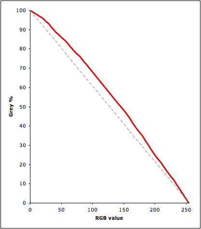
Second discovery, made whilst messing about with the first discovery: my monitor – a Formac Gallery LCD profiled with an OptiCal Spyder – isn’t half bad. In a dark room I can see 1% greyscale steps almost right out to both ends of the scale.
Third discovery: the eye – my eye, anyway – seems to be more sensitive to subtle differences in light shades than dark.
Dark grey from black: depends on the level of room lighting. In a dark room I can just about discern 98% grey (RGB 10,10,10) from black. In daylight I can’t unless I look from an angle, not directly onto the monitor. Straight on even 96% (RGB 20,20,20) is difficult.
Light grey from white. I can discern 1% grey (RGB 254,254,254) from white in a dark room but not in daylight. 2% grey (RGB 251,251,251) is easy even in daylight.
Here are some examples. The black rectangle on the left has 98% and 96% grey rectangles in it; the white one on the right has areas of 1%, 2% and 4% grey. I can make these out in a browser on my laptop; your mileage may vary.


Next Step: print out my DIY greyscale test charts and compare them to a standard photographer’s greycard.
Possible outcomes: I can see three possible outcomes to this whole project. (1) I discover that the printer is actually fine, and I just need to up the contrast a bit in my pictures before I print them. (2) The printer needs calibrating, and I eventually work out how to do it (or pay somebody else to do it) … or (3) I decide it’s just not worth the time and energy and buy a cheap Hewlett packard black & white printer instead (having first convinced Maria that it’s cost-justified and that I can find space on the printer shelf for it)
(*) I apologise to any American readers who might find my spelling of “grey” a constant irritation whilst reading this.
epson r800 notes
8th April 2005 permanent link
J Greely noticed that his Epson 6x4 photo printer wasn’t printing the whole of his 6x4 photos, and eventually managed to get a response from Epson support saying that this is an intentional feature: the print driver enlarges the picture slightly to avoid borders appearing if the paper alignment isn’t 100% accurate.
I noticed the same thing printing 6x4s with my R800 but hadn’t got round to investigating it further. (Non-borderless “centred” prints aren’t, quite, either. Presumably also paper misalignment). After my initial reaction – “print my whole picture, dammit!” – I have to concede that Epson do have a point.
Epson probably think – and they’re probably right – that most people printing 6x4s don’t compose their pictures carefully and won’t notice or care that the whole thing isn’t being printed. And for my purposes:
- for things where a 6x4 print is the final output (pictures of Jack for grandparents, mostly) exact composition isn’t that critical
- if I’m doing colour proofs for things I eventually want to print bigger, guess what – exact composition isn’t that critical for them either
And in any case …
- conventional minilab prints do the same thing, at least as badly, and probably for the same reason of paper misalignment
- I imagine it’s probably very hard to get 100% borderless prints exactly right printing by hand with an enlarger, too. (I’m guessing. I’ve never done conventional darkroom printing)
UPDATE: I tried sizing at 6x4 then printing at 95% for a picture that did have a crucial detail right at the bottom of the frame. I got nearly but not quite the whole bottom of the frame, with a very narrow but easily visible (about half a millimetre) right border. Getting paper alignment accurate to within a millimetre clearly isn’t doable yet on a printer at this price.
what the f*ck?
5th April 2005 permanent link
Adobe have announced Photoshop CS2 (what would, I assume, have been Photoshop 9 if they had stayed with their previous version numbering). I use Photoshop CS and it is a marvellous piece of software.
But.
The announced price for the upgrade is $149 (US). Everybody in the photographic world knows this, and Adobe surely know that everybody knows this. And yet today, Adobe send me an email offering me the German language version (which I don’t use, and they presumably know I don’t use it because they know what version I have registered) for a bargain 288.84 Euros, or $370.16. They must be fucking insane.
This is even more blatant than the previous Euro-ripoff pricing of Photoshop CS.
I answered the mail asking what on earth they think they are playing at. I don’t expect a reply.
UPDATE 28th April: John Gruber on Adobe the once-great creative software company. And no reply to my email from Adobe Deutschland yet.
UPDATE 30th May: not only no reply to my mail, but today Adobe Deutschland had the nerve to spam me again with their “only” two and a half times the US price offer. Bastards.
been & gone
1st March 2005 permanent link
I was in the camera shop today. (Hey, I didn’t go out with the intention of going to the camera shop. I mean, Jack gave the keyboard a cup of tea, and after three days drying out it still hadn’t recovered, so I had to go to the Apple shop. And the Apple shop is just across the road from the camera shop, and there’s no harm in just having a little look? Right?)
Anyway.
I was in the camera shop today, and they said their first shipments of Nikon’s new flagship the D2X – which I can’t even think about affording at the moment, maybe in a year or two – and the Tokina 12-24mm zoom lens – which I am seriously interested in, the 18-70mm on the D70 just isn’t quite wide enough – have already been and gone.
practice, practice, practice
2nd February 2005 permanent link
Photos taken on my New Year’s visit to Maria’s family in Russia: about 500. Pictures deemed (mostly by Maria) worthy of putting on a CD for Maria’s brother in law: about 50. Deemed worthy by me of putting on a web page for my parents: 25, most of which are there for the subject matter and only a couple of which I think are worth anything qua photographs.
And one that is on my to-be-looked-at pile as possibly a quite interesting landscape photograph, taken whilst walking on the frozen River Volga on New Year’s Day(*).
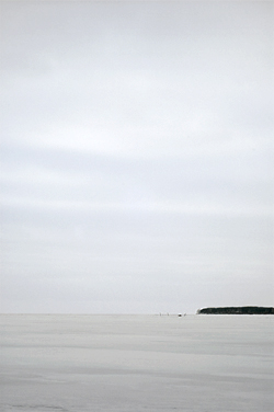
(*) Things I Never Thought I Would Say.
And, incidentally, of the two or three decent pictures out of 500 from this trip, pictures taken with the lovely-on-the-D70-as-a-mild-telephoto 50mm f1.8: all of them.
a walk in the park
16th January 2005 permanent link
Sunday Photography Vignette: I just got home from a Sunday afternoon family walk in the park, with a 512 MB flash card crammed to bursting with 90 pictures. This is exactly the reason why I got my Nikon D70 – I would never have taken three rolls of film with me just for a Sunday afternoon family walk (I’m sure some people would, and good luck to them, but I’m talking about me here) and, other things being equal, the more pictures you take the better your pictures will become. Taking pictures is far more important than having any amount of expensive exotic lenses. Practice, practice, practice.
There is a great, classic photo to be taken in Munich’s Westpark (just as there is everywhere). This isn’t it, but I might take it one day if I practice enough.
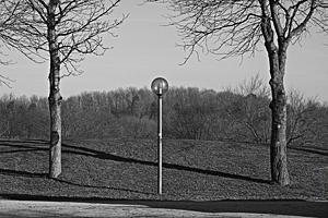
your camera does not matter
16th January 2005 permanent link
Instapundit introduces us to South Knox Bubba, who introduces us to the bizarre concept of a “basic DLSLR kit”’ costing a shade under ten thousand dollars.
Folks, try not to worry too much if you don’t have a ten grand starter budget. You can win photojournalist of the year with a $500 digicam. Alternatively, Ken Rockwell has some sensible advice about starter lenses for DSLR photography. Dante Stella also has strong views on what lenses most photographers need/can use effectively (although I disagree with him about 180mm telephotos)
Let’s take a look at Bubba’s ideas anyway. I have no interest in Nikon-vs-Canon religous wars. (I personally shoot Nikon. I’ve been very happy with the Nikon cameras and lenses I’ve used; I’m sure Canon make very good cameras and lenses too)
Canon kit:
20D Body: $1400
24-70mm F2.8: $1095
70-200mm F2.8 IS: $1600
400mm F4 DO IS: $5300
100mm F2.8 Macro: $450
Total: $9845
Nikon Kit:
D70 Body: $900
17-55mm DX F2.8 $1350
70-200mm F2.8 VR: $1600
200-400mm F4 VR: $5300
105mm F2.8 Macro: $580
Total: $9730
In the Canon kit he hasn't got a wide angle lens (24mm isn't wide on a 20D) – he realises this. But if you’re actually interested in taking pictures rather than dick-waving, a wide angle lens costing a few hundred bucks is going to be useful far more of the time than a 400mm, $5,000 mega-wonder-telephoto.
He hasn't got a really good portrait lens in either kit. The macro lenses could serve in a pinch, but on these cameras they’re really too long, and at f2.8 they’re not really fast enough for available light indoors either. For both Canon and Nikon a 50mm f1.8 costs a hundred bucks or so and makes a lovely indoor portrait lens on a small-sensor DSLR.

No batteries, no flash cards, no flash. With either of these cameras I would want at least two batteries and three or four one gigabyte cards. If I were laying out this kind of cash I’d want a proper flash gun too. The built-in flash on the D70 is ok for daylight fill flash, but for non-available light indoor photography (an abomination, but necessary sometimes) you really need more power and the ability to do bounced and/or diffused indirect light. Plus you’re quickly going to find you want powerful flash and a beamer a lot of the time with your $5k giant telephoto lens.
I really question the usefulness of those $5k giant telephotos. If I were a professional sports or wildlife photographer, or rich (“professional sports or wildlife photographer” and “rich” being pretty much mutually exclusive), I would buy the Nikkor 200-400mm tomorrow. But I’m not, and while I’m sure a lens like that would be great fun to play with I don’t think it would actually help to improve my photography.
Bubba specifically says he’s looked at the specs of high end pro SLRs and decided he doesn’t need them. Fair enough. If I had that kind of money to spend, I’d sooner spend half of it on a Nikon D2x (due out in February) or a used Canon 1Ds (seem to be going for around $4k on ebay) than on some esoteric wonder lens.
Here’s what I’d do with ten thousand dollars to spend on a Nikon DSLR kit, following Bubba’s rule of buying new from B&H:
| D2x body: | $4995 | Due out in February, this seems to be the expected price |
| 50mm f1.8: | $100 | budget portrait lens. Alternatively the 105mm f2 ($920) or the 85mm f1.4 ($1000) – both reputedly absolutely lovely lenses, but a bit long for portrait use on a small frame DSLR. |
| 70-200mm F2.8 VR: | $1600 | I already have the lovely 180mm f2.8. If I were buying again, I’d get the zoom for more versatility |
| 17-55mm DX F2.8: | $1350 | I really want something a little bit wider than the 18-70 that comes with the D70. This or the 12-24 ($940) |
| SB800 flash with SC29 cable: | $395 | |
| 300mm f4: | $1100 | The teleconverter, the 300 f4 and the 80-400 are all good options costing well under $5k if I decide I really need something longer than the 70-200 (already equivalent to a 300mm f.28 in 35mm). I’d try the teleconverter first. |
| 80-400mm VR: | $1430 | |
| TC17e teleconverter: | $420 |
Total: $8860
I don’t know the Canon range so well so I won’t comment in detail. I’d go for a used 1Ds for around $4k, swapping that for the 400mm telephoto. On this body 24mm is wide enough, but I’d definitely want the 24mm Tilt-Shift ($1000) for landscape photography. If I still had any money left over I’d get the 100-400 IS zoom ($1410).
And what would I get on an absolutely unlimited budget? There’s definitely Leica M7 in there somewhere, plus a Phase One P25 and something Zeiss-y to stick on the front of it. I could make Bubba’s $10k look like small change.
Update: reading further, I see that Bubba is into bird photography. In which case yes, he does need those big long lenses. I retract the bit about “dick waving”. (I was wondering if he might be into sports, in which case neither the D70 nor the 20D is fast enough for serious use). He says he’s quite happy with 6 or 8 megapixels resolution, and “To me, the lenses are the biggest investment. New bodies will come along all the time.” Which is true. For me, resolution, low light ability and a fast(er) camera are the things worth spending money on for the sort of photography I find interesting; Bubba has clearly thought his priorities through and decided that for him telephoto reach is very important. Fair enough.
photography quotes
13th January 2005 permanent link
the most rewarding part of photography is the picture-taking, rather than the end results. … loads of dusty photo albums – or from now on chunks of memory on my hard drive – are a small price to pay for the chance to really look at the world now and then.
Mick Hartley
Hallelujah, brother!
jack in russia
8th January 2005 permanent link
Pictures of my son Jack visiting his grandma in Russia. Intended mainly for his other grandparents, but anybody else who feels like it is welcome to have a look too.

the right tool for the job
21st December 2004 permanent link
I was browsing American Photo magazine in the international newsstand at the railway station this morning and noticed a piece about Magnum photojournalist Alex Majoli, who apparently does most of his work with a pair of Olympus C-5050 digicams. (Couldn't find an online verson to link to – here’s an Olympus press release instead). This is interesting: here's somebody who is clearly very good at what he does and knows what he needs to do it, choosing what would normally be regarded as a “serious amateur” camera in preference to a multi-thousand dollar professional SLR.
Olympus have have always made good cameras. According to reviews the 5050 has excellent optics and a good level of manual control – the latter being obviously essential for a working professional. They’re a lot smaller, lighter and cheaper than SLRs. And, as Majoli says in this profile on Apple’s website, they’re less obtrusive and menacing than some huge black Canon for people photography, especially in potentially tense situations like the sort Majoli works in.
Michael Reichmann in his review of Olympus’ successor model, the C-8080, says the camera is capable of producing great pictures but pans its user interface design. But if you’re using something as the main tool of your trade all day, every day, then ease of learning and setup is less important than control and the quality of the end result. See also Leicas and old manual Hasselblads: they are anything but easy or intuitive to learn, or to use on an amateur/sporadic basis; but for professionals they offer total control, and the lenses are second to none.
This is a clear case of somebody choosing the right tool for the job. If you look at his portfolios, Majoli clearly travels a lot in some rough and remote areas. I lugged a medium format camera and a 35mm SLR with a bag of lenses around India, and it was a pain. I’d be willing to bet I did not as a result get better pictures than Alex Majoli.
photography links
10th December 2004 permanent link
Lynn Sislo links to some great pictures by Jim Nilsen
And an interview with The Master, Henri Cartier-Bresson, not long before his recent death.
epson r800 notes – the price of ink
3rd December 2004 permanent link
I’m delighted with the colour prints from my Epson R800. Haven’t worked out how to consistently get decent black & white from it yet, but I haven’t really had time to experiment. Here’s the state of the ink after just over a hundred 6x4s and a few A4 prints:
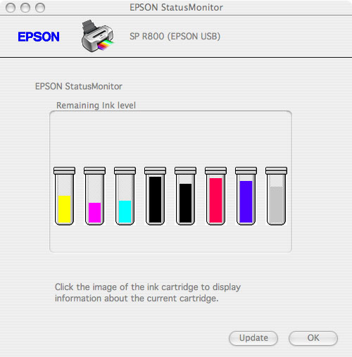
As you can see, the inks are being used at very different rates, and I’m clearly in my Magenta-Cyan Period.
There’s another big print job coming up in preparation for our Christmas visit to Maria’s family in Russia, and I didn’t want to run out of ink in mid-batch. It was clearly time to stock up.
If you’re reading this in the States and you think Epson ink & paper are expensive, you’ll feel much better if you look at European prices. An ink cartridge for an R800 is $12.95 at Adorama; the offers on amazon.de start at €15.69 for the genuine article. A euro is $1.33 at the moment, so that’s $20.82 – 60% more expensive. (Quoted prices in Europe always include sales tax at 16%, and quoted prices in America don’t. So OK, only nearly 50% more).
I don’t want to have to go through this whole painful feeling-like-I’m-being-ripped-off-or-worrying about-orders-arriving-from-America experience again too soon, so I decide to get four magentas and cyans and two or three of everything else: total 23 cartridges. Adorama want $48 to ship 23 cartridges from America; the guy who’s already 60% more expensive on amazon.de wants €80 to ship them from somewhere in Germany. So bugger him. In total I would save €130 by ordering from Adorama. There might be an unknown amount of customs duty to add to that, but I still look likely to come out ahead.
As it turns out, the box from Adorama arrives in three days with no customs charges. UPDATE: no it doesn’t. A week later an invoice arrives from UPS for €69 customs duty and sales tax. So I’m still ahead of the game, but nowhere near as much as I thought I was.
I notice this huge price difference seems to be an Epson thing; Hewlett Packard(*) inks are only slightly more expensive here than in the States. And I presume it is Epson’s fault – if it were possible to make a profit selling them at the American price in Europe somebody would.
(*) So with the €130 I just saved I could buy an HP7660 with a greyscale cartridge and not have to faff about trying to get decent black & white photos out of a colour printer. I would just need to convince Maria that I have a legitimate need for three printers – colour photo, black & white photo and a laser for letters, seems perfectly reasonable to me – and find space for it in the fenced-off corner of the living room that is my toddler-safe studio.
paging nanny ogg
13th October 2004 permanent link

Somebody in Austria has been reading Terry Pratchett. Or perhaps Terry Pratchett has been holidaying in Austria. This shop in Neustift, in the Tirol, is “The Fruit & Herbal Drinks Company”. It sells traditional Austrian fruit and herbal drinks such as, for example, pear schnapps.
Incidentally, note the limited exposure range of the digital camera. In order for the interior of the shop to not be too dark, the white exterior wall is overexposed. This is still better than slide film could do. Colour negative film would get slightly more range – could expose the interior correctly without burning out the outside quite as much – but scanning a colour negative and getting the colour balance right is such a pain I wouldn’t do it just to illustrate a quick little joky weblog posting. Black & white film has still more exposure range, but in this case would miss the whole point of the picture, which is the colour of the light inside the shop.
Rick Coencas correctly points out that there are ways to squeeze a bit more range than this out of digital. Had I known two months ago what I now know about how to deal with digital photos in Photoshop, I could possibly have exposed the exterior correctly, let the interior be too dark, and then lightened the interior up again in the raw file conversion or using Photoshop’s shadow adjustment tool. I’m not totally convinced though. Pictures where I’ve used shadow adjustment – mostly people’s faces in shade when I’ve forgotten to put a spot of fill flash on them – have an odd flat, slightly murky look to them that I don’t like on prints. This may be because I need to use some noise reduction in conjunction with the shadow adjustment – further experimentation required.
what is abstract art?
6th October 2004 permanent link
Eric Raymond is back, and on an art-rants roll with this:
There are entire genres of art that have self-destructed in the last hundred years – become drained of vitality, driven their audiences away to the point where they become nothing more than museum exhibits or hobby-horses for snobs and antiquarians.
The three most obvious examples are painting, the literary novel and classical music. After about 1910 all three of these art forms determinedly severed the connections with popular culture that had made them relevant over the previous 250 years. Their departure left vacuums to be filled; we got modern genre literature, rock music, and art photography.
Other art forms underwent near-death experiences and survived only in severely compromised forms. Jazz, running away from its roots in honky tonks and dance halls, all but strangled on its own sophistication between 1960 and 1980; it survives today primarily as smoothed-out elevator music.
And this:
If we judge by what the critical establishment promotes as "great art", most of today's artists are bad jokes. The road from Andy Warhol's soup cans to Damien Hirst’s cows in formaldehyde has been neither pretty nor edifying. Most of "fine art" has become a moral, intellectual, and esthetic wasteland in which whatever was originally healthy in the early-modern impulse to break the boundaries of received forms has degraded into a kind of numbed-out nihilism.
One question Eric touches on: what is “abstract” visual art?
[Bathsheba Grossman] will laser-etch the protein structure of your choice into glass, using the same technique as in the Large Scale Model, for prices starting at $145. These images of cloudy, intricate structure are visually beautiful enough as abstracts, but they derive their true power from being about something.
Can a literal representation of a physical object that actually exists in the real world be “abstract” art? Clearly not in the same sense as a Jackson Pollock painting. What do people mean, then, when they talk about “abstract” photographs? This is one of my favourites among my own photographs - is it “abstract”?
What about these rather better pictures by Bill Atkinson? Clearly in one sense a photograph can never be “abstract” – every photograph is an image of something that actually existed in the world at a particular moment, seen from a particular perspective under a particular light. What do we mean when we call a picture of something that actually exists an “abstract” picture?
Is it a picture where the artist’s primary intention, or the viewer’s primary interest, is more in the picture as a thing in itself than in what the picture is “of”? But then isn't that true at least to some degree in all visual art? Even in photojournalism – one of the most literal, representational artforms of all, one might think. James Nachtwey, the greatest war photographer of his generation, says
I'm trying not to create photographs that viewers will look at and think: "What a good photographer he is," or "Look what an interesting composition he can make." I want the first impact, and by far the most powerful impact, to be about an emotional, intellectual and moral reaction to what is happening to these people.
… but I’m afraid when I look his pictures, I’m just as stunned by his compositional brilliance as by the subject matter.
Oops, deep water.
photography quotes
24th September 2004 permanent link
film is a long way from being obsolete in applications where quality matters, and I wouldn't be surprised to see it gain the kind of appreciation that vintage analog gear has gotten in the sound-engineering world.
Glenn Reynolds
oh wow
16th September 2004 permanent link
Your camera does not matter.
Your camera does not matter.
Your camera does not matter.
the powers of composition and visual discrimination that make good pictures don't depend on whether or not you are holding a box that says Leica, Voigtlander or Konica rather than a differently-shaped one that says Nikon, Canon or Contax.
Dante Stella
… or on whether your camera has one megapixel or twelve.
… so I can just wait and get one of these in about two years when they’re cheap. Except that its predecessor, the D1x, has not dropped in price significantly in three years, even used, because despite its adequate-but-obsolescent 5.4 megapixel sensor it’s just such a good camera in every other respect.
epson r800 – printing cds
15th September 2004 permanent link
Printing on CDs on the Epson R800 worked first time, to my great relief. I was worried that it might not, because I read some guy in a discussion forum somewhere (can’t find it again just now otherwise I would link to it) saying it didn’t work for him on his Mac. So I very carefully followed the instructions in the manual exactly to the letter, and success.
(In case the guy who had the problem is still googling for answers and finds this: I’m running OS X 10.3.4 and version 1.9a of the R800 driver.)
Print quality on CDs isn’t great – Epson warn you that it won’t be. The colours are dull and washed out. Even so, for archiving photos a CD labelled with one of the pictures that’s on it looks a lot better, and is a lot easier to find quickly, than one adorned with my spidery handwriting.
Now, where can I find high quality digital images of composers and musicians for burning music CDs?
inspiration, motivation
14th September 2004 permanent link
Ways to get inspiration and motivation for photography.
After Jack was born I had a spell of taking very few photos. It was partly because with a baby in the house, of course I had less free time and spare energy than before. It was more because I took a lot of pictures of Jack just after he was born, and dealing with all the film, scanning it, trying to get decent prints, was so laborious and frustrating I got discouraged.
Kyle Cassidy says about his beloved Leica:
like a lot of photography, it's psychological. It goes something like this "Hey, I have a Leica. I must be a good photographer. (snap snap snap)" Doesn't always work but sometimes it's worth a try. If you're a decent photographer and having a Leica makes you want to take more pictures, then it's a good thing.
… which was also my real reason for getting my new Nikon D70 and Epson R800: if I can spend more time taking pictures, and less time faffing about with scanners and photoshop, I’ll be a happier and more motivated photographer. It seems to be working. In the two months I’ve had the D70 I’ve taken a thousand pictures. Practice, practice, practice.
Also, look at great photographs. Today I discovered Paul Caponigro’s marvellous work; and, in a brief and precious baby-free half hour in a bookshop on the way home from work, looked at a couple of books by Henri Cartier-Bresson and Andreas Gursky that literally had me gasping in wonder as I turned the pages.
I try not to overanalyse that sort of reaction: I prefer to just experience. Looking at pictures isn’t left brain time for me, even though I might, theoretically, I suppose, be able to improve my own pictures if I could see what it is that these guys are doing. I can sort of see what’s going on with Gursky: something about making the three dimensional into geometric patterns on a flat plane, and something special about his colours. But HCB: the prints in the book aren’t even particularly good, but some of his compositions are just magic in some way that’s completely beyond my left brain’s ability to comprehend. My right brain likes them though. Both Gursky and HCB have the great photographer ability that most impresses me: the ability to produce fascinating images out of completely mundane things I wouldn’t even look twice at.
film still better?
13th September 2004 permanent link
Brigitte Little (no relation) is also a fan of the great French photographer Raymond Depardon, and wrote to ask my opinion of digital photography. A reply to the email turned into a long unfinished essay (one day I shall just publish everything in my drafts folder and be damned). One answer to an out of control drafts folder is to pull out the bits that are reasonably self contained and finished, such as this on some advantages that film (for the time being) still has over digital photography.
What can you do with chemical photography that you can’t (yet) with digital?
Absolute resolution. Twenty-plus megapixel cameras costing tens of thousands of dollars are nowhere near the resolution of a piece of 4"x5" film in a view camera that you can buy for $1000 or less. (Although to actually do anything with your piece of 4"x5" film, at some stage you're likely to need to run it through a drum scanner also costing tens of thousands of dollars)
Seventy megapixels? Maybe not. This landscape picture was scanned at 3000 dpi from a 6x9 cm negative (shot on a $600 Fuji GW690) and is roughly 7,000 x 10,000 pixels. But if you view the full size version at 100% you can clearly see film grain, so say the effective resolution is actually about a half to a third of the number of pixels. But for about the same amount of money, if you're willing to put up with more hassle you can use a piece of film twice as big in a view camera.
Extreme low light photography. Available light photography in dark yoga studios is one of my favourite photographic games. Digital is way better than colour film in the 800 to 3200 iso range, but I don't know if it can do anything like what you can do with fast black & white film when you’re squeezing out every last drop of light at ISO 6400.
Contrast range: the amount of difference in light intensity you can get in a picture without having either the highlights go to featureless white, or the shadows featureless black. Digital can deal with a similar contrast range to colour slide film. It has nowhere near the range of colour negative film or, especially, black & white film. With digital you probably couldn’t do that wonderful glaring-desert-heat-at-noon thing Depardon does so well.
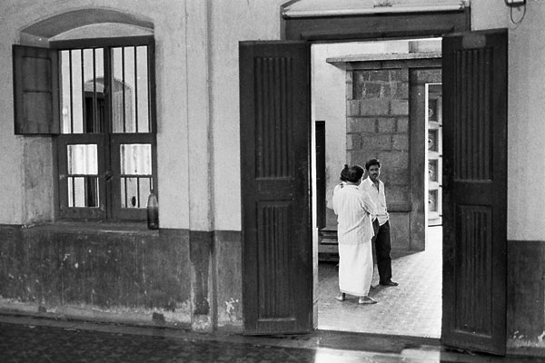
These pictures of temple interiors in India make no claim to be the world’s greatest photos, or anything like pictures Raymond could have taken in the same places, but they do show black & white film’s ability to show detail both in the shadows inside and the sunlight outside. You couldn’t get away with this with digital.
All these things: absolute resolution, low light sensitivity, contrast range – are technical problems that will be solved. Fuji’s latest could be a major step towards dealing with the contrast range issue.
great pictures
13th September 2004 permanent link
Great aerial photos of New York in this article on robgalbraith.com about New York Times staff photographer Vincent Laforet.
epson r800 notes
10th September 2004 permanent link
These are really just working notes for my own purposes. I used to have some separate blog pages for that purpose, and might do that again one day. Meanwhile, here they are in case anybody else might find them useful too.
I just bought an Epson R800 photo printer. I already have Epson’s previous flagship photo printer, the Stylus Photo 2100, which does A3+ whereas the R800 is only A4. So why switch? I actually found I hardly ever made big prints. The 2100 is capable of producing great results but it’s been a pain in the arse to use. Epson’s Mac drivers two years ago when I got the 2100 were useless, so I ended up buying expensive ImagePrint software to try to actually get useful results out of the thing. Which worked until I upgraded to OS X 10.3, at which point the makers wanted more money from me to upgrade. I could, at that point, have tried the latest Epson driver so see if they’ve improved in two years – but then the R800 came out costing less than the 2100 sells for used on ebay, and with one killer feature that the 2100 doesn’t have. The 2100’s achilles heel was that it printed superbly on matte and semigloss paper, but not on glossy paper that actually looks and handles like chemical photo prints. So, no big prints with the R800 but great small prints that we can send to grandmothers, and I should be able to sell the 2100 for at least as much as I paid for its replacement.
That was the plan. Impressions of the reality so far: Epson’s Mac support is still slightly second rate. The driver installation requires a reboot – how pathetic is that? This is a real operating system, we don’t shut down three times a day. And Firewire doesn’t appear to be supported. But installed on USB, and having rebooted, it works first time. There seem to be some peculiarities printing borderless: a 6"x4" picture on 6"x4" paper either shows slight margins in the Photoshop print preview that aren’t on the actual print, or if you select “Scale to fit media” so that no margins show in the preview in Photoshop, then you lose quite a lot of the edges of the picture. But with a bit more trial and error I’m sure I’ll be able to work out what’s going on here. Niggles apart: it’s fast, and prints using Epson’s standard paper profiles look great with very accurate colour. Looks like being much easier to live with than the 2100 ever was.
Useful R800 links:
- Digital Outback Photo
- Alain Briot
- Vincent Oliver
- Roger Cavanagh, with icc profiles that Epson supply in the States but not in Europe
italian architecture
27th August 2004 permanent link
Thoughts on old Italian architecture, Part One:
It sometimes looks very pretty …
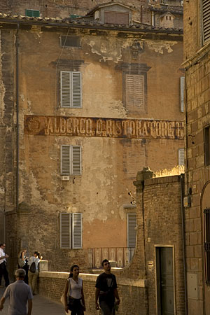
evening street scene, Siena
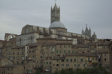
Siena cathedral at dusk

window, Soave
… but I wouldn’t want to live in it.
Coming soon, maybe: more thoughts on why, and Chris Alexander.
my other new toy
27th August 2004 permanent link
Pascale Willi emailed me to ask for my impressions of my new Nikon D70. Here are some. These are just thoughts as they occur to me, not an attempt at a systematic review. I like it. I haven’t printed anything from it yet and I haven’t shot extensively with any other good digital camera.
instant feedback
Is nice, and you shoot more with digital because an individual shot costs nothing. You can have several goes at a shot until you get it something like right. This should be good for one’s photography – or should it? I worry that it might encourage a less focused (mentally), contemplative attitude to picture taking. We shall see. This is not a controlled experiment, though – my chances of doing any contempative art photography whilst travelling with a toddler would be pretty much nil with any camera.
ergonomics
Excellent for me. Sits nicely in my hand with every lens I’ve used it with. Very much a right-handed design, but then so are pretty much all modern SLRs, so left handers presumably must be used to it. Menus & buttons are ok, there were only a couple of things I had difficulty remembering/finding when I didn’t have the book with me (selecting autofocus points, using the self timer).
build quality
Feels solid enough. I was walking about with it in a light shower yesterday and wasn’t worried.
battery life
I haven’t had any problems. Have shot hundreds of frames over two or three days, with a lot of reviewing on the LCD and some fill flash, without emptying the battery. Bought a generic no-name spare battery on ebay for $10 (compared to the $40 that Nikon want for printing their name on one) anyway just in case.
viewfinder
Is clear and bright enough, but small. Compared to my other Nikons (an FM2 and an F801s) it’s sharper but smaller. Small enough to possibly make it diffcult to compose effectively with. Not remotely in the same league as the wonderful finder on a friend’s D1x that I had a brief play with.
metering
Said to be the same metering system as the legendary F5 but with more up to date software. Whatever. It’s hard to get it to do anything wrong. Fill flash metering is consistently spot on. Digital sensor can’t handle anywhere near the contrast range of black & white film, but that’s a different matter.
no mirror lock
Pretty much rules the D70 out for serious landscape photography, but so does the fact that it’s 6 megapixels and so at best roughly equivalent to 35mm film.
sensor dust
I have some. It’s trivially easy to clean up if falls in a fairly blank area of the picture such as the sky, a pain in the ass if it’s right on top of some crucial detail. Much less of a pain in the ass than spending hours spotting dust and scratches on film scans though.
workflow
Is a dream compared to working with scanned film. No hours of scanning, no hours spotting dust & scratches, no hours pissing about with colour balance. Noise is so low that you can easily just sharpen the whole picture instead of having to construct elaborate edge masks to avoid sharpening grain as you do with scanned film.
Being able to switch ISO at will without worrying about what film you have with you is great too, as is not having to reload film every few minutes. Having to have some means of backing your pictures up would be a major drawback for serious travel/backpacking photography; but so is trying to keep film from getting baked on week long desert hikes.
autofocus
I’ve never used a modern autofocus camera before. Autofocus is great. I consistently get sharp shots of still subjects with a 50mm f1.8 wide open. I can’t do that focusing manually.
I haven’t tried any focus tracking of fast moving objects (e.g. my son) since I found the menu option to switch the AF to continuous tracking, so I can’t comment on how well that works.
lenses
The 18-70 zoom that comes as a kit lens is getting good reviews and is a pretty decent general purpose lens. But it’s no substitute for fast primes for low light and portraits. Take a look at these pictures of my son. Most of them were taken with the zoom, two of them with a 50mm f1.8 prime. To my eye it’s obvious which are which. It’s nice that a humble and cheap 50mm f1.8 is almost the same effective focal length on this camera as a significantly more expensive 85mm portrait lens.
It’s nice, too, that my relatively humble but optically excellent 180mm f2.8 that I bought years ago for about $600 used is now almost equivalent to a 300mm f2.8 costing several times as much. I’m tempted by the new 1.7x teleconverter for $400 or so that would make it into a nearly 500mm f4.5. I have no idea what one of those costs except that it’s probably an order of magnitude more.
It’s less nice that my nice wide 24mm is now a not very wide at all 36mm, that the 18-70 zoom at the wide end isn’t quite as wide and that something as wide as the 24mm would cost a lot more money. Like most people I have difficulty composing effective wide angle shots and can’t really handle anything wider than 24mm. But I have a fairly good success rate with the 24 and have taken a lot of my favourite pictures with it since I got it (used, cheap) three years ago. 27mm equivalent isn’t quite wide enough.
henri cartier bresson r.i.p.
7th August 2004 permanent link
Henri Cartier-Bresson is dead. H C-B is most famous for his work as a photojournalist in the fifites and sixties. In later life he returned to his first love, drawing, and did much less photography. His later work includes some truly beautiful landscape photography, though, for example this wonderful impressionistic riverscape:
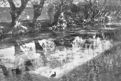
Île sur la Sorgue, by Henri Cartier-Bresson
I’ve walked along that riverbank. I couldn’t have taken that picture. Not because of lack of technical skill – because I wouldn’t have seen that there was a picture there. The greats see differently.
Online galleries of Cartier Bresson’s work at Magnum, the world famous photo agency that H C-B co-founded in 1949, and here where prints of his work are for sale. (I haven’t enquired about the prices. I suspect I wouldn’t like it if I did). henricartierbresson.org appears to be grosssly overloaded at the moment, which isn’t surprising.
using my pictures
3rd July 2004 permanent link
In the last couple of days I’ve been surprised to see my pictures in places I didn’t know they were being used. This one, of my yoga teacher Bettina:
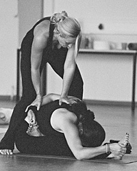
… was being used to illustrate a brochure for course she’s teaching in the summer. And of course I would have said yes immediately if the guy organising the course had asked me. I’m a little peeved that he just took it without asking; he’s also shooting himself in the foot by using a low-res web image in a printed brochure when I would gladly have given him a higher resolution copy for printing.
The other was when I noticed in my referer log that one of my Indian street photos was being requested frequently from the same website. I looked and sure enough, the guy is using my picture, linked from my server, as the background for his home page. I’m pleased that he likes my picture, but not so pleased that I’m willing to contribute to his bandwidth bill. And he, too, might well be shooting himself in the foot by making himself dependent on alanlittle.org’s uptime over the next week or two.
In general, I’m delighted if people like my pictures so much that they want to use them. That’s what I originally started alanlittle.org for: I wanted people to see my pictures and hopefully like them. I do find it rude, though, when people use them (and my bandwidth) without asking. It’s not as if I don’t have copyright notices and mailto: links all over my site.
People wanting to to use my pictures for non-commercial purposes are generally welcome to do so (and by posting them on the web, I’ve made it impossible for me to stop them anyway). But I would appreciate it if you have the good manners to:
- ask anyway
- link to me
- put a copy on your own server so I’m not paying for the bandwidth
Thanks.
photography quotes
27th May 2004 permanent link
Stop wasting your time talking cameras, and go take pictures! … It is the eye that takes the picture.
From an excellent article on photographic gear, film and digital, by Dutch photographer Stefan Heijendael on Luminous Landscape.
clever photo software
12th May 2004 permanent link
This has that astonishing but at the same time obvious (once somebody else has thought of it) quality that really clever ideas have. French company DO Labs has two new software products out for digital photographers. The first one, DxO Analyzer, is less obviously interesting – basically, using shots of a standard test chart made under controlled conditions, and some fancy maths, it produces a profile of the optical imperfections in a camera/lens combination. Interesting for lens makers, camera reviewers, and people who worry about equipment and technicalities rather than how to compose interesting pictures.
However, DxO Analyzer makes possible the bit that actually is somewhat interesting. The idea behind DxO Optics Pro is conceptually straightforward. DxO Analyzer gives you a profile of the optical imperfections of your lens – in other words, a set of transformations between the image that was actually in front of the lens and the one that got recorded on the digital sensor. And these transformations are presumably reversible, so you reverse them and voilà! Optically perfect images from any old cheapo garbage lens.
Of course it’s not actually 100% effective in real life, and makers of expensive high end lenses probably don’t need to start losing sleep over it just yet. But Michael Reichmann of Luminous Landscape is impressed:
How Good Is It?
In a word – remarkable. I know that some readers who aren’t familiar with the fact that I’m often very critical of products, and am not afraid to say so in print, will think that I’m being hyperbolic. But I’m not. This product is revolutionary. It can’t turn a bad lens into a good lens, but it can make a mediocre lens a lot better, and a good lens can be raised up to being terrific.
… I’ll leave off here by saying that what I see is a dramatic improvement in several aspects of image quality, and no visible negative affects at all. Improvements are most noticeable when using lower quality lenses. But even with very fine (and expensive) lenses improvements are readily visible.
Looking at Michael’s test images, I’m impressed too. He shows an example of a picture shot with one of Canon’s best professional lenses, and even with this lens the version processed with DxO Optics Pro is clearly significantly better than the “before” version.
The pricing is cheaper than buying really good lenses. For example, for the new Nikon D70 and a single lens, such as the perfectly ok 18-70 zoom that comes with the camera, DxO Optics Pro would come in at about $127. A significantly better lens than the 18-70 would cost at least four or five times that much.
This only works for digital cameras. It might be theoretically possible to attempt it for film, but there are so many more variables in film processing that the results would probably be meaningless. Scanned film introduces a whole new set of variables, notably film flatness and thickness, and the fact that the film scanner is a specialised digital camera in its own right. So you would have to profile for every possible lens-camera-scanner permutation, and even then the fact that your film isn’t sitting exactly the same in the camera & scanner every time would probably make the whole exercise futile anyway.
Just to reiterate the key message: I find this quite interesting in that “oh look, somebody’s done something stunningly clever that looks deceptively simple after the fact” way. But even if DxO Optics were perfect it still wouldn’t solve the only photographic problem that’s actually interesting and important: how to compose artistically interesting images. Technical limitations of cameras and lenses are not remotely close to being the main limiting factor in most people’s photography, and you can’t make a boring composition interesting by taking a technically perfect picture of it.
might listen to ...
29th April 2004 permanent link

Richard Tanyon sends me a link he thinks may be of interest to me and readers of my weblog about Rene Gruss, “a composer on a mission to connect new audiences with dynamic new sounds.”
The quote is from Muso magazine – a UK classical musicians’ trade mag that I had never heard of up until last Sunday, but that I now know is read by working classical musicians because I saw a copy last Sunday in my brother’s office.
I also checked out the domain Richard’s mail came from, newbohemia.net. It describes itself as a “web-zine of new realism in the arts” and there’s some interesting stuff there. I found this portait by Manfred Jürgens stunning – it’s modern, but the Dürer influence the artist mentions is obvious too. On the other hand, I find Rene Gruss’s hairdo offputting. I suppose I shouldn’t let such superficial considerations prevent me from at least having a listen to the free samples on his website.
photography quotes
27th April 2004 permanent link
give a better lens to a worse photographer and you'll still get a worse image
Marc Gouguenheim on photo.net
digital photography?
27th April 2004 permanent link
I’m seriously thinking it might be time to buy a digital SLR, probably the new Nikon D70. But I was just looking at looking at my absolute favourite photo book – Raymond Depardon’s Voyages – and wondering if all this wonder technology is actually relevant to anything anyway. Perhaps I should just buy a Leica, a 50mm lens and a big pile of Tri-X. Or keep the Nikon FM2 and 50mm lens I already have and just buy the big pile of Tri-X. Not that I think buying a Leica and a big pile of Tri-X would make me into Raymond Depardon – or that admiring somebody’s work means you should therefore try to be just like them.
But it is good to ask why, in fact, I think buying a digital camera would help my photography.
digital photojournalism
21st April 2004 permanent link
Steve Fine, photo editor of Sports Illustrated on digital versus film for sports photojournalism:
For years [with film], we’ve been fighting a battle between sharpness and grain, especially in low-light shots. You try to sharpen and you just end up building more graininess. I’m amazed at the quality we’re getting in low-light shots off our digital files. We’re running [low-light pictures] up to two-page size that we could never have done before. Sometimes [digital] looks like it’s underwater, a little bit too smooth. A strobed basketball game on a Hasselblad has a sharp line and a punch that digital doesn’t have. But we don’t have grain anymore. In really poorly lit situations, the ability to make a clean picture far outweighs the downside.
(People still use Hasselblads for shooting sports? Wow)
I’m also intrigued by these comments by the magazine’s head of pre-press, Geoff Michaud:
There’s a different quality expectation with digital vs. film. With film, grain was accepted and tolerated. It was a by-product of sharpness. When we moved to digital we found that the expectation changed. I’m not 100% sure why. Now a softer feel image [is considered good], and when noise becomes apparent it’s a negative thing, where it wasn’t with film. I’m concerned with my operators now that because noise or grain has become a negative thing, sometimes they’re holding off on sharpening. [Sometimes] I look at images, and I feel they’re not quite sharp enough.
People expect smooth, grainless images from digital but the price of that is slightly less sharpness. This makes sense and would explain why people often say digital images look a bit flat, a a bit lacking in "pop" - I think it might be extreme edge contrast that can make really good film images (especially film images shot with classic Leica and Zeiss lenses) look almost three-dimensional.
Link courtesy of Tim Bray. As Tim says, the whole article on how Sports Illustrated’s workflow operates is a must-read for anybody with any serious interest in digital photography.
yet more leica digicams
13th April 2004 permanent link
This is my fourth weblog entry about a camera I have never even held in my hand and have no intention of buying, which seems excessive. (Previous entries here, here and here). But Ben Lifson’s article on Luminous Landscape about the ergonomics and philosophy of photography with real Leica rangefinders, and why the Digilux isn't one, is fascinating. And I *do* want to have a play with a real Leica rangefinder one day.
moscow church
10th April 2004 permanent link
A Russian friend of Maria’s has her birthday this weekend. We thought she might like some pictures of the Rodina, so I spent a couple of happy hours in Photoshop scanning and dust-spotting pictures from our visit to Moscow a couple of years ago. I particularly like the colours in this one, of a small church just off Red Square.

The sky really was that strange grey-pink colour – Moscow was suffering from bad smog that summer, caused by forest fires in the surrounding countryside.
an interesting request
17th March 2004 permanent link
I felt very pleased and honoured by a request that landed in my inbox this morning. It was from a Buddhist monastery in a Tibetan refugee settlement near Mysore, in southern India, asking if they could use some of my pictures of their temple for their website. Expect a few days of no writing while I spend my evenings scanning pictures, followed by a photo exhibit on Tibetan temple murals.

I’m delighted. I’m not a Buddhist, but Buddhism is high on the list of Religious/Philosophical Traditions I Respect. I would also be very pleased to see an independent Tibet free from Chinese repression, although I don’t realistically expect to in my lifetime.
Maria points out that an alarmingly high proportion of the business of Alan’s Photo Corp consists of donating pictures to penniless good causes like yoga philosophy magazines and Tibetan monasteries. I figure it all has to be worth at least one less go round on the wheel of suffering.
blowhards on digital cameras
15th March 2004 permanent link
When I was in my between-weblogs period, I had a rather rude habit of writing my weblog in the form of excessively long comments on other peoples’. I haven’t been doing that so much lately, but I did today in the form of a response to some comments by Michael Blowhard on digital cameras. Here’s what I said, slightly tidied up and fact- and spell-checked.
Interesting post. Some thoughts:
MB: You know how digi-photos, no matter how dazzling, often look a little tight and flat? One of the reasons for this is that their exposure latitude is narrow.
Kinda sorta. Digital has much narrower exposure latitude than print film, but about the same as or slightly more than colour slide film which is what most pros (except wedding & portrait specialists) shot for years. So that in itself isn’t it.
Fact check the figures I found checking my bookshelf and the web for exposure latitude of film versus digital – i.e. the dynamic range of difference between light and dark in a scene that a camera can capture without having either highlights go completely white or shadows completely black – varied wildly. Around 5 or 6 f-stops was generally the quoted figure for both slide film and digital (although, as I mentioned next, highlight failure on slide film is slightly more gradual and forgiving). Colour print film has more range, maybe 8 or 9 stops. Black and white varies hugely depending on how it is exposed and processed, but figures well above 10 stops seem to be widely quoted. I also saw 10 or 11 stops quoted as the range the human eye can deal with.
More of an issue is that digital has no “shoulder” – that is, the light sensitivity is more of a straight line than an s-curve. With film, the amount of detail in blown highlights or dark shadows tails off smoothly; with digital, highlights just blow with no gentle tail-off.
There are a couple of interesting approaches to fixing this. One is software, as you mention – I’ve heard that Kodak’s new shadow retrieval stuff is excellent. Fuji have also announced a new SLR, the S3, which has sort of 6MP resolution but that consists of two 6MP grids, one of big pixels that are good for low light, one of small ones that are less likely to blow out intense highlights. They reckon that by reading the big ones, but then seeing if they can get a reading from the small ones in areas where the big ones are blown out (or something like that) they can get a dynamic range more like print film. Fuji’s digital SLRs so far have been very good indeed, so it will be interesting to see how this works out.
I’ve also read a theory that, because of the way different colour sensors are laid out on most current imaging chips, red is more likely to blow out, or has less resolution, than other colours. This is said to produce the effect where digital images have less colour contrast and general "snap" and feeling of depth than good film images, and is again said to be not *too* hard to fix in Photoshop.
MB: The Kodak guy said that he and his colleagues think that a digiphoto would need 13-16 million pixels to match a tiptop film image.
That sounds about right for the very finest-grained 35mm films. You can see film grain clearly in images scanned at or above about 3000 dpi, so that says a piece of 35mm has an effective resolution in the region of 3000 x 4500 dpi =~ 13.5 “megagrains”. Note that there are a couple of 35mm style digital SLRs with this resolution, and there are professional studio cameras over 20 megapixels (also over $20k)
That’s for the very finest grained slow fims, shot on a tripod through a good lens – which, however, isn’t how 99.9% of photographs are taken. In particular, digital holds up much better than film for shooting at very high ISO in low light. Very fast film has huge and obvious grain and very poor colour fidelity; digital produces a lot of noise when shot at 1600 ISO or above, but that’s much easier to fix in software than blotchy grain and nasty colours. (Kodak’s digital SLRs are notoriously weak in this area, but Nikon and Canon are excellent)
A lot of people also seem to think that the absence of noise in good (SLR, low ISO) 6MP digital images more than compensates for the slightly lower absolute resolution (2000 x 3000 for 6MP versus 3000 x 4500 for 50 to 100 ISO film)
MB: He compared the current state of digi-photography to the early days of music CDs, when the sound they delivered – while brilliant and clear – was also cold and grating.
Sounds about right to me. Glenn Reynolds had an interesting piece a while back where he predicted that, as with analog gear in music and recording, the “warm look” of film will be a cult in a few years.
I’m thinking about selling my Hasselblad to buy a digital SLR, but I haven’t quite been able to bring myself to do it just yet. I will never sell my Nikon FM2.
I also completely agree with your previous post about horrible digicam ergonomics. There’s an interesting new Leica/Panasonic effort that sounds as if it addresses a lot of these issues, but it’s ridiculously expensive for a digicam ($1500 to $1800). My thoughts on that here. Ken Rockwell’s observations on digicam handling are spot on:
You have to wait for them to turn on, and then you have to wait after you press the button for something to happen. Even zipping through the annoying menus takes time; time I don't have. With these long delays you have to hope your subject doesn't loose interest or fall asleep while you're trying to get a photo.
… as are his no-bullshit general observations on what film and digital respectively are good for.
more on leica digicams
11th March 2004 permanent link
A while ago I wrote about a new Leica/Panasonic digital camera announcement that looked good at first sight, but maybe not quite so great after a bit of consideration. There’s been a lot of interest in this camera. It’s now available in the shops in both Leica and Panasonic-badged versions (Panasonic several hundred dollars cheaper), and there are a couple of preminary reviews on Luminous Landscape - Panasonic version, Leica version.
They’re impressed by the ergonomics - the Panasonic guy says “the LC1 is the best handling camera I have had in terms of ergonomics, weight distribution (balance) and ease of use.” Image quality is apparently excellent. On the other hand, it’s very slow shooting uncompressed image files and the viewfinder isn’t very good. The Leica guy’s conclusion: “It’s not perfect and it is expensive but it’s very well designed, very useable and produces excellent files”
I still have no intention of buying one(*). For a nice-but-flawed camera with some serious limitations, it’s just too expensive. Or, as somebody on the Luminous Landscape discussion board put it a little more harshly:
$1800, useless finder, slow AF, 6 seconds between shots... oh, but it’s got a badge-engineered Leica lens and it looks a bit like an M6, so its a great camera.
Come on, this is crazy.
In related news, Epson and Cosina have announced a camera with some pretensions to be a real digital Leica - their own exchangeable-lens digital camera that takes Leica lenses, called an R-D1. My first reactions: it’s ugly. Same silly SD cards as the Digilux. Your wide angle lenses suddenly aren’t any more(**). It will be even more terrifyingly expensive than the Digilux, though that that will not deter hard core Leica fans. On the other hand: although they do have too much of a cult status, some of Leica’s rangefinder lenses are among the best lenses in the world, and all those lovely Leica 50mm lenses suddenly make very nice 75mm (equivalent) portrait lenses.
(*) Personally, I have the new Nikon D70 on pre-order. But I’m still considering whether to get a Fuji S2 instead - a bit more expensive and inferior handling in many ways, but better image quality. Or whether to hold off and not buy anything for another year or two.
(**) As with most current digital SLRs, the sensor size is smaller than a piece of 35mm film. This increases the effective focal length of lenses by about 50% and so does away with one of the prime advantages of rangefinder designs. Rangefinder wide angle lenses can be better designed than SLR wide angle lenses because the back of the lens doesn’t have to be a long way away from the film to make room for a mirror flapping about, and some of Leica’s wide angles have especially stellar reputations. But the widest Leica lenses as far as I know are about 20mm, which on the R-D1 will equate to about a 30mm lens. Just not that wide any more. There are wider rangefinder lenses by other manufacturers - but let’s face it, the main reason people will be willing to pay for this thing is because they already have a big investment in wonderful Leica lenses.
seeing in black & white
4th March 2004 permanent link
There’s a discussion at the moment on Luminous Landscape about black and white photography, and whether having a “preview in black & white” function on digital camera screens would help. Luddite that I am, my first contribution was to point out that film cameras don’t have black & white preview, despite which people have been managing to take black & white photographs quite successfully for over 150 years. Others pointed out that digital camera LCDs are so small and inaccurate that they really wouldn’t be much help. So then somebody asked “So, how would you teach someone to 'see' in B&W?”. Here are my ideas on the matter. I would do well to apply some of these to myself.
- Take lots and lots of black and white photos.
- Look at them. Work out what you like about the ones you like, what you don't like about the ones you don't like.
- Ask yourself how your pictures are different from how you wanted them to look. (Do you *know* how you wanted them to look?)
We've already covered the important bits. You could stop here.
- Look at lots of other people’s black and white photos too until you find some you really like.
- Find out who took those. Get hold of their books, look at lots more of their pictures.
- Compare your new heroes’ pictures to your own and work out what's different/better about their pictures *that matters to you*.
- Finally, *if* you really think you already have the compositional eye of a Cartier-Bresson and the main problems with your pictures are technical (unlikely though this may be) then you might need to look at buying a view camera or a Leica and a big pile of Plus-X, studying books on sensitometry and the Zone System, getting a better version of Photoshop, or whatever. (Hint: it is highly unlikely that this step will help)
photography quotes
19th February 2004 permanent link
at the end of the day, the photographer must also be a thief, inevitably
Italian photojournalist Mario Mazziol , quoted by Frank Van Riper
photography in india
19th February 2004 permanent link
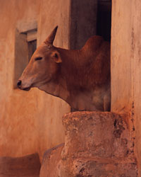

I have written a big article on photography in Southern India - shooting locations, travel and gear practicalities and general musings on Alan’s philosophy of travel photography. (Warning – lots of big images, will be slow for readers with dial-up connections)
I actually wrote the article a year ago and have been trying to get it published on a couple of major photography websites, but without success, so here it is anyway
photography quotes
11th February 2004 permanent link
The Truth Is
You have too many cameras and you don’t take enough photographs.
Kyle Cassidy
I have seven cameras, and haven’t taken a photograph since New Year’s Day.
It’s just seeing - at least the photography I care about. You either see or you don’t see. The rest is academic. Anyone can learn how to develop
Elliott Erwitt, courtesy of photoquote.comTechnical perfection is not the goal of photography: seeing life is
Ellis Vener on photo.net
photo gallery revamp (2)
29th January 2004 permanent link
On why I hate working with CSS but nevertheless grudgingly accept that it’s on balance not an entirely bad idea.
I’ve just about got the stylesheet for my new-look gallery pages ready after several train journeys and late nights. I really dislike working with CSS: it’s completely unintuitive and getting anything to behave as you want it to requires lots of frustrating trial & error and (if you’re lucky enough not to be on the train at the time) extensive web searching to find out how to do things that should be simple and obvious. At times the temptation to just say stuff it and put everything in html tables, which are conceptually straightforward and work as you expect them to, is overwhelming. But tables are Out (*) so I persisted with CSS because I know it pays off in the long run.
The new look fairly closely copies the look & feel of some of the gallery pages on the Magnum website (always steal from the best!), but I implemented it myself from scratch.
Once you’ve gone through the hours of teeth-grinding frustration and actually have a stylesheet working, it’s worth having. You have a consistent look across all the pages that use the stylesheet without having to do lots of time-consuming and error-prone copying; and you can do fairly major revamps to the look & feel of all the pages just by tweaking the stylesheet. My weblog pages are produced using templates, so the templates are the only html I ever have to edit by hand; but even so, there are several subtly different versions of the template for the main page, for the archives and for individual entries. Even keeping three or four files in synch would be a major pain and would inevitably go wrong sooner or later, so all they contain is a really minimal html skeleton and the real work is mostly done in the stylesheet.
Quite apart from the technical difficulties, I’m also discovering that there’s quite a lot of creative effort involved between having a collection of good pictures, and having a collection of small jpegs with a consistent size and look that I can use as the index to an online gallery.
- I want them all to be the same size and shape (square, probably). The ones I have had so far have been different: I think a gallery index page looks better if they are all the same. What I use as the “small” version of a picture for an index page has also tended to get larger since I started the site four years ago: fewer people are on dialup connections these days, and I’ve become more concerned about visual impact than download times.
- This means I will have to revisit most of the pictures I have had in the gallery and at least re-crop and re-size them – with the attendant danger that I’ll end up completely re-editing them when I look at them again and realise I can do a much better job with them now than I could then.
- I thought about keeping the actual jpeg files I already have, and just using the height and width in my img tags to get them all to display the same size, if only as a stopgap. But I’m not going to. I don’t want to waste my readers’ bandwidth (or mine) sending out larger files than I need to; and more importantly, do I trust the image resizing algorithms in Photoshop, or the ones in some random web browser? You only have to look at the browser itself to see how visually talented browser programmers generally are(n’t).
- I might have a landscape picture that looks stunning as an A3 print or a double-page spread in a magazine, and even ok as a reasonable size web image; but it’s going to look like nothing if I just squeeze the whole thing down to a 200x200 thumbnail. It might take several minutes of looking and trial-and-error in photoshop to find some part of it that actually works as a small square crop, assuming it’s possible at all.
- I’m not sure about mixing black & white and colour pictures on the same page. But if I don’t, then I’ll want to find some way to make it really obvious on the colour page that there’s also a black& white page and vice versa
(*) I make reasonable efforts to build this weblog as standards-compliant xhtml. The main page isn’t valid at the moment, however, because I have an unescaped ampersand – “&” instead of “&” – in a link somewhere, and in xhtml that is a Sin. I’ve checked the text file that the original link is in, and everything is fine there; so somewhere along my production line there is a bug that un-escapes it. Mea culpa. But I really don’t have the time – and frankly don’t care enough – to bother fixing it. The offending link will automatically drop off the bottom of the main page in a month anyway and then I’ll be valid again. For what it’s worth. See also this entertaining rant from Mark Pilgrim on just how little it is, in fact, worth.
nama rupa magazine
26th January 2004 permanent link
Issue 2 of Nama Rupa is out; my copy arrived yesterday. In addition to photographs by me (only two this time) it contains:
|
|
|

thoughts on indian traditional arts
22nd January 2004 permanent link
I have a series of postings coming up that have been prompted by weblog dialogue with Brian Micklethwait: firstly his observation that “Photography is one of the great under-discussed influences on Modern Art”. I think he underestimates how underestimated it is. I set out to respond with a comment, but the comment got too long and turned into a posting for my weblog, which then got even more out of hand and turned into a disconnected, rambling and very unfinished heap of notes on my thoughts about Art in general.
Then Brian responded to my off-the-cuff comments about movies: “do art forms have a life cycle, and are movies at the end of theirs?”; and that sent me off into even more broad and unfinished thoughts about what it would actually mean for art forms to have a life cycle, and are creativity and Art-With-A-Capital-A inextricably tied up with originality and innovation? Is that in fact why certain major art forms in the west, such as classical music and high brow literature, seem to be moribund at the moment? Big questions, to which “life cycle” is much too simplistic an answer. I think I will end up mostly agreeing with Brian on a different explanation for what has been wrong lately (i.e. the last two hundred years, approximately) with the arts in western culture. But I haven’t got there yet.
I started thinking about what little I know about arts in a different culture, namely India, where as far as I’m aware people don’t appear to worry so much about that sort of thing. So my long unfocused rambling essay on art-in-general began to turn into a somewhat more focused essay on Indian traditional arts. It was still far too long and nowhere near finished. So I decided a good idea would be to cut it up into pieces and then be disciplined about finishing each piece, publishing it and moving on to the next(*).
So, coming soon: Alan draws grandiose conclusions based on a rather small amount of actual knowledge of the following Indian arts & traditions:
- Sculpture and temple architecture
- Kathakali dance
- Yoga teaching (this one will be the exception in that I do actually know what I’m talking about – which, as everyone knows, is optional on the web but can occasionally be helpful)
- Classical music
It may seem like we’re a very long way, at this point, from “the influence of photography on Modern Art”. But I am in fact going there – I’m just going the long way round.
(*) It’s better to publish something than nothing; better to get part-finished things out where people can read and critique them, than to wait forever and not say anything until you (wrongly) think you alone have worked out the ultimate truth – this being another of Brian’s perennial Good Points about why weblogging is an excellent thing from an educational perspective, not to mention being a widely known truth about any kind of creative effort: the Perfect is the enemy of the Good.
on hive minds
21st January 2004 permanent link
On being part of a hive mind: some thoughts on consensus in arts and how, boring though it might seem to people who want to see themselves as avant garde free-thinkers, the consensus on what is good in any well-established art form is generally broadly right. I base this on my own experiences over the last few years with things I don’t or didn’t previously know much about, namely painting, photography and classical music.
A little over a year ago I was in the Kunstforum in Berlin – a new and impressive art gallery with a wonderful collection of Renaissance paintings. Several times I found I would walk into a room full of portraits, have a quick look round and think “well they’re all good, but that one’s amazing”; and then find that one was by somebody really famous like Holbein, and the others were by people I had heard of barely if at all. On the same visit to Berlin, my girlfriend Maria who has a good eye for pictures but knows nothing about any famous photographers, went round an exhibition of Ansel Adams photographs and said “well the ones I particularly liked were …”, and proceeded to reel off a list of Adams’ most famous classic photographs.
Similarly with the Wilhelm Furtwängler recording of Beethoven’s Eroica symphony that I heard recently. I thought it was clearly by far the best performance I had ever heard; half an hour’s research on the rec.music.classical.recordings newsgroup revealed that I am far from being alone in that opinion.
Even if I really don’t like somebody who is generally acknowledged as a master in some artform, I can often see why other people might think they are so great. I have hardly ever managed to get through a whole novel by Charles Dickens – I find his plots and characters completely uninteresting. But I freely admit he could craft an English prose sentence like nobody else. The opening passage of Bleak House would get my vote for the best beginning ever to a totally boring novel.
It may be that the closer you get to an artform, the more likely you are to appreciate and admire people in it who are slightly off to the side of the main pantheon. In photography, I can look and appreciate the work of the “gods” like Ansel Adams, Henri Cartier-Bresson and Walker Evans; but my heroes, the people whose pictures consistently make my jaw drop with amazement, are Raymond Depardon, Harry Gruyaert and Ernst Haas. Who are all famous and highly respected among photographers, but not quite to the same degree as the other three I mentioned. (Of course, photography is such an obscure and unappreciated artform that the average person in the street probably couldn’t name a single “famous” photographer. If they could, it would probably be Ansel Adams)
Finding yourself time after time agreeing with a consensus isn’t terribly exciting, though. Part of what holds me back from writing serious pieces about Art-With-A-Capital-A, (or rather, finishing and publishing them – there is no shortage of half-finished drafts on my laptop’s hard disk) is that I don’t think I have much to say that isn’t already being said rather well by people like Brian, Alice or Michael & Friedrich. That’s not the main issue – which is lack of writing time – but it’s certainly part of it. Nevertheless, coming soon (maybe) on a related theme: a currently half-finished piece on Indian traditional arts and whether originality is actually an important part of creativity or not.
closed for redecorating
19th January 2004 permanent link
I’ve decided it’s time to put some effort into revamping my photo gallery. Having a place to display my pictures was the original purpose of alanlittle.org, but that has largely been overtaken by weblogging in the last couple of years. Meanwhile I’ve neglected the gallery pages, and when I look at them now I think they’re not very well presented or organised, and don’t have half the pictures on them that I would like to display. Despite which people still look at them. Whilst inspecting my December logs I noticed that I’m number two on a google search for “Hampi photos”. Not bad considering Hampi is probably the second most famous and visited tourist attraction in southern India after the beaches of Goa (and check out the lady who is number one. Not many pictures there, but they’re interesting). But my Hampi gallery is a rushed selection of maybe about a quarter of what I would like to show, that I threw together in an evening shortly after I got back from India with not much thought to sequence or presentation. It’s time to do something about this. In the last two years I’ve bought a much better scanner, and my photoshop and html/css skills have improved immensely. I should be able to do a much better job now.
Meanwhile I’ve noticed that my weblogging activities over the last few weeks have slipped nto a pattern of publishing even more trivial things than before, while the pile of potentially interesting but perpetually unfinished Big Ideas grows even faster than usual. Perhaps it’s time for a change. So – expect not much weblogging for the next few weeks except (a) announcements of photo gallery updates and (b) cursing and swearing about the horrors of CSS. Hopefully more (a) than (b).
It also occurs to me that there might be potential for actually selling prints a bit more systematically. Despite the sad state of the gallery pages, my pictures themselves are good enough that I get a steady trickle of enquiries about prints and publications. The first pictures I ever put on the web found their way into a newspaper in Australia, and my best magazine gig ever – for a struggling startup yoga magazine that unfortunately couldn’t afford worldly illusions like paying its photographers – also resulted from the editors having seen my website. Maybe if I actually make it clear that prints are for sale, and decide prices up front instead of having to wonder every time whether I’m asking too much or too little, I might get a few more sales. I’d be surprised if print sales ever even covered my hosting costs, but you never know unless you try.
(None of this has ever or will ever match my Photographic Success Of A Lifetime, which was meeting Maria whilst acting as Official Photographer at a friend’s wedding)
ego surfing
17th January 2004 permanent link
Anybody with an interest in what I used to look like in the days when I did a lot of rock climbing, could head over to my old climbing club’s website and check out this picture by Dave Dillon.
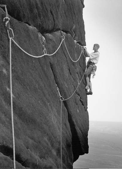
google searches and old web pages
15th January 2004 permanent link
I was looking through my site logs for December on the train this morning, and was surprised to see that 156 people were still reading my review of the Ansel Adams centenary exhibition from the December before. More surprising were a couple of the google searches that sent people my way: “Elliott Erwitt”, for example, and “Ansel Adams christmas cards”. My review does in fact mention both Eliott Erwitt and christmas cards, but I just checked and I'm not even in the first five pages for either of those searches. Good grief. Some people just have far too much time on their hands.
oops, maybe i don’t
4th December 2003 permanent link
A few minutes’ fact-checking reveals that Leica’s Digilux 2 announcement may not be as impressive as I thought after all, and teaches me a valuable lesson about not being impressed by press releases.
First, and worst, it uses SD cards for storage. These are the little postage stamp-sized things used in smartphones. Compared to the microdrives used by all serious digital photographers, they’re expensive and pathetically small. The largest SD cards available seem to be 512MB, and they cost over $300. A basic 1 gigabyte microdrive goes for about $150; 2 gigabytes aren’t much more and 4 gigabyte drives are either already out or will be soon.
It may be that SD cards have some great compensating technical advantage – let’s assume for the sake of argument that Leica’s engineers aren’t completely stupid. Perhaps they are much faster, or have much lower power consumption, or something. I don’t know. It certainly seems a reasonable bet that the mass market for smartphones will improve their price/capacity rapidly.
But.
The people who are going to appreciate the benefits of speed and handling in a digicam are serious photographers, many of whom already have or are considering digital SLRs. And this Leica starts to look like a seriously expensive second camera if you also have to buy a whole second set of non-standard storage cards. Unless the Leica’s speed and image quality are really, stunningly better than the competition – which seems unlikely – SD cards could be a fatal mistake.
Sensor size. Not as exciting as I thought. The so-called 2/3” sensor size that Leica are using gives about 50% more area per pixel, for the same pixel count, than the standard digicam sensor size. But Leica aren’t the only people using this size, and it’s still only about a fifth of the area per pixel of a typical 6 megapixel SLR. Useful tutorials on digital camera sensor sizes by Bob Atkins on photo.net, and, for some reason, on this Bangladeshi website (scroll down).
Leica digicams are, I now know, actually manufactured by Panasonic. Which means that this one’s cast magnesium body will probably be well made, but no better than lots of other also-magnesium-bodied cameras from Nikon, Canon, Sony, etc. etc.
The Leica M Series is the Porsche 911 of cameras, but Leica’s other efforts have always been a decidedly mixed bunch. Michael Reichmann of Luminous Landscape, who is a Leica M Series fan and has probably also used and/or tested more high end digital cameras than anybody else, says of the Digilux 2:
… it could well be an attractive digicam. A digital M series Leica it's not though, regardless of the cosmetics.
oh my god i want one
4th December 2003 permanent link
I want one of these new Leica digicams.
I have a digicam – a 3 megapixel Canon G1 that I paid far too much money for about three years ago and is now worth hardly anything. It’s a perfectly decent camera in terms of the picture quality it’s capable of producing, but it’s so ergonomically horrible and slow that I have never liked it and hardly ever use it. The Canon S50 that lots of people seem to really love at the moment (including my brother and I’ve had a play with his) is basically a sleeker, higher res version of the same thing. Lovely results, but I still don’t enjoy using it – too slow, and everything controlled by myriads of little buttons and menus that you have to look at to use, when you should be looking at what you want to photograph.
Time between pressing the button and the shutter actually opening:
- Leica M-series – a few milliseconds
- SLR (film & digital SLRs are similar) – a few hundredths of a second
- Most digicams – about five minutes, by which time the subject has lost interest and wandered off unless it was a tree, and possibly even then
This Leica, on the other hand, is supposed to be fast. It won’t be as fast as an M Series, and I don’t see them quoting a figure anywhere, but Leica have a history of getting this right. It has proper manual controls as god intended – focus, zoom and aperture controlled by rings on the lens barrel, shutter speed by a dial on top near the shutter button, so you can operate it while looking at things you want to photograph instead of peering at dozens of tiny little buttons and menu options.
It has a big sensor. A pixel does not equal a pixel. For the same resolution, a physically bigger sensor will produce a better image because bigger pixels gather more light, so they can measure it more accurately and are less subject to noise. This is why six megapixel SLRs are capable of producing a lot better images than five megapixel digicams, and is also grounds for scepticism about Sony’s announcement of an 8 megapixel digicam with the smallest physical pixels of any production camera. The sensor on this Leica is somewhere between normal digicam size (tiny) and SLR size.
And it has a Leica lens. There’s a lot of mystique and bullshit about German lenses, and the best Japanese lenses these days are very good. But the very best Leica and Zeiss lenses are still visibly a bit better. Of course, the lens on this thing may or may not be one of Leica’s very best efforts, but if they have any sense it will be. Leica make very expensive high end cameras (I haven’t seen a price mentioned for this one yet); their selling points are lens quality, build quality and ergonomics. They are the Porsche of cameras. They have to stay better than the competition on all of these things to have any hope of surviving.
I found out about this from Tim Bray.
nokia 3650 photo critique (2)
12th November 2003 permanent link
I was in the charmingly-named Munich Ausländerbehörde (“Office For Foreigners”) yesterday, sorting out a visa for Maria’s aunt from Moscow to come over and meet her great-nephew for Christmas. There on the wall was a fascinating sheet showing the number of registered foreign residents of all nationalities in Munich. I was surprised how few native English speakers there are – maybe 10,000 or so in total; I had the impression there were a lot more than that but then, from the people I know I would. There are only just over a thousand Irish – they must all go out drinking, every night, to keep all the Irish bars in business.
The big numbers are the obvious suspects – Italians, Turks, ex-Yogoslavs of various kinds. And then there are the lonely folks who are the only ones from their countries – there aren’t many Dutch Guyanan bars for the one Dutch Guyanan to go and socialise with his or her compatriots.
What does this have to do with Nokia 3650s or photography? Bear with me. I had noticed this interesting sheet on my last visit (the life of a foreigner in Germany tends to involve regular visits to the Ausländerbehörde; at least the one in Munich is generally friendly and efficient. Once I was there and the official at the next desk was explaining to a young Polish guy that having a verbal offer of a job next week didn’t count as being “in employment”, but he was polite about it.) I checked on the website but didn’t find the figures there. This time I thought “if only I’d brought a digital camera with me – but wait, I have!”, and whipped my phone out and took pictures. Here’s a sample, blown up to double the original dimensions.

As you can see, Nokia will not be seriously threatening Minox in the spy camera business any time soon. The paper was white - the darkish grey-green tint is because the picture was taken under not very bright fluorescent lights. The fringing around the writing is, I think, chromatic aberration typical of a not very good wide angle lens being used close to the subject. Even after the application of what I suspect are some of the same sophisticated image enhancement algorithms used by the CIA (i.e. cranking the contrast way up and sharpening in Photoshop) there’s no way to get legible text out of that picture. (Alright, alright - you can see that the first two are “Uruguay” and “USA”, and the number for Uruguay might be 38 and the number for the USA is four figures and might be eight thousand and something)
(Yes, of course this is tongue in cheek – what do you think I expect from taking photos with a telephone? I did sort of hope they might come out legible though)
photo exhbit - indian landscapes
12th November 2003 permanent link
A few months ago I had a photo-essay published in Nama Rupa. Nama Rupa is a project I feel very honoured and proud to be involved with — it’s a serious magazine about yoga and other systems of Indian philosophy (unlike Yoga Journal, which is a rag that exists to sell designer yoga clothing and expensive workshops with celebrity yoga teachers. This of course also means Nama Rupa can’t afford luxuries like paying its photographers – I’m purely in it for the karma)
I’ve been busy in the last few months, but I’ve finally got round to putting all the Nama Rupa pictures up on the web. This page has everything I submitted, including text and pictures that they chose not to use. (WARNING - lots of big images. Will be slow for dial-up readers). It’s an interesting experience submitting a portfolio to a photo editor who says “hey, these are great”, and then proceeds to use your least favourite pictures that you put in almost as filler, and not use your beloved masterpieces. I assume professionals get used to it. The text is more a series of extended picture captions than a coherent article.
Full disclosure regarding Yoga Journal and possible accusations of inconsistency/hypocrisy: I am well acquainted with the designer/celebrity yoga scene. I know a designer who designs Designer Yoga Clothing. I bought some for Maria; it looks great and is outstandingly well made. Fashionable yoginis of my acquaintance reckon it is better then Christy Turlingtons “Nuala” range. I would have a “buy Nathalie’s stuff” link, but I can’t find her website just now — exclusive, see? I have studied with a couple of the celebrity yoga teachers who regularly feature in Yoga Journal. They are very good yoga teachers. So I have nothing in principle against Designer Yoga Clothing or Celebrity Yoga Teachers. Nama Rupa is still a much better magazine than Yoga Journal.
pictures at an exhibition
8th November 2003 permanent link
I went to an art exhibition today. This is something that happens a few times a year and not, in itself, particularly unusual. But this one wasn’t a public museum or art gallery - it was an art dealers’ trade fair, the Munich Kunstmesse. It was a great day out with far more interesting stuff to look at than in most of the galleries I’ve been to. Not comparable to, say, the Museum of Modern Art in New York or the Kunstforum in Berlin; but I would say better than all but possibly one of the galleries here in Munich.
The variety and quality of the things there were to see was amazing. I counted two Picassos, three Joan Mirós and a Chagall - all with no prices shown, which I assume means they were firmly in the “if you have to ask you can’t afford it” range. Whereas a mere 16,000 euros buys you a five thousand year old Sumerian cuneiform tablet. Probably a shopping list or somebody’s tax return but still - a voice from the dawn of civilization. I had no idea it was possible even for rich people to just walk into a shop (or, in this case, a trade fair) and buy such things. I thought they were all long since locked away in museums and galleries.
16,000 euros also buys you an 11th century Ganesha from south India. Alternatively you could have (price not shown) a 10th century Pallava dynasty Vishnu. I’m not sure about that - I’m all for Indian sculpture but I prefer to see it where it belongs, on the walls of temples in India, not stolen by sacreligious British imperialists and shipped off to Europe.
 (Right) An Indian sculpture where it belongs - on the wall of the beautiful and fascinating Hoysala temple at Somnathpur, south India.
Also striking was how much better and more interesting the “modern art” (for want of a better term for the art of the first half of the last century - there was very little on display that was less than about forty years old) was than the older stuff. People who dismiss modern art can’t, I conclude, have spent much time looking at eighteenth and early nineteenth century European art, most of which is hideous. I doubt if even Damien Hirst or Tracy Emin has ever produced anything as ugly and ridiculous as a sparkly porcelain bundle of asparagus.
(I specify “eighteenth and early nineteenth century European art” here, because 7,000 euros buys you a stunningly beautiful 18th century Japanese landscape by Hokusai)
The only other commercial art experience I’ve had was the Dom Khudozhnika (House of ArtPainters) in Moscow - a former tea warehouse on the bank of the Moskva river that is now a huge emporium of contemporary Russian (and other ex-Soviet) art. I expected lots of kitsch, and there was, but there was also a huge amount of good stuff. It was actually even better than Munich because some of the things were affordable. I bought a marvellous self-portrait by a Georgian painter, Julia Pankrelidze, for a hundred bucks. Maria and I both loved a semi-abstract landscape by Ossetian artist Magrez Kelekhsaev; we didn’t buy it because we hadn’t gone with the intention of spending $1500, and have regretted the decision ever since.
Token education-plus-gratuitous-lilexia bit for Brian: Maria’s friend’s 12 year old son, my former English student, was bored senseless by the whole thing. Which prompted Maria to worry about how, in twelve years time, will we go about giving Jack the chance to have what we think are worthwhile cultural experiences without boring him senseless? No conclusions reached.
Updates & corrections: my editor says that I actually paid over $200 for the painting in Moscow and it isn’t a self-portrait. She can’t prove it, it’s just her recollection of what happened over a year ago against mine. What she can prove is that “Dom Khudozhnika” should be translated as “House of Painters” rather than “House of Art”.
camera geek tv
8th November 2003 permanent link
There’s a fun German TV programme called Wetten Das (“Bet You That …”), where celebrities bet on whether members of the public can do odd and improbable things.
Today we had a used camera dealer from Munich betting with Boris Becker on whether he could identify cameras, blindfolded, by the shutter sound. He had brought a selection of a hundred wierd and wonderful cameras from his shop; the presenter selected five of them and he had to get four right. Which he did. An EOS 3, a Yashica SLR from the 70s, some funny little 1960s Agfa rangefinder, and something else that I don't remember. He passed on an Olympus OM3 Ti (which sounded lovely). I thought this was excellent, the most interesting thing I’ve seen on TV for ages, and it was a shame they didn’t do all 100. Maria thinks I’m sad.
photoshop 8
31st October 2003 permanent link
Photoshop 8 is out, with support for 16 bit layers that may or may not be useful. I think it looks worth getting anyway, but I'm not exactly delighted that Adobe are following US software companies’ usual policy of blatantly ripping off foreigners. The upgrade from Photoshop 7 to Photoshop 8 is listed on adobe.com at $169.99. It’s worth it, there’s a lot of good stuff in there including one of the better converters on the market for raw files from digital cameras, which used to cost $99 on its own as an add-on to Photoshop 7.
But Adobe’s US online store will only ship to the US. I don’t want to risk getting a German language only version from adobe.de, so I look at their UK site. £139.99. WHAT? That’s 238 dollars. Now, quoted retail prices in Europe always include sales tax and in the US they don’t, so let’s add UK sales tax at 17.5% for a fair comparison, and $169.99 becomes $198. The residual “blatantly rip foreigners off” factor is still $40, or almost 25% of the price of the product. Bastards. Sod ’em. $40 isn’t a fortune, but it’s the principle of the thing. I’ll wait until my graphic designer friend in New York pays a visit and get him to bring a copy over. Or I could ask our next Russian visitor to pick up a pirate copy in Moscow - Adobe, I’m willing to buy a legitimate copy of your product at a fair price, but I’m not happy about being overcharged 25% just because I don’t happen to live in America.
breathtakingly beautiful
28th October 2003 permanent link
I find this picture, by Canadian artist Lawren Harris, breathtakingly beautiful.
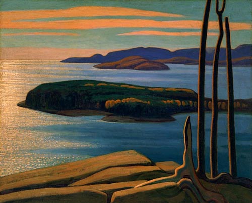
That in itself would be a good enough reason to post if, even if it weren’t for the fact that I’m also testing a function that turns the background image in my stylesheet off if the top weblog posting also has an image in it (otherwise the image in the posting superimposed on the background image looks stupid. Apart from which I’m very pleased with my new legible font plus background image look).
Picture courtesy of 2 Blowhards
but what is art, asked alice
24th October 2003 permanent link
I’m not normally in the habit of writing weblog entries saying “excellent posting by so and so, go and read it”, but now and again it can’t do any harm. Particularly when it’s as excellent as Alice Bachini’s deep philosophising on an Exhibition of Mediaeval “Art” at the V&A and what is art anyway? Was it in the middle ages what certain “high art” cliques have defined it as in the last couple of hundred years? (No). Is it what goes on in self-described “art galleries”, and is what goes on outside ”art galleries” not it? (No).
Quote from Alice:
So instead of asking ourselves, “But is it art?” we should be asking ourselves, “But is it any good ?” The Gothic knick-knacks I saw at the weekend were mostly very appealing. But this is 2003; we can do better. And I for one believe we are, and not just inside art galleries either
The comment I left:
You’re right. The idea that there is something that is Art-with-a-capital-A that exists on a different and somehow more elevated plane than grubby things like entertaining the masses, or making useful everyday things look pleasing, is and always has been utter garbage. It is a piece of romantic idealism that has poisoned people's minds for the last two hundred years and is hopefully now on the way out.
I can see no grounds at all for suggesting that things that actually do entertain the masses like, say, cinema or non-classical music or industrial design aren’t “art”, whereas things that were once wonderful but are now irrelevant dead genres, like literary novels or classical music, are. Anybody who can write a “History of Art” that covers the twentieth century without even mentioning photography or cinema is obviously an ignorant pretentious tosser. (Oops, Paul Johnson did)
Have been meaning to write something about this for a while but it's sitting in the “perpetually-unfinished profound stuff” pile. Whereas the stuff that actually makes it into my weblog mostly comes from the “quick throwaway things that I can bash out in half an hour on the train to work” bucket. Need to learn how to bash out profundity in half an hour.
kathakali photos
3rd September 2003 permanent link
Weblog software still-nearly-ready + having to drive to Düsseldorf and back at the weekend + photo submission deadline for a magazine = no writing for almost two weeks, but some new photos added to my Indian kathakali dance page

pictures of jack
11th August 2003 permanent link
I was thinking of having a “Photo Of Jack Of The Week” section in my weblog; but then I thought about it and realised that doing regular jobs on a repetitive schedule is not one of my strengths (ask anybody who’s ever worked with me), so “sporadic photos of Jack whenever I happen to feel like it” is what I’m going to do instead. Here’s one of my recent favourites, which also happens to be one of the very few photos of me that I really like. (In my experience it’s generally much safer to be the one behind the camera).

That one was taken on a cheap & basic Yashica 35mm point & shoot camera - albeit one that is actually something of a cult among photographers for being a cheap & basic point & shoot camera that just happens to have a world class Zeiss lens.(*)
In the interests of science, let’s unfairly compare that to another picture very similar in its subject matter and composition and taken by the same photographer (the number one woman in Alan and Jack’s lives), but on a rather different camera - namely, a telephone.

Here’s what I see: the Nokia picture as it comes from the camera isn’t very sharp. It sharpens up surprisingly nicely in Photoshop, but even at this size it still clearly isn’t as sharp as the real photo. The exposure on the skin tones is absolutely spot on, but the sunlit part of the hammock on the left is burnt out. The colour balance is way too blue/magenta.
The combination of quite possibly the best lens ever put in a cheap camera, with the world’s finest-grained colour portrait film, gives the Yashica picture somewhere in the region of fifty times more effective resolution than the Nokia’s awe-inspiring quarter of a megapixel. I could get away with printing the film image at 12” x 18”; I’d be pushing my luck at 2” x 3” with the picture from the Nokia.
But the phone reception on the Yashica is lousy; whereas the Nokia definitely the takes the best pictures I’ve ever taken with a telephone.
(*) Yashica doesn’t make the T4 any more, and a quick ebay search shows them going for roughly double what I paid for mine, used, five years ago. Should’ve bought more than one.
photoshop file sizes
1st August 2003 permanent link
This post will be slightly off-topic from what I’ve been writing about in this weblog so far. I’ve had separate subject area blogs for quite a while, which were really more semi-private notebooks - I was keeping them for my own use and didn’t really care if anybody else read them or not. Now I’m experimenting with mixing everything up together in one public weblog.
Which means I am, with a fairly clear conscience, about to talk about an obscure Adobe Photoshop issue that I would previously have put in my photography notebook/blog. It could be worse - at least I’m not jumping straight from Mac browsers and the relative merits of python and java as real world programming environments, to the finer points of some yoga asana I’m having difficulty with. (You wouldn’t believe how obscure that can get. I’m an active member of a couple of yoga discussion boards where arguments about the precise angle of the pelvis in a particular backbend, or all the possible implications of the sanskrit word atha (now), can go on for days)
Meanwhile, safely back to the technical - some thoughts on the use of high bit images in photoshop. High bit images is a term photoshop types use to refer to images with 16 bits per colour per pixel instead of the usual 8. And surely more data == better?
Well.
Working with 16 bit images has a non-drawback, and a drawback. The non-drawback is that they’re twice the size of 8-bit images. But so what? Memory is cheap and disk space is almost free. A few years ago when I was working for IBM, I was involved in a project to build a terabyte data warehouse, which cost several million pounds and at the time was one of the largest in Europe. Now I have over a quarter of a terabyte in my living room. And I want a LaCie Big Disk, which would bring the total storage capacity of Alan’s Data Center to over 800 gigabytes.
Let’s say a gigabyte of disk space costs about a US dollar and a 35mm picture, scanned at 4800 dpi and 8 bits per channel, is a hundred megabytes (these are right-order-of-magnitude approximations for ease of arithmetic). A 16 bit scan, therefore, is two hundred megabytes, or ten cents worth of disk space more than the 8 bit scan. If it even crosses my mind whether to save the larger file or not, then I’ve just wasted more than ten cents worth of time. And in a few years when disks have 100 times more capacity, that ten cents will be a tenth of a cent.
Memory isn’t as cheap as disk space, but I have a gigabyte and a half on my photoshop machine and that’s more than enough to work on the biggest 16 bit files my scanner is capable of producing.
The real drawback of working with 16 bit files is that you’re severely limited as to what you can do with them in photoshop. You can’t use the smart selection tools to pick out precise areas, and you can’t use layers to make changes. Layers allow you to switch your changes on and off at will in any permutation, without doing anything irreversible to the original image. They are the overwhelming advantage to working with 8 bit images. (They also substantially increase the size of your 8 bit file, back up to what a 16 bit version would have been or more - another reason why file size is a non-issue)
But quality takes precedence over speed & convenience. And more bit depth must mean better quality - I can do subtler colour corrections, with smoother results, if I have 64k tones to play with in every channel than if only I have 256. Right?
Wrong, apparently, according to The Photoshop High-Bit Advantage: Fact or Fiction. The author Jim Rich asked pre-press professionals and photographers at a conference to distinguish between prints of 8 and 16 bit images, using images he had specifically chosen to show up the potential weaknesses of 8 bit processing, and edited far more drastically than usual. And they couldn’t. They admitted they were guessing, and nobody got more than 60% of them right. Whatever theoretical advantage 16 bit images may have just isn’t visible to the naked eye, even if it’s the naked eye of an experienced graphics professional.
So maybe I should forego the comfortable feeling I get from those lovely big 16 bit files, and accept that the practical benefits of editing with layers are more important than the theoretical benefit of having more subtle colour gradations that I can’t actually see.
photoshop tutorials
1st August 2003 permanent link
Another entry that really belongs in my photography notebook, but that I'm going to put in here anyway (to make it look like I'm writing lots of stuff) is a link to this excellent photoshop sharpening tutorial by Thom Hogan, which I found whilst looking for things to give my brother to supplement the "three years of photoshop experience in three hours" seminar I did for him earlier in the week.
While I'm on the subject I might as well plug a couple of other photography websites with good photoshop tutorials and loads of other interesting stuff: Michael Reichmann's Luminous Landscape and Ian Lyons' Computer Darkroom. Michael and Ian are both good guys - knowledgeable, friendly and helpful. I'm in discussions with Michael about publishing a major photography article that I've written.
ansel adams at 100
12th December 2002 permanent link
In December 2002 I went to see the Ansel Adams at 100 exhibition in the Kunstforum in Berlin. A thoroughly good day out – the exhibition was marvellous, the gallery it is in is really impressive, and I find Berlin a fascinating city and love visiting it.
The exhibition, designed by John Szarkowski and put together by the San Francisco Museum of Modern Art, is very cleverly laid out. It’s arranged to show Adams’ early development as an artist, and is ordered roughly chronologically as you go round the room. Some of the early photos from the 1920s are nothing much, and you think ’hmm, what was I actually so excited about coming to see?’. Then you get halfway round the room to the mid-30s, he hits his stride and wow. It’s clearly to be seen in some of the Adams trademark dead wood abstracts. There’s one from the late 20s that is by any standard very good – interesting composition, spot-on exposure, lovely tonality and texture – but the print is in places maybe just a little soft. Next to it is one from 1936 that is perfect. The compositions start to get consistently interesting around 1928 – the quality of the prints isn’t so impressive until the mid-late 30s.
Then we start to get the trademark Ansel Adams look – perfectly chosen, perfectly controlled highlights against a rich, dark (but not-quite-black) backdrop. (Does this have to do, as well as his improving technique, with the development of less excessively blue-sensitive films making it possible to produce dark sky tones?)
The general layout of the exhibition is so good, one little innocent cliché is forgivable – juxtaposing a New York street “canyon” picture with the big grand Yosemite prints. The NY picture is only small, and it’s good, so it’s ok.
I’ve only seen one or two original Ansel Adams prints before, and I found the experience of looking at a large collection of 8x10 contacts fascinating. If you press your nose up against the glass and squint you can just about convince yourself that you can see grain in mid-tones, but highlights and shadows are so creamy-smooth and perfect. Looking at relatively small prints behind glass is frutstrating though – reflections inevitably get in the way(*), can’t hold them up to the light at different angles, it’s hard to really *look* at something nailed to a wall. On this scale, anyway. I was surprised that none of the prints are BIG. Even the enlargements were mostly only about 16x20, so only 2x if from 8x10 negatives, or 4x if from 4x5. There was one of Yosemite that was bigger, and visibly less sharp (not that you would notice if it wasn’t right next to other smaller Ansel Adams prints).
Adams now is so much the epitome of conventional, “classical” black & white landscape, it’s hard to realise how *modern* he was in the 30s and 40s. The pure graphical abstraction of the dead wood or the grass-on-water pictures; and there’s one of a moon in a dark sky over a rock in Joshua Tree that’s reminiscent of an expressionist painting by someone like Paul Klee.
Seeing the actual prints also makes sense of some of what John Szarkowski has to say in the book that accompanies the exhibition. He says that during the later years of his life, Adams took fewer new pictures, or fewer that he liked, and concentrated instead on ’re-interpretations’ of earlier negatives. And Szarkowski feels that the later prints – intenser, more contrasty – are heavy-handed and melodramatic compared to the earlier prints. Having seen the prints he’s talking about, I agree. He shows two examples – one of aspens in New Mexico, a print circa 1960 and one from 1976; and another of Denali (Mt McKinley) – again, a print from the ’40s or ’50s and one from the ’70s. The earlier aspens print is gently, ethereally beautiful (melancholy, my girlfriend Maria says). The ’70s print also has a certain – different – beauty viewed close up, but from further away it just looks harsh. Same with the two Denalis. You can’t see this at all in the book (which I therefore didn’t buy). In the reproductions there, the ’70s prints look good, the earlier prints just look grey and flat and lifeless. You can’t see this sort of thing in a book, you have to be looking at a real print.
Pictures that I found particularly amazing and memorable:
- dead wood abstract, 1936
- the Yellowstone geyser series
- the gates of Yosemite pictures
- the tree in front of Cathedral Rock – the perfect framing, the delicacy of the pale leaves against the rock (how did he get his leaves & grass so pale? Green filters? Near-infrared film?)
- aspens (the 1960 print)
- rain on grass in Alaska, ’40s
- Broad Streeet New York – a cliche the way it’s presented next to the Yosemite pictures, but lovely nevertheless
- Moonrise, Hernandez (seeing a real print – I never understood before, from seeing reproductions in books, what all the fuss with this picture was about)
- lake reflections, Montana
The Sierra Club website has an online galley of Adams pictures.
thoughts on ansel adams, eliot erwitt and contrasting approaches to photography
The last time I was in Berlin was for the Magnum 50th anniversary exhibition – a very different and, is some people’s view, even antagonistic photographic experience:
Quality doesn’t mean deep blacks and whatever tonal range. That’s not quality, that’s a kind of quality. The pictures of Robert Frank might strike someone as being sloppy--the tone range isn’t right and things like that--but they’re far superior to the pictures of Ansel Adams with regard to quality, because the quality of Ansel Adams, if I may say so, is essentially the quality of a postcard. But the quality of Robert Frank is a quality that has something to do with what he’s doing, what his mind is. It’s not balancing out the sky to the sand and so forth. It’s got to do with intention.
Eliott Erwitt (quote courtesy of photoquotes.com)
This is worth thinking about, although I ultimately don’t agree with it. It’s certainly true that technical mastery doesn’t in & of itself make for interesting art. A technically perfect print of a boring picture is a boring picture. And, although I’m not personally a big fan of Erwitt’s pictures, there are other Magnum photographers whose work I admire more than Ansel Adams. Some kinds of picture don’t need huge negatives or fantastic darkroom technique to be powerful & impressive. Not just photojournalism. Even landscapes – look at Ernst Haas’ (differently but equally) impressive impressionistic kodachrome landscapes – all (I think) shot on 35mm.
And the great Magnum photographers, although they may not have been obsessive technical maestros like Adams and used different tools than he did for different purposes, were by no means sloppy or casual about equipment, technique or who they got to do their printing for them(**)
The world is going to pieces, and people like Adams and Weston are photographing rocks!
Henri Cartier-Bresson, quoted in Kenneth Brower’s review of Ansel Adams at 100
My view on this: in a world where a lot of things certainly can be seen as going to pieces (and arguably more so in the mid 20th century than now), there are still things that make it all worthwhile; and some people’s ability to see beauty in rocks is one such thing. And being motivated by seeing beauty in rocks, enough to dedicate a lifetime’s effort to campaigning to preserve wild and beautiful places like Yosemite, is worthwhile and important too.
I am personally (even) more impressed by some Magnum photographers, like Raymond Depardon and Ernst Haas, than I am by Ansel Adams. What I admire in them, though, isn’t some supposedly greater “social relevance” in their pictures compared to his. It’s their ability to pull amazing, striking compositions out of nothing – a street corner, an empty car park, some scratched and peeling paintwork. A lot of the famous Adams pictures aren’t like that, especially the Yosemite ones – they’re huge, impressive pictures of huge, impressive, obvious things. Or so I used to think. As I think about it more, though, I’m not so sure. Ansel Adams also took a lot of pictures – the dead wood still lives, the closeups of grass stems in ponds or wet leaves, the semi abstract aspen trunk compositions – that look obvious to us now because everybody with any interest in photography has seen his pictures of them dozens of times. But actually, they probably weren’t at all obvious when he was photographing them in the ’30s and ’40s. He was probably a lot more modern then than he looks now. There’s still something about Depardon’s achingly empty street corners and lost desert highways that moves me personally more than any Ansel Adams pictures; but that certainly doesn’t mean I find Adams boring or irrelevant.
what my girlfriend thought
I went back to the show a second time with my girlfriend Maria (Russian) who has a very appreciative and discerning eye for art and photography, but had never heard of Ansel Adams. She was impressed. Pictures she particularly loved were Moonrise Henrandez; Aspens (earlier print), Yosemite panoramas, and one of a tree in snow in front of Cathedral Rock that the Kunstforum used as the exhibition poster. Was interested to hear that these are all among the most famous classic Adams photographs. (It’s interesting to see how often people agree about these things. I also had a look round the collection of paintings in the Kunstforum. Would glance a round a room full of portraits and think “well, they’re all pretty good but that one’s particularly excellent”. Then the particularly excellent one would turn out to be the only one in the room by Holbein, or somebody else famous)
She also liked a picture of a dead tree covered in snow, that we both agreed would make a perfect Christmas card. I wonder what a batch of 50 original Ansel Adams 4x5 contact prints would cost? Is, however, otherwise sceptical of the concept of dead trees as a photographic subject. (Must remember not to take her to any Edward Weston exhibitions)
Wanted to know why my digital prints from scanned 35mm film aren’t as sharp as Ansel’s prints. Listened patiently to an explanation of 8x10 view cameras and contact printing – but refused to entertain the concept of me going out and buying “a camera the size of a television” and turning the bathroom into a darkroom.
Also refuses to have anything to do with the idea that there might be anything about the American landscape that could be more impressive than Russia – “oh, we have things like that too in Siberia / Kamchatka / the Urals”. Until stopped by a picture of a saguaro cactus – had no idea that the such things as giant cactuses existed in the world, and now wants to go to Arizona to see them. Also to Yosemite. Fine by me.
thoughts on berlin
I love visiting Berlin – it seems like a far more interesting and exciting city than Munich where I live (as witness, for example, the fact that it gets all the interesting touring photo exhibitions and Munich doesn’t). I’ve only been there twice, for a couple of days each time, but I have the feeling that if it weren’t for the lack of mountains I could happily live there. Having the Alps on the doorstep is the best thing about Munich. Had dinner with a friend of Maria’s who’s lived in Berlin for years and he agreed – said that being near mountains is mostly what he misses.
The gallery where the Adams exhibition is being held, the Kunstforum, is only a couple of years old and very impressive. Definitely the best new art gallery I’ve ever been in. The area it’s in, around Potsdamer Platz, was right by the Berlin Wall and has been rebuilt in the last ten years with a lot of also-impressive modern architecture – the Philharmonic Hall, a big new railway station, a couple of shopping centres and several office buildings, and the offices of the German Bundesländer (states). It reminds me of how impressed I was when I first came to Germany four years ago by the amount and quality of modern architecture in Germany compared to Britain – a sign, I think, of West Germany having been a wealthier and more self-confident society than Britain in the 70s and 80s.
Nowadays, though, it’s increasingly obvious that that era is over. The German economy is in deep trouble and the days of massive spending on impressive public works projects are numbered. Maria says her ex worked in the construction industry in Berlin, and twice lost his job because the companies he was working for did big expensive projects, then went bust because the clients couldn’t pay.
The Kunstforum also houses a very fine collection of German and Dutch Renaissance art, which I spent a couple of hours looking at after Ansel Adams. It’s interesting to see that – despite unrealistic compositions and boring biblical subject matter – (a few) people were well capable of painting "photo-realistic’ human faces and clothing over five hundred years ago. And I learned, by looking at a fifteenth century nude Venus by Lukas Cranach, how Photoshop unsharp marking actually works. (Cranach did a much better job of it than Photoshop usually does).
I also expected the German national gallery to have an impressive Dürer collection, and perhaps it does, but there was disappointingly little of it on display – perhaps it’s all on loan to the British Museum.
It’s a fun experience just to spend what would normally be a working day walking around a fascinating and unfamiliar city looking at pictures in an art gallery, then hanging out in the art gallery cafe writing about looking at pictures. Well worth working a weekend to be able to take time off during the week. Eerily quiet, though.
notes
* not a criticism of the lighting in the Kunstforum, who have done a good job. Certainly much better than a Martin Parr exhibition at the Tate Gallery in Liverpool that I went to last year, where the lighting – direct window light and fluorescents – was so bad you actually couldn’t see some of the pictures for reflections. (back)
** according to Mike Johnston’s column for Luminous Landscape, there is a widely believed story that Henri Cartier-Bresson had his lenses specially made for him by Leica. (back)
*** Kenneth Brower’s review of the exhibition in the Atlantic Monthly is an interesting read. Kenneth Brower is the son of Adams’ long time friend and publisher, David Brower, and himself knew Adams and worked with him on book projects. He is also a leading Sierra Club environmentalist, and sees Szarkowski’s exhibition as Adams viewed through East Cost urban blinkers. He talks at length about how Manhattan urbanite art critics are afraid of mountains and don’t understand what Adams was seeing in them. I find this a little odd as a criticism of an exhbition where the first third is devoted to (to my eye, largely pretty nondescript and uninteresting) early pictures of the Sierra Nevada and the Canadian Rockies. More importantly, he takes exception to the absence of any of Adams’ non-landscape work (true) and to the choice of almost entirely contact prints and small enlargements – Adams himself, apparently, delighted in making and displaying huge prints. He also mentions that the American exhibition also had a major section devoted to pictures by Adams’ contemporaries – this section hasn’t made it as far as the Berlin leg of the tour which is a shame, it would have been interesting to see.(back)
all text and images © 2003–2010