alan little’s weblog
tokina 12-24 first impressions
18th May 2005 permanent link
One of the things I have missed in the year I have had my D70 is the ability to take proper wide angle pictures. I don’t personally need or want ultra-ultra-wide: the 24mm is one of my favourite film lenses but composing effectively even with that is a challenge, and I’ve found I can’t really handle anything much wider. But still, 24 is 24 and the wide end of the 18-70 zoom that I got with the D70 (equivalent to about a 27mm perspective) just isn’t quite wide enough.
Paying over a thousand bucks for Nikon’s 12-24mm zoom isn’t an option for me at the moment, so I was very interested when Tokina came out with their 12-24. A lot of reviewers seem to think it is optically of similar quality to the Nikon at half the price; it seems to lack only things that, for me, are irrelevant in a wide angle lens anyway like fast internal autofocus.
They seem to be selling faster than Tokina can make them; my local shop let me had a play with a display/demo one today but said they couldn’t sell it to me and didn’t know how long it would take if I ordered one.
build quality & handling
I’m impressed. General feel is very solid. More neat & compact than I was expecting; very unobtrusive on a D70 body.
Zoom ring: I can’t compare to Nikon professional zooms as I’ve never used any. Way better than Nikon consumer zooms I have used (original 24-120, 18-70)
Manual focus ring: better than Nikon AF primes I use regularly (24, 50 1.8, 180)
AF performance: not relevant for the type of photography I do, especially for a wide angle.
test shots
Very unscientific quick’n’dirty test (standing in a shop with my 2 year old son and a borrowed camera & lens)
12, 18 & 24mm at f4 and f8, just handhelds pointed along the shop counter. And I didn’t have anything with me to compare it with – if/when I get one, I will do comparisons with the 18-70 at its wide end (should be no contest?) and the 24 prime (might be interesting).
Big methodological mistake: the area where I had most usable detail for comparison – lots of writing – was bottom right. But I quickly noticed that was close enough to the camera that differences in depth of field made any kind of assessment of comparative sharpness between f4 and f8 meaningless, even at 12mm. Note to self: use a flatter subject next time.
Methodological mistake #2: I was using the shop’s D70S. I forget to set it to raw: it was taking 3000 x 2000 jpegs with sharpness/contrast/saturation set to Normal.
Methodological mistake #3: I was shooting handheld indoors, and had to set the ISO to 400 to get a shutter speed I could handhold at f8. If there’s slightly more visible noise in the f8 shots, ignore it.
Methdological caveats aside, my general impression is: impressed again.
Corner pictures are actual pixels crops from untouched from-the-camera jpegs. I’m not going to waste time or bandwidth with centre crops: in-focus objects at the centre of the picture are sharp.
12mm
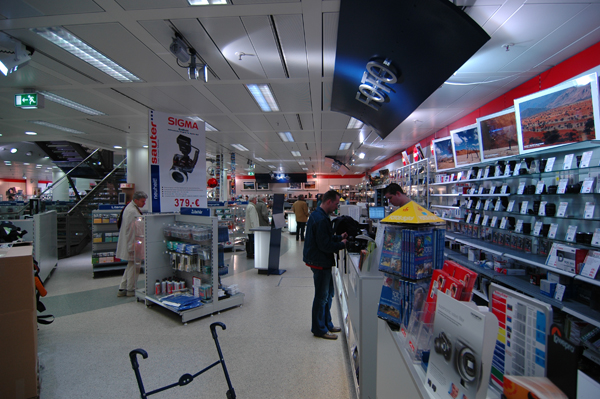 |
| 12mm f4 |
If I buy this lens, it won’t be primarily to use it at the very wide end. Nevertheless, here if anywhere is where I would expect to see obvious weaknesses.
Barrel distortion is clearly visible but not dreadful. Light falloff in the corners is visible at f4 if you look for it, but not blatantly obvious/objectionable to my eye.
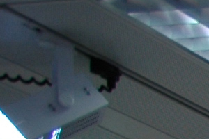
Let's have a look in the top left hand corner:
 |
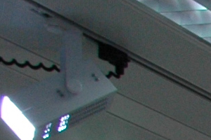 |
| 12mm f4 corner | 12mm f8 corner |
What I see here: f4 is softer but not terrribly so. Chromatic aberration around the edges of the spotlight is visible in both pictures but more pronounced at f4.
There appears to be some blue colour shift in the f4 picture, but given that the pictures were taken under mixed artificial light with I-forgot-to-check-what light balance setting in the (not my) camera, I really wouldn’t want to jump to any conclusions from this.
18mm
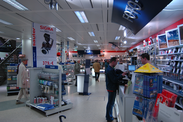 |
| 18mm f4 |
I did test shots at 18mm because it’s the middle of the zoom range; it’s also around (a bit longer than) where I would expect to be using the lens most, based on 24mm (=16mm) being my most-used wide angle with film.
Still some barrel distortion detectable by drawing straight lines on the image in Photoshop, but not at all obvious to my naked eye. Still a bit of light falloff at f4.
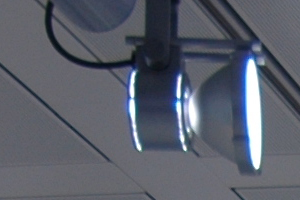
Corner view (actually top-just-a-bit-left-of-centre view, but this was the only place I had good in-focus detail right at the edge of the frame):
 |
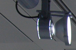 |
| 18mm f4 corner | 18mm f8 corner |
f8 is visibly but not massively sharper than f4. Chromatic aberration around the spotlight is very obvious at f4, only just visible at f8.
Again, ignore differences in exposure/colour balance – this was not a controlled-lighting test.
24mm
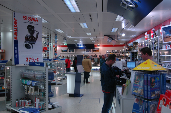 |
| 24mm f4 |
Oops. Moved the camera whilst switching settings between f4 and f8. The top left hand corner of the Sigma poster is right in the corner of the f8 shot and about a sixth of the way in in the f4 shot:
 |
 |
| 24mm f4 corner (ISO 200) | 24mm f8 corner (ISO 400) |
To my eye the f4 looks sharper. I think this is probably the noise difference between ISO 200 and ISO 400 compensating for any minimal difference in sharpness between f8 right-in-the-corner and f4 near-the-corner. There’s visible magenta chromatic aberration/fringing on the red lettering at f4 that’s barely there at f8.
moiré
All the pictures have moiré in the ceiling tiles that for some reason is more pronounced at f4 than at f8. I assume this is about the camera not the lens. The f4 pictures were shot at ISO 200 and the f8s at ISO 400: I wonder if the noise in the ISO 400 pictures is breaking up the moiré patterns to some extent?
related entries: Photography
all text and images © 2003–2008