alan little’s weblog
moma!
20th September 2005 permanent link
Five years ago, on my first visit to New York, I was absolutely floored by the Museum of Modern Art. Since then the museum has had a spell of exile in Queens while its midtown Manhattan site was completely rebuilt and greatly enlarged. Now it’s back. The old MoMA was a hard act to follow.
Things that struck me about the new one …
Edward Weston’s prints: not for their subject matter, which is irrelevant, but for their sheer technical beauty – lustrous depth, rich contrast, incredible sharpness. Can nobody print black & white photographs like that any more? Certainly nobody whose work is on show in MoMA at the moment can – Frank Gohlke’s prints, for example, are shockingly flat and muddy by comparison.
(Frank Gohlke might argue – certainly anybody could argue – that producing prints that are technically immaculate in that particular highly abstract Weston way is not the only legitimate artistic goal in photography. He/they would be right. It’s just difficult for me personally, having just been struck dumb by the sheer excellence of Weston’s prints to the point where my wife almost had to drag me from the room, to then go and look at technically inferior prints immediately afterwards, whatever the non-technical merits of the pictures might be)
Joel Sternfeld’s pictures of the High Line, an abandoned elevated railway on Manhattan’s west side.
I gather they have some stuff by painters and sculptors too, although remarkably little of it post-Jackson Pollock – i.e. in the last fifty years – seems to be interesting in any way.
The new building. Michael Blowhard points out that Terry Teachout is most unimpressed. I liked it, as a building, for two main reasons:
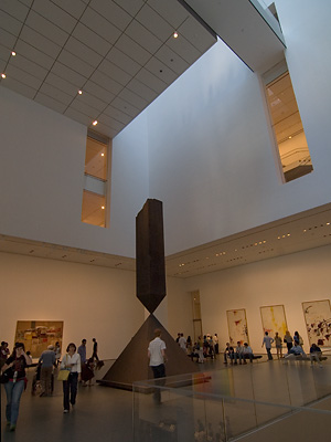
(1) I found the huge atrium very impressive.


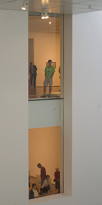
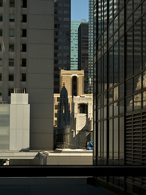
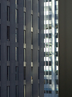
(2) Windows. Michael, I know, and Terry, I assume, are long-time Manhattanites and might therefore be jaded and inclined to overlook the fact that Manhattan itself is the ultimate work of Modern Art. I, on only my second visit to the city, am not and find just walking around the place looking at it hugely exciting. The new MoMA has windows that offer some great views of the fantastic surroundings. I don’t remember windows or being able to see the surroundings anywhere in the old MoMA except the courtyard.


So I found the new building impressive as a building. But I liked the old MoMA too, I didn’t find this visit such a mind-blowing experience as my first one. That was my most awe-inspiring art gallery experience ever by far. Why not? This time I wasn’t seeing the amazing MoMA collection for the first time. Maybe this time they didn’t have the right things on display to push my buttons – there is nowhere near enough photography on show given the alleged vastness of the new display space; nor do they have the old hit-them-right-between-the-eyes-right-away “highlights of the collection” room right by the entrance. Pollock, Monet, van Gogh, Picasso … That was an excellent idea. And this time I was there on Labor Day so it was very busy.
Is the new building actually a better or worse place for viewing art than the old one? I certainly don’t dislike it the way Terry does, but I wouldn’t say it was obviously a huge improvement either.
“The Lenin's Tomb of Modern Art”, says Robert Locke. “Fill ’er up”, says Edward Winkleman.
related entries: Photography
all text and images © 2003–2008