alan little’s weblog
r800 black & white notes
28th April 2005 permanent link
I’m (still) very happy with the colour glossies I get from my Epson R800. Our wedding photographer, who shot digital, gave us conventional photo prints from the digital files, and jpegs on a CD. The Epson prints I'm getting from the jpegs are, to my eye, clearly better than the conventional photo prints.
Black & white is a different story, as it still almost always seems to be with inkjets. Other people seem to be happy with theirs, but mine seem to be coming out slightly green and a bit lacking in punch/contrast. So far this has been on my “look at one day when I get round to it” list; unfortunately it has suddenly become more urgent because the pictures Maria chose as housewarming presents for two friends of ours (who I hope won’t read this before their housewarming party on Sunday) are black & white.
So, now it’s time for me to get serious about working out whether there is in fact anything wrong with the prints the Epson is producing – and if so, what to do about it.
These, then, are working notes from a project in which Alan finds himself learning more than he ever wanted to about colour theory, printer calibration and how to use a Nikon D70 as a crude colorimeter.
Step One - print some test charts
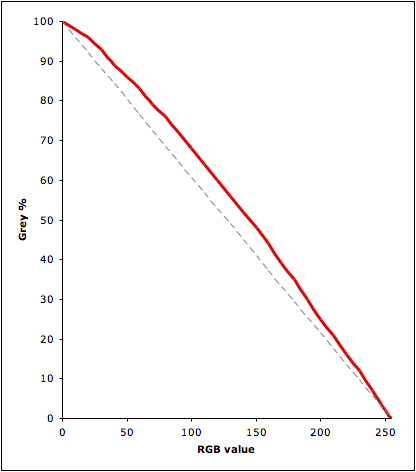
I thought I would just run up some test files in Photoshop with bands of 100% 90%, 80% etc, grey(*), print them and see what they look like.
First discovery: RGB-to-greyscale conversion in Photoshop isn’t linear. RGB 127,127,127 gives you 57% black, not 50%. Much experimentation later, here’s the curve:
Second discovery, made whilst messing about with the first discovery: my monitor – a Formac Gallery LCD profiled with an OptiCal Spyder – isn’t half bad. In a dark room I can see 1% greyscale steps almost right out to both ends of the scale.
Third discovery: the eye – my eye, anyway – seems to be more sensitive to subtle differences in light shades than dark.
Dark grey from black: depends on the level of room lighting. In a dark room I can just about discern 98% grey (RGB 10,10,10) from black. In daylight I can’t unless I look from an angle, not directly onto the monitor. Straight on even 96% (RGB 20,20,20) is difficult.
Light grey from white. I can discern 1% grey (RGB 254,254,254) from white in a dark room but not in daylight. 2% grey (RGB 251,251,251) is easy even in daylight.
Here are some examples. The black rectangle on the left has 98% and 96% grey rectangles in it; the white one on the right has areas of 1%, 2% and 4% grey. I can make these out in a browser on my laptop; your mileage may vary.


Next Step: print out my DIY greyscale test charts and compare them to a standard photographer’s greycard.
Possible outcomes: I can see three possible outcomes to this whole project. (1) I discover that the printer is actually fine, and I just need to up the contrast a bit in my pictures before I print them. (2) The printer needs calibrating, and I eventually work out how to do it (or pay somebody else to do it) … or (3) I decide it’s just not worth the time and energy and buy a cheap Hewlett packard black & white printer instead (having first convinced Maria that it’s cost-justified and that I can find space on the printer shelf for it)
(*) I apologise to any American readers who might find my spelling of “grey” a constant irritation whilst reading this.
related entries: Photography
all text and images © 2003–2008