alan little’s weblog
r800 black & white notes iii
2nd May 2005 permanent link
print your own greycard?
Having read various discussion forums in which people complain about their Epson R800s producing coloured black & white prints, and then apparently push buttons in Photoshop and Epson’s printer driver more or less at random until the results start to look more pleasing, I decided instead on the radical approach of actually doing some measurements to work out what is wrong and what to do about it.
Here's how to use a Nikon D70 (or any other good digital camera) as a poor man’s colorimeter:
You take a photographer’s standard grey card, meter and set manual white balance on the card, and take a picture of it. You load the raw file into Photoshop, adjusting nothing in the raw file converter, and voila, you have a grey picture with RGB values around 110,110,110 – the light level inevitably varies across the surface of the card but it’s is pretty much perfectly neutral, with the R, G and B values never varying by more than a point or two.

photographer’s standard greycard
(People refer to standard grey cards as “18% reflectance”, but this doesn’t seem to correspond in any way to what Photoshop regards as “black minus eighteen percent”, or 82% greyscale. Nor is it 50%. Photoshop calls RGB 110,110,110 “64% grey”. I am so glad I don’t actually need to understand this stuff)
Then you print the print the picture of the grey card exactly as you were previously printing your black & white pictures. In my case, that was as an RGB file, with the appropriate Epson paper profile, perceptual rendering intent and black point compensation selected in Photoshop, and colour adjustment turned off in the printer driver. This gives excellent results for colour pictures, but black and white comes out looking green to my eye.
You lay the print on the grey card, reset the manual white balance in case the ambient light has changed, take a photograph showing half the real grey card and half the print, load that into Photoshop and compare the two sides.

greycard (right) compared to unadjusted glossy print
You immediately discover two things: it’s difficult to use this approach with glossy prints because what you photograph is as much reflections on the surface as what’s actually on the print. (It might be better to use a flatbed scanner for this exercise if you have one instead of a camera. Or perhaps not – I hope a $1,000 D70 has better metering and white balance than a $50 scanner).
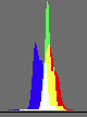 But also: even with a glossy print, you quickly learn that what your eye was seeing as a “green” print is actually yellow – or in RGB terms, lacking blue. The density of the print – i.e. how dark a shade of grey it is – is pretty close to the real grey card, but B is around 12 points below R and G. You can see this clearly on the histogram too: everything is nicely bunched together as it should be for an all-one-shade-of-grey image, except that spike of too-low blue on the left.
The first correction I try is a Yellow -5 colour adjustment in the printer driver. This produces a picture that is pretty neutral, but far too light. Look at the two nicely neutral, but too far apart, spikes on the histogram.

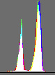
greycard (right) compared to glossy print with Yellow-5 colour adjustment
Switching to matte paper for the time being because it’s going to be easier to get accurate comparisons, you find that an unadjusted print still looks-green-but-is-really-yellow, but slightly less so than it was on glossy paper: B is 7 or 8 points down instead of 12.
I try levels tweaks in Photoshop. The first thing I try is simply Blue +5. This looks pretty good to the naked eye, but when measured is still a bit too light (10 to 15 points) and a bit too red (R 5 points or so higher than G and B).

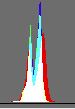
greycard (right) compared to matte print with blue+5 levels adjustment
At this point I perhaps go slightly off track (again). This print looks good to the eye but still doesn’t measure all that well, so I go off trying further multidimensional levels tweaks, taking the overall tone down a bit, blue up a bit, red down a bit etc. The “best” one I come up with – i.e. the one that measures closest to the actual greycard, is this: RGB midtone down 8 points, blue +6, red -3, green +2. It’s still not perfect, but it’s getting very close (look at the lovely tight histogram):

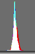
greycard (right) compared to matte print with complex levels adjustment
There are still two problems: it’s still just fractionally too red and too light – doubtless fixable by further tweaking. But further tweaking may not be worthwhile because … it doesn’t actually look any better than the first, simple levels tweak.
Lessons learned: a methodical scientific approach pays off. Finding out exactly what was wrong was quick, and I was immediately able to try out adjustments that made big steps in the right direction. But also: what measures best may not be what looks best to the eye. My first simple tweak on matte paper (Photoshop levels Blue+5) doesn’t quite match the greycard perfectly when measured, but to the naked eye it looks at least as good as, if not slightly better than, the fancier attempts I made afterwards. Don’t forget that the objective is to find out what produces an aesthetically pleasing print; measurement is a tool to get yourself pointed in the right direction, not an end in itself.
NOTE: I should mention - ignore the slightly lighter bands in the middle of all the comparison prints. These are just the out of focus edges of the prints laid on the grey card. It’s the left hand side (print) versus the right hand side (greycard) that we’re interesting in comparing. At some point if I have time I shall re-photoshop the images and cut the middle bits out.
related entries: Photography
all text and images © 2003–2008