alan little’s weblog archive for may 2005
nein daddy, spi
30th May 2005 permanent link
Monday Family Life Vignette: growing up multilingual. A week after his second birthday, Jack’s vocabulary is coming on rapidly in a mix of Russian, German and English. Russian in the lead at the moment – of course, it’s literally his mother tongue – but we expect German to overtake it soon as he spends more time at creche.
He’s just at the stage of starting to put two- and three-word sentences together. Today he was tired: when I asked him after supper if he wanted to go for a bath the answer was “nein Daddy, spi”.
Three words, three languages: Nein (no) – German; Daddy – English; spi (sleep) – Russian.
information overload
30th May 2005 permanent link
Matt Webb is subscribed to too many RSS feeds, and would like his RSS reader to help him prune them by hiding them and seeing if he notices.
I’m subscribed to 58 feeds in bloglines, of which there are about ten I immediately look at when there’s anything new. Bloglines could, if it wanted to be helpful, float those ones to the top of the list for me.
On the subject of information overload: I apologise to the people whose emails have been sitting in my follow-up folder for the last three weeks while I was busy nursing a sick toddler. He’s fully recovered now, and I will be blogging and answering mails again soon.
going retro
17th May 2005 permanent link
I’ve been shooting nearly all digital since I got my lovely Nikon D70 last year, but a couple of things inspired me to dig a few rolls of black & white film out from the back of the fridge, and my old manual Nikon and 50mm lens from the back of the camera cupboard, and do some back-to-basics retro photography.
One was this excellent editorial from Lenswork magazine, 21 Ways to Improve Your Creativity: Letters to a Young Photographer [pdf], linked to by Evelyn Rodriguez. The other was a mail from Hugh Leighton McWilliams, who had come across an old blog entry where I was wondering whether I could do more to improve my photography by buying the D70, or just keeping the cameras I had and buying a big pile of black & white film.
On the whole the D70 was a good idea – if you actually want to do anything with your pictures, the whole digital workflow is so much easier than film that I have been taking more pictures, and enjoying my photography more, than I would otherwise. And more pictures ultimately == more good pictures. From 21 Ways:
1) Shoot more than you do; print more than you do; and be a ruthless editor. There is a great deal to be gained in sheer volume – not that volume itself is any virtue, but practice is.
I have noticed, though, that I don’t “see” in black & white as well with the D70 as I do with a camera loaded with real black & white film. It’s not just a matter of post-processing; the whole attitude and approach to composition needs to be different. I personally don’t often take colour pictures that work well converted to black & white after the fact in Photoshop.
Whether or not I actually get any decent pictures out of it, it’s been a very worthwhile exercise to spend a couple of days thinking carefully again about light, shade and composition in a different medium – pictures as things not pictures of things. The zoo this afternoon with convalescent Jack was fun: instead of just hauling my biggest telephoto lens around adding to the world’s already vast surplus of boring animal close-ups, I was actually looking for interesting pictures. It’s the looking that matters, not whether I actually got any this time.
related entries: Photography
leberkäs
17th May 2005 permanent link
I thought I was the only one but no, J. Greely is getting it too: a wierd new form of spam that, as far as I can tell, appears to be legitimate links to genuine German news stories (I haven’t followed any of the links to check, but the URLs look ok), but coming from apparently random, presumably spoofed, non-German addresses. I’ll be interested to see how quickly Apple Mail learns to recognise it.
UPDATE: it’s apparently the latest variant of a well-known Windows worm. Note to infected Windows users: take some basic security precautions, please, and stop pestering me.
(*) Leberkäs: literally “liver cheese” but as far as I know actually containing neither, Leberkäs is a Bavarian delicacy that looks for all the world like lovingly hand-crafted farmhouse spam. I have no idea if it tastes as repulsive as it looks (although that would be difficult) because I could never bring myself to try it.
stuporblogging
14th May 2005 permanent link
for most people getting less than six hours sleep in 24 hours reduces cognitive abilities by about 15-percent. Try that for four days and you’ll be down about 70-percent. Recovery of full cognitive abilities can take several days of “proper” sleep (7-8 hours).
Says strategypage. Jack’s ear infection turned out to be a side effect of bacterial bronchitis. The antibiotics seem to be starting to kick in, which means we just had the first reasonable night’s sleep in our house in two weeks.
Soon it may become possible to finish various blog drafts in progress, some even nearly finished, which have nevertheless been too intellectually strenuous to contemplate.
I got off relatively lightly, actually. After the first five or six coughing’n’crying outbreaks I’m so tired I stop reacting. This is not an option for mothers, whose hearing is wired differently.
perfect songs
11th May 2005 permanent link
Michael Blowhard links to Will Duquette’s list of six “perfect songs”. I’m always a sucker for the music list game – especially when nobody in our house has slept for days, thanks to my son’s ear infection; this pretty much rules out any blogging that might involve actual thinking.
So instead, playing by Will’s rules:
What I mean by a Perfect Song is a recording which is so perfectly itself that it couldn't possibly be altered without breaking it. The music and the singing mesh perfectly together, and the whole thing usually has a unique feel to it. Any other recording of the same song is going to have take an entirely different approach, because these recordings can't be beaten at their own game.
These aren't necessarily my favorite songs, mind you
I would nominate:
- Personal Jesus: Johnny Cash’s American IV version of the Depeche Mode song.
- Furry Sings The Blues: Joni Mitchell’s stunning live performance of her own song with The Band, on the extended edition of The Last Waltz.
- Hyperballad: Björk with the Brodsky Quartet.
- Clearly something from the ’70s heyday of Bryan Ferry & Roxy Music: Over You would be one of several strong contenders.
- Any Ike & Tina live recording of Proud Mary (I don’t personally rate the Creedence original)
related entries: Music
lost & found
6th May 2005 permanent link
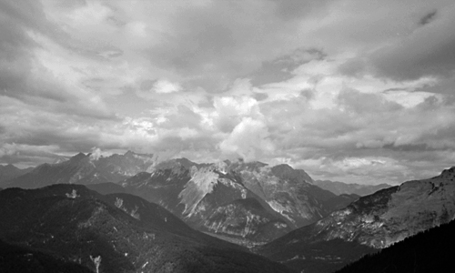
Wetterstein Alps, Austria
A couple of years ago I lost the negatives from a couple of rolls of film of hiking and climbing trips in the Alps. I was hopeful that they might turn up one day – I couldn’t see myself knowingly having thrown negatives out – and sure enough, last night I was looking for some other pictures and there they were in the wrong folder.
I quite like this one, of storm clouds building over the Wetterstein Alps on the Austrian-Bavarian border. It violates the “rules” of landscape photography that say “thou shalt use large (or at least medium) format slow film on a tripod”, having been shot handheld with fast film in a 35mm point & shoot. This is because, as the late Galen Rowell knew, the “rules” of landscape photography are trumped by the rule of mountaineering that says “thou shalt not carry heavy stuff that jeopardises thy chance of being off the mountain before those photogenic storm clouds get to where thou art”. Which I was.
related entries: Photography
not a herd animal
6th May 2005 permanent link
I sometimes wonder whether I’m just interested in oddball stuff that hardly anybody else is (and whether that, if true, would necessarily be a bad thing)
Such as when I noticed today that not many of my del.icio.us links [a phrase that may one day not feel stupid when I type it – after all, “google” doesn’t any more] seem to be linked to by anybody else.
I had a quick look at the first hundred and found that 76 of them aren’t linked to by anybody else, and that people – at least people who use del.icio.us – are very interested in software and money, a little bit in photography and not at all in music or yoga. At least not the kinds of music and yoga that I like.
lotus without tears iii
6th May 2005 permanent link
I just found this very good article by Donna Farhi with lots of good advice, both on the physical aspects of how to approach lotus safely and the mental aspects of how to cope with yoga “challenges” generally.
To lift the leg into Ardha Padmasana (Half Lotus Pose), reach your right hand under your calf to grasp the outside of the right lower leg near the ankle. Flex the foot so that you can no longer see the sole, and slowly lift the leg up, rotating the shin and thigh outwards as you do so. Carefully place the ankle on the upper thigh near your groin, with the outer ball of the ankle joint supported by your thigh. Continue to draw the little toe of your right foot back towards your outer knee to prevent the rotation from coming at the ankle or knee. If you pull the leg up by grasping the top of the foot and allowing the foot to sickle, you will only overstretch the ligaments of your ankle and knee rather than opening your hip.
I wish somebody had told me this when I was learning lotus. The trouble is, the people teaching me probably had had open enough hips when they started that they did it without having to think about it or struggle with it, and so didn’t need to explicitly know these things. (It’s also possible that they did tell me, but I was too busy cranking my foot towards “the goal” by brute force to listen to them)
Lotus Without Tears Part 1, Part 2
UPDATE Christmas 2007: my original link to Donna Farhi’s article was broken. Peter Horst kindly pointed me to another copy of the same or a very similar article.
related entries: Yoga
currently listening to …
3rd May 2005 permanent link
… twelve tone music, apparently, although I wasn’t aware that was what it was until a music-knowledgeable friend told me so on the phone this morning.
Kyle Gann regards Schönberg, the originator of the twelve tone concept, as a vastly overrated composer and his and his friends’ and disciples’ work as at best a moderately interesting academic curiosity. Eric Raymond and the Pope blame him for classical music’s slide into elitist obscurity. I have heard hardly anything by him.
There are a couple of pieces by Alban Berg – the Lyric Suite and the violin concerto – that I liked rather a lot when I first heard them, although I wouldn’t go out of my way to listen to them all that often.
And recently, whilst trawling through things I had in iTunes but had never listened to – forgotten downloads and odd bits from compilation CDs – I found a couple of things by Anton von Webern that were fun. So I asked around in various places, including on rec.music.classical.recordings, what else of his I should listen to, and as a result I just went out and bought this Naxos CD. Haven’t listened to it yet.
I suppose I was vaguely aware that Berg and Webern were friends/disciples/co-conspirators of Schönberg but I hadn’t thought much about it. Nor, as long as I just want to enjoy listening to their music, do I see why I should care particularly.
related entries: Music
cookery blog
3rd May 2005 permanent link
Just a quick note to say that I do not share the general European superstitious dread of genetically modified crops, and could somebody please produce an aubergine that keeps its colour when cooked? Thank you.
secret russian formula
3rd May 2005 permanent link
I have the Secret Russian Formula.
Sorry. I couldn’t resist building a Tuesday Family Life Vignette around that phrase:
Jack isn’t feeling well today, so we have kept him home from creche. Maria has just taken him for a walk, and I have been entrusted with her Russian meatball recipe to make his lunch.
yoga curmudgeon iv
2nd May 2005 permanent link
I never intended “yoga curmudgeon” to be an ongoing feature of this blog, but on the basis that it’s easier to go with momentum than fight it …
This practice assumes you come from a floor-sitting culture.
… says [senior ashtanga yoga teacher] John Scott about the ashtanga primary series. The primary series, as its name suggests, was originally envisaged as a basic introductory practice for Indian students, but it contains lots of postures – mostly involving legs in lotus or half lotus position – that a lot of western beginners find very challenging and take years to learn.
This doesn’t mean, however, that ashtanga vinyasa yoga practice is inherently impossible/unsuitable/dangerous for adult western beginners as some people think. It just means that they have more work to do, will (generally) progress more slowly and need to be more careful, than teenage Indian boys like Pattabhi Jois and BKS Iyengar were when they started studying yoga in the 1930s. Western hips, backs and shoulders tend to be excessively tight from years of sitting on chairs hunched over desks; it is this, not different-shaped bones, that makes routine (for Indians) sitting postures like lotus a big challenge for most westerners. And that damage can be undone – it just takes time (and patience and hard work).
related entries: Yoga
finally, a real picture
2nd May 2005 permanent link
This, incidentally, is the picture I actually wanted to print when I began my Epson R800 black & white printing adventure:

Tungabadra River, Hampi
related entries: Photography
more pictures of greycards
2nd May 2005 permanent link
Whilst spending an entertaining and educating morning measuring prints of greycards, I realise that this would also be a good time to measure the dynamic range of the D70’s sensor.
Which turns out to be about 6 stops: 3½ under, 2½ over.

The mid grey bar with the red stripe shows a grey card at a standard exposure. The bars to the left and right show under- and overexposure in 1 stop increments. We go white - highlights completely burned out – somewhere between +2 and +3 stops.
On the underexposure side there’s still a clear discernible difference between -3 and -4; there’s still a slight measurable difference between -4 and -6 but I can barely see it, and I‘m sure it’s nearly all noise by then anyway. I assume you could keep underexposing more or less indefinitely without getting to RGB 0,0,0 – difficult under normal conditions to prevent any light whatsoever from reaching the sensor – but beyond a certain point you’re just taking pictures of the sensor’s background noise.
Greater underexposure latitude is presumably why current imaging software, such as Photoshop’s Shadow/Highlight adjustment, can do such a remarkably good job of salvaging recognisable (if noisy) detail from what appear to be the deepest shadows; whereas white is white – once a pixel is reading off the scale that’s it, game over.
Coming soon: a return from camera/printer geekery to actual photographs somebody might actually want to look at. But (some level of) one is part of being able to produce the other.
related entries: Photography
r800 black & white notes iii
2nd May 2005 permanent link
print your own greycard?
Having read various discussion forums in which people complain about their Epson R800s producing coloured black & white prints, and then apparently push buttons in Photoshop and Epson’s printer driver more or less at random until the results start to look more pleasing, I decided instead on the radical approach of actually doing some measurements to work out what is wrong and what to do about it.
Here's how to use a Nikon D70 (or any other good digital camera) as a poor man’s colorimeter:
You take a photographer’s standard grey card, meter and set manual white balance on the card, and take a picture of it. You load the raw file into Photoshop, adjusting nothing in the raw file converter, and voila, you have a grey picture with RGB values around 110,110,110 – the light level inevitably varies across the surface of the card but it’s is pretty much perfectly neutral, with the R, G and B values never varying by more than a point or two.

photographer’s standard greycard
(People refer to standard grey cards as “18% reflectance”, but this doesn’t seem to correspond in any way to what Photoshop regards as “black minus eighteen percent”, or 82% greyscale. Nor is it 50%. Photoshop calls RGB 110,110,110 “64% grey”. I am so glad I don’t actually need to understand this stuff)
Then you print the print the picture of the grey card exactly as you were previously printing your black & white pictures. In my case, that was as an RGB file, with the appropriate Epson paper profile, perceptual rendering intent and black point compensation selected in Photoshop, and colour adjustment turned off in the printer driver. This gives excellent results for colour pictures, but black and white comes out looking green to my eye.
You lay the print on the grey card, reset the manual white balance in case the ambient light has changed, take a photograph showing half the real grey card and half the print, load that into Photoshop and compare the two sides.

greycard (right) compared to unadjusted glossy print
You immediately discover two things: it’s difficult to use this approach with glossy prints because what you photograph is as much reflections on the surface as what’s actually on the print. (It might be better to use a flatbed scanner for this exercise if you have one instead of a camera. Or perhaps not – I hope a $1,000 D70 has better metering and white balance than a $50 scanner).
 But also: even with a glossy print, you quickly learn that what your eye was seeing as a “green” print is actually yellow – or in RGB terms, lacking blue. The density of the print – i.e. how dark a shade of grey it is – is pretty close to the real grey card, but B is around 12 points below R and G. You can see this clearly on the histogram too: everything is nicely bunched together as it should be for an all-one-shade-of-grey image, except that spike of too-low blue on the left.
The first correction I try is a Yellow -5 colour adjustment in the printer driver. This produces a picture that is pretty neutral, but far too light. Look at the two nicely neutral, but too far apart, spikes on the histogram.


greycard (right) compared to glossy print with Yellow-5 colour adjustment
Switching to matte paper for the time being because it’s going to be easier to get accurate comparisons, you find that an unadjusted print still looks-green-but-is-really-yellow, but slightly less so than it was on glossy paper: B is 7 or 8 points down instead of 12.
I try levels tweaks in Photoshop. The first thing I try is simply Blue +5. This looks pretty good to the naked eye, but when measured is still a bit too light (10 to 15 points) and a bit too red (R 5 points or so higher than G and B).


greycard (right) compared to matte print with blue+5 levels adjustment
At this point I perhaps go slightly off track (again). This print looks good to the eye but still doesn’t measure all that well, so I go off trying further multidimensional levels tweaks, taking the overall tone down a bit, blue up a bit, red down a bit etc. The “best” one I come up with – i.e. the one that measures closest to the actual greycard, is this: RGB midtone down 8 points, blue +6, red -3, green +2. It’s still not perfect, but it’s getting very close (look at the lovely tight histogram):


greycard (right) compared to matte print with complex levels adjustment
There are still two problems: it’s still just fractionally too red and too light – doubtless fixable by further tweaking. But further tweaking may not be worthwhile because … it doesn’t actually look any better than the first, simple levels tweak.
Lessons learned: a methodical scientific approach pays off. Finding out exactly what was wrong was quick, and I was immediately able to try out adjustments that made big steps in the right direction. But also: what measures best may not be what looks best to the eye. My first simple tweak on matte paper (Photoshop levels Blue+5) doesn’t quite match the greycard perfectly when measured, but to the naked eye it looks at least as good as, if not slightly better than, the fancier attempts I made afterwards. Don’t forget that the objective is to find out what produces an aesthetically pleasing print; measurement is a tool to get yourself pointed in the right direction, not an end in itself.
NOTE: I should mention - ignore the slightly lighter bands in the middle of all the comparison prints. These are just the out of focus edges of the prints laid on the grey card. It’s the left hand side (print) versus the right hand side (greycard) that we’re interesting in comparing. At some point if I have time I shall re-photoshop the images and cut the middle bits out.
related entries: Photography
demographics
1st May 2005 permanent link
Last year when Maria went back to work part time, we sent Jack to a Turkish lady for daycare. Frau K (not her real initial) has five children of her own, now in their teens, and we knew as soon as we met them that Jack would be ok with her. If all children were as bright, charming and obviously well brought up as Frau K’s five I would have no serious concerns about the future of the world.
Yesterday we met up with Frau K’s family for a picnic in the park. Frau K herself wears a headscarf, doesn’t speak German all that fluently and, although perfectly polite and friendly to me, generally seems more comfortable talking to Maria. Her three teenage daughters are a different kettle of fish. They speak Turkish to their parents but perfect German among themselves, with no accent that I can hear. I would be quite surprised if I ever saw any of these young ladies in a headscarf.
They are all wearing the same blue and yellow football shirts. Maria asks whose they are, and they name some Turkish team we’ve never heard of. I ask why not Galatasarai (sp?) – the only Turkish team I have heard of. Oh no, I’m told, that would be so boring – like supporting Manchester United or Bayern Munich. And besides, Galatasarai (sp?) colours are red and black, and how could we possibly wear red and black? Ah, I say, so women choose football teams to support based on the colours? Yes, partly, they tell me, also the looks of the players. (All those jokes in the last world cup about Brazil beating Turkey in the semis because Brazilian female football fans are better looking than Turkish ones? Not actually the case)
They say they don’t want to marry too soon. We suggest that when they do, they consider not moving too far from their mum as it would be hard to imagine a better grandma. They are interested in biology, as bright kids ought to be these days, and point out forcefully to their little brother (11) that his attitude and priorities at school are in need of some adjustment if he’s serious about wanting to study medicine. The kids are alright.
german indian food
1st May 2005 permanent link
I have discovered how to get good Indian food in Germany (other than by cooking it yourself).
You go to a restaurant where you have been before, and thought the food was mediocre. Only this time, instead of being in an Anglo-Irish-Canadian-German party, you are with an ex-colleague who is going back to India to get married and are one of only two foreigners in an otherwise all-Indian group. Suddenly the food is excellent.
all text and images © 2003–2009